

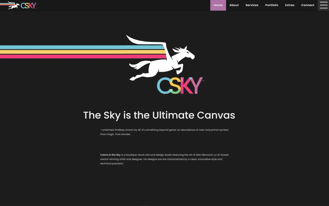
- CSKY Web Home Page, c. 2017
- Screenshot of Website
- Web Design by Alex Stevovich
I designed and developed the website for CSKY (Colors in the Sky), my studio platform focused on visual arts, graphic design, broadcast graphics, and web development, launched in 2017. The site succeeded the Transomnebulism platform, a name change that also marked an era shift: stronger and more mature branding, improved personal capabilities reflected in richer imagery and design, and a move into modern web technologies appropriate to the period.
CSKY was conceived as a personal studio platform capable of supporting a large-scale archival portfolio, nearly 1,000 entries spanning multiple design disciplines, alongside a proprietary publishing system for original writing on visual design. The scope demanded both a strong front-facing identity and a robust, extensible back-end architecture to match.
Scope of Work
- Website architecture and system design.
- Design and development of visual identity.
- Development of original vector graphics and artwork for the visual identity and hero presentation.
- Front-end development (HTML, CSS, JavaScript).
- Server-side application development (Node.js).
- Data structuring for portfolio entries and service domains.
- Proprietary publishing platform development utilizing Marle.
- Archival figure display system with structured artwork attribution.
- Responsive layout implementation.
- Search engine optimization and accessibility implementation, including structured metadata and semantic markup.
- Ongoing site maintenance and technical oversight.
Identity
As a personal studio platform, CSKY allowed me to lean fully into my own aesthetic instincts without designing toward a neutral or generic portfolio presentation. Across my studio subdivisions, I approach branding almost like world-building, drawn to the kind of heightened identity clarity where design feels intentional, symbolic, and internally coherent rather than assembled from conventions.
CSKY is built on minimal but strong symbolism, controlled color, and bold but disciplined graphic choices. The visual identity, including the Pegasus mark, logotype, and color system, was developed as original vector artwork created specifically for this rebranding. The logotype assigns each letterform a distinct color drawn from the platform's palette, binding mark and environment into a single visual system.
A central element of the platform is a full-width hero image featuring the Pegasus in flight with a seamless multicolored rainbow trail arc extending across the screen. The trail is engineered as a seamless graphic effect that follows the motion of the Pegasus, producing an immediate and declarative statement. It signals that the viewer has entered a constructed visual environment rather than a default layout. Even with these stronger stylistic decisions, content areas remain restrained. The work itself still leads.
Features
Portfolio Architecture
The site was designed to support nearly 1,000 portfolio entries organized across multiple design disciplines. Given the breadth of work on display, spanning web development, print design, publication design, exhibition design, and more, entries are organized into focused categorical presentations so that different client viewers can locate relevant work directly, without navigating an undifferentiated archive.
Under the hood, all portfolio entries are implemented as pages within the proprietary publishing system, giving the archive a consistent data model and enabling the same rendering and metadata infrastructure used for written articles to serve portfolio presentation as well.
Publishing Platform
A proprietary publishing platform was developed utilizing Marle, my custom data notation format and integration system, to support original writing on visual design as well as the full portfolio archive. Marle provides the underlying data structure and display logic that powers both editorial content and portfolio entries through a unified content model.
Archival Figure Display
Given the integration of fine art into a significant portion of the client work on display, a dedicated archival figure display system was implemented. This provides a structured, typographically considered presentation for images, supporting full captions, credits, and artwork attributions. The system creates clear distinction between the design work and the fine art it was built around, resolving potential ambiguity for viewers between the layout design and the artwork itself.
Dark Theme
The site was developed with a display theme toggle between light and dark. Dark felt well suited to artwork presentation and consistent with the platform's visual identity. The dark ground allows work to read with greater clarity and gives the hero image its full graphic weight.
Responsive
A fully responsive layout was implemented to ensure consistent presentation across screen sizes and devices.
SEO (Search Engine Optimization)
Structured metadata, including Schema.org markup, was implemented across relevant page types. Semantic HTML, descriptive metadata, and logical pagination were used to support search indexing and discoverability. The site architecture was designed to support both human navigation and search engine crawlability across a large archive of entries.
Accessibility
The site was developed with attention to accessibility standards. Clear semantic structure, descriptive image metadata, and consistent navigation patterns were prioritized to ensure ease of use across devices and assistive technologies.
Technical Approach
The website is implemented as a Node.js server utilizing components of my proprietary Deep Frame architecture. Pages are rendered server-side through Lydio, my custom HTML rendering framework. This approach is not only performance-oriented but architectural: it provides unified access to request context, data models, and rendering logic within a single execution layer, keeping the system cohesive and extensible without fragmenting responsibilities between client and server.
History
CSKY launched in 2017 as the successor to Transomnebulism, representing a full rebrand and technical rebuild. In 2022, the site was merged into alexstevovich.com as part of a consolidation of all studio divisions under a unified platform, reducing the maintenance overhead of running separate technology stacks across multiple business sites, and reflecting a shift in how I wanted my practice to be understood: as a polymathic body of work presented on a single surface, rather than as discrete client-facing operations.
Artwork Attributions
Some of the artwork displayed on the website as figures represents design layouts showcasing the artwork of other fine artists. In these cases artwork is copyright of their respective rights holders.