

- Paddock Particulars Square Graphic Logo
- Vector illustration
- Original artwork by Alex Stevovich
- © Alex Stevovich
I developed the brand identity for Paddock Particulars, an equestrian lifestyle and products brand. The identity balances a traditional sensibility with a clean, contemporary presentation, classic enough to feel established, restrained enough to feel current.
Scope of Work
- Development of visual identity and concept.
- Design of monogram.
- Design of logo mark.
- Design of horizontal lockup.
- Production of vector artwork for final outputs.
Identity
The palette of sage green and warm cream was chosen to evoke the natural, pastoral qualities associated with equestrian life while remaining soft and versatile across applications. The combination reads as grounded and organic without leaning into anything rustic or nostalgic. The serif wordmark reinforces this balance — traditional in form, set with enough breathing room to feel considered rather than dated.
Deliverables
A set of graphics were developed as an initial package of branding assets. All final artwork was produced as digital vector illustrations.
Lettering
- Paddock Particulars Wordmark
- Vector illustration
- Original artwork by Alex Stevovich
- © Alex Stevovich
The wordmark sets Paddock Particulars in a classical serif at generous scale, in sage on warm cream. The letterforms are open and unhurried, with enough weight to read clearly without asserting themselves above the brand's quiet tone.
- Paddock Particulars Monogram
- Vector illustration
- Original artwork by Alex Stevovich
- © Alex Stevovich
A standalone P mark in cream on sage, set at large scale as a typographic monogram. Clean and direct, suited for use as a stamp, label, or emblem.
Graphic Logo
- Paddock Particulars Square Graphic Logo
- Vector illustration
- Original artwork by Alex Stevovich
- © Alex Stevovich
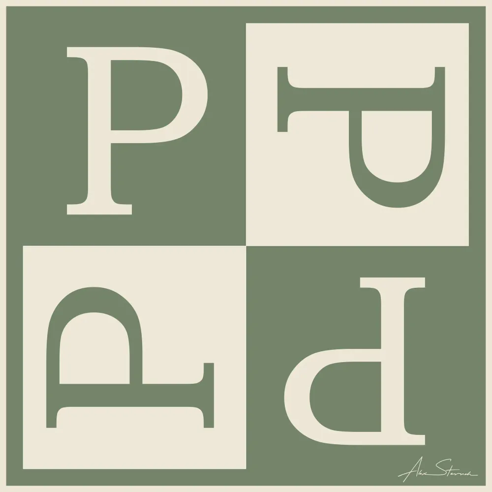
A square divided into four quadrants, each containing the letter P rotated in a different orientation — upright, mirrored, inverted, and inverted mirrored. The two-color field alternates sage and cream between quadrants, creating a figure-ground reversal across the grid. The device reads as both a typographic study and a simple geometric pattern, giving the mark versatility and visual interest at any scale.
- Paddock Particulars Graphic Logo Banner
- Vector illustration
- Original artwork by Alex Stevovich
- © Alex Stevovich
The logo mark paired with the Paddock Particulars wordmark in a serif typeface, set in sage on cream for a clean, refined horizontal presentation.
Vector Artwork
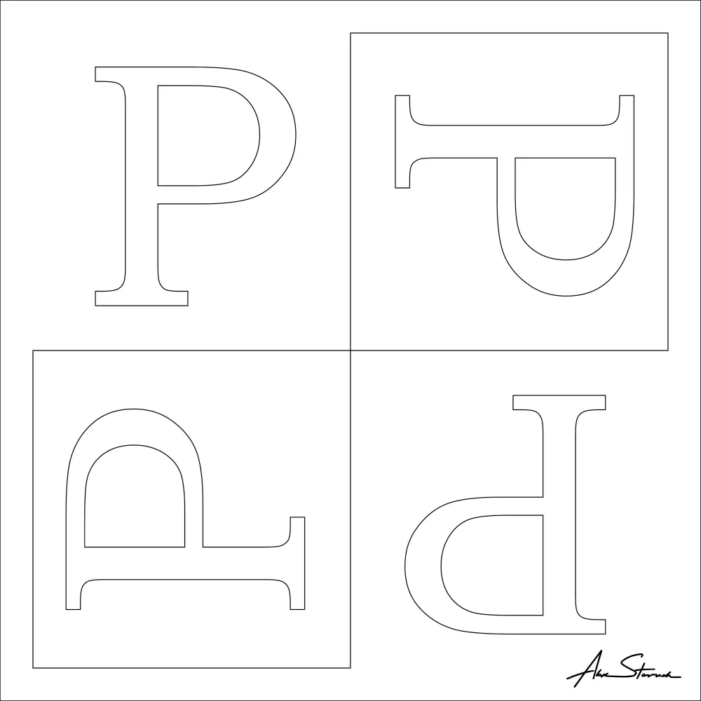
- Demonstration of underlying vector-lines for the Paddock Particulars Graphic Square Logo
- Original artwork by Alex Stevovich
- © Alex Stevovich
The final illustration is produced entirely in vector, with no additional post processing.