

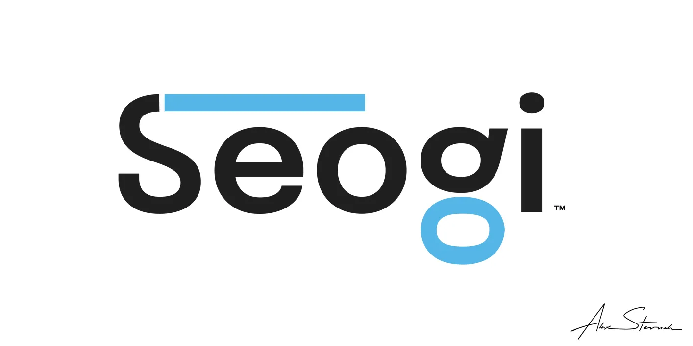
- Seogi Blue Wordmark
- Vector illustration
- Original artwork by Alex Stevovich
- © Alex Stevovich
I developed the brand identity for Seogi, an entertainment brand. The identity centers on bold black lettering with colorful accents, built with flexibility in mind so the mark can shift between contexts, production facing and entertainment facing, through color alone.
Scope of Work
- Development of visual identity and concept.
- Design of wordmark with red and blue accent variants.
- Design of crowned mask emblem.
- Design of standalone crest mark.
- Development of square logo color variants.
- Development of dark background variants.
- Production of vector artwork for final outputs.
Identity
A crowned mask was developed as the core visual concept behind the brand, explored across a range of graphic treatments from a literal mask illustration to a more abstracted geometric emblem. Color flexibility was treated as part of the brand itself rather than a fixed rule, allowing the mask and wordmark to shift palette depending on placement while the underlying form stays constant. The wordmark carries the brand's two primary contexts through its accent bar, a blue version for entertainment facing use and a red version for production facing use, with black and white variants for neutral placements.
Deliverables
A set of graphics were developed as an initial package of branding assets. All final artwork was produced as digital vector illustrations.
Lettering
- Seogi Blue Wordmark
- Vector illustration
- Original artwork by Alex Stevovich
- © Alex Stevovich
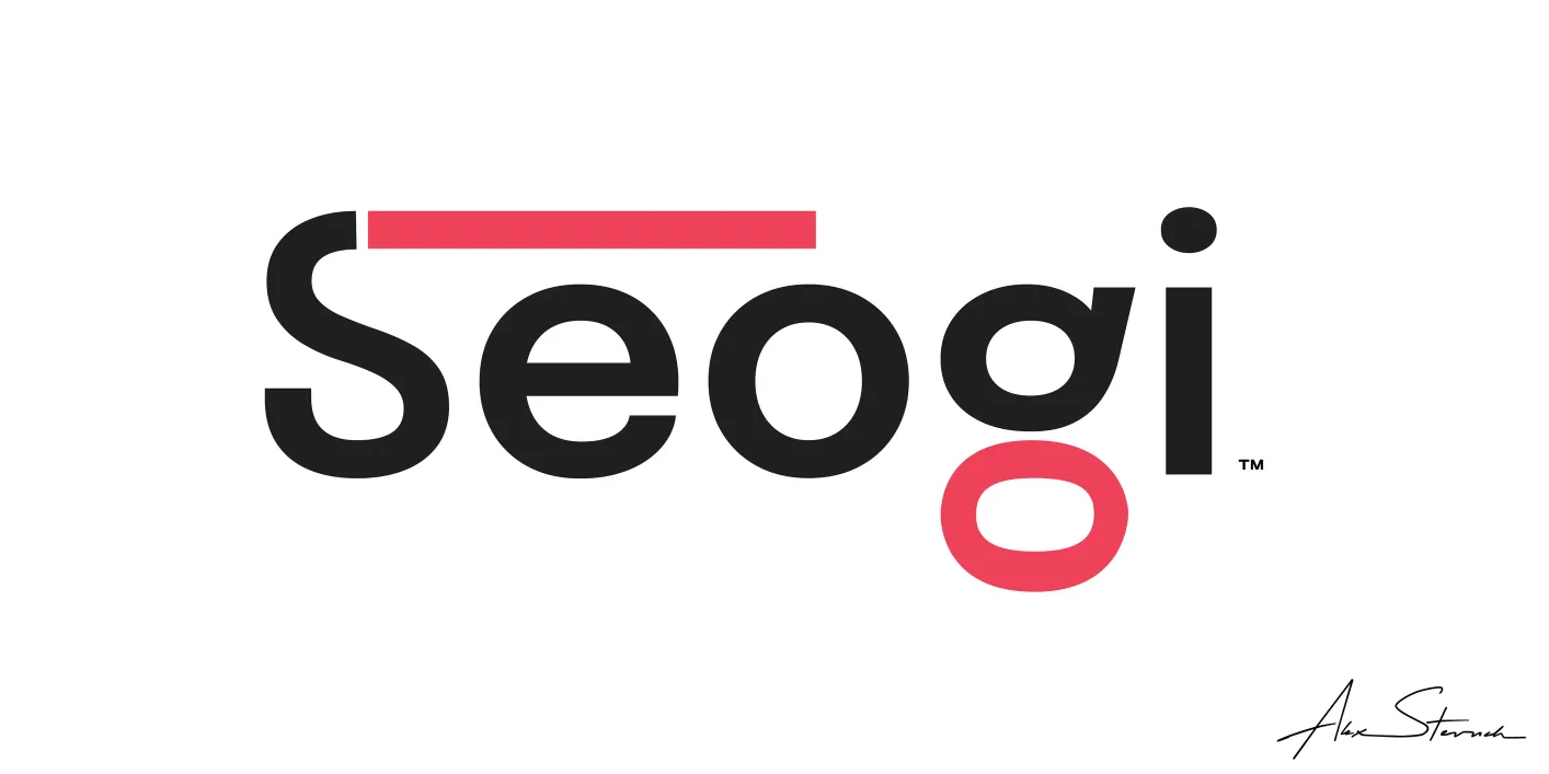
- Seogi Red Wordmark
- Vector illustration
- Original artwork by Alex Stevovich
- © Alex Stevovich
Seogi is set in a rounded lowercase sans serif with a distinctive top bar cutting across the S, filled in an accent color that shifts by context. Red and blue versions were developed alongside black on white and white on dark variants, with the lowercase o in the second syllable carrying the same accent color as a recurring detail.
Illustrated Logo
The primary logo depicts a crowned mask built from assembled graphic parts, a winged crest rising to a flame like peak above a central eye, set over a shield shaped lower face. The emblem sits above the wordmark as the brand's main lockup, rendered in the same flexible color system as the type.
The square logo mark was produced in a range of color combinations, including full color on black, black on white, solid blue, and split color treatments dividing the mask between two tones. These function as flexible alternates rather than a fixed variant system, since the mask itself carries no single defined color language, only the wordmark does.
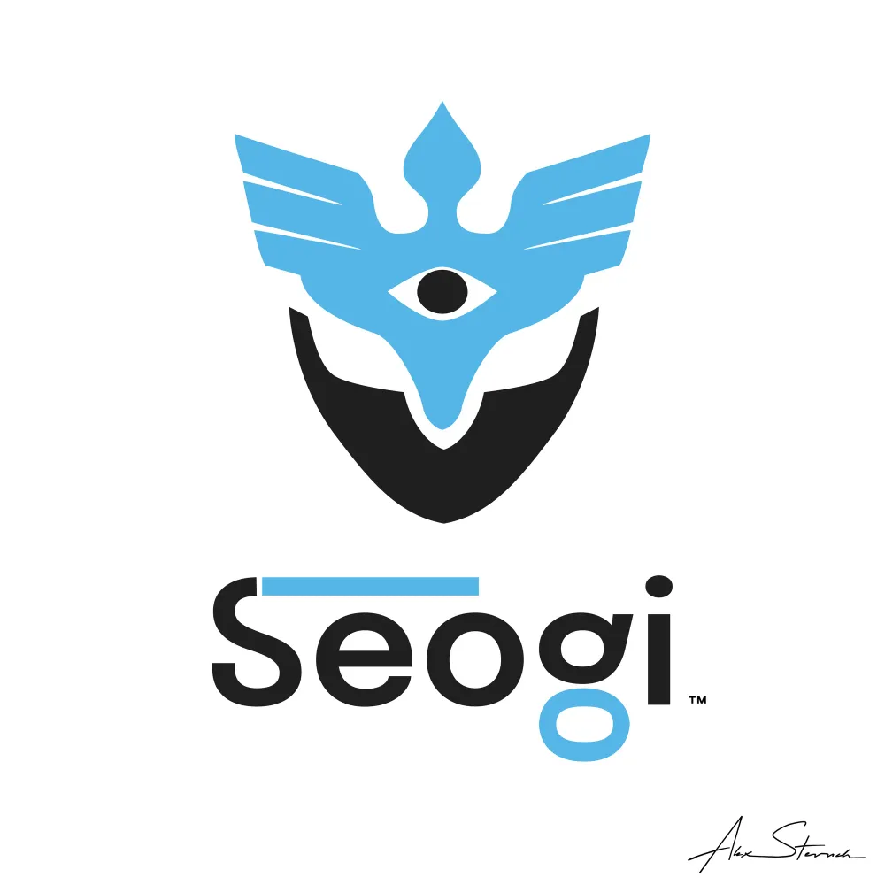
- Seogi Illustrated Square Logo #1
- Vector illustration
- Original artwork by Alex Stevovich
- © Alex Stevovich
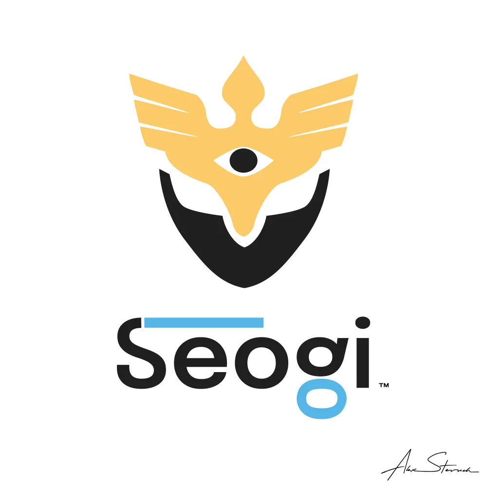
- Seogi Illustrated Square Logo #2
- Vector illustration
- Original artwork by Alex Stevovich
- © Alex Stevovich
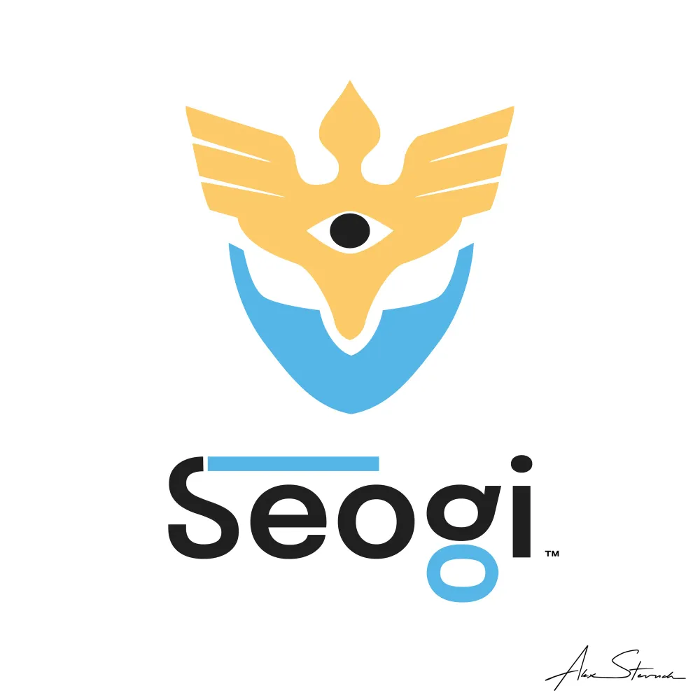
- Seogi Illustrated Square Logo #3
- Vector illustration
- Original artwork by Alex Stevovich
- © Alex Stevovich
Illustrated Crest Logo
A standalone version of the emblem's upper visor was developed as its own mark, isolating the winged crest and central eye without the lower face, for use where a simpler or more compact symbol is needed.
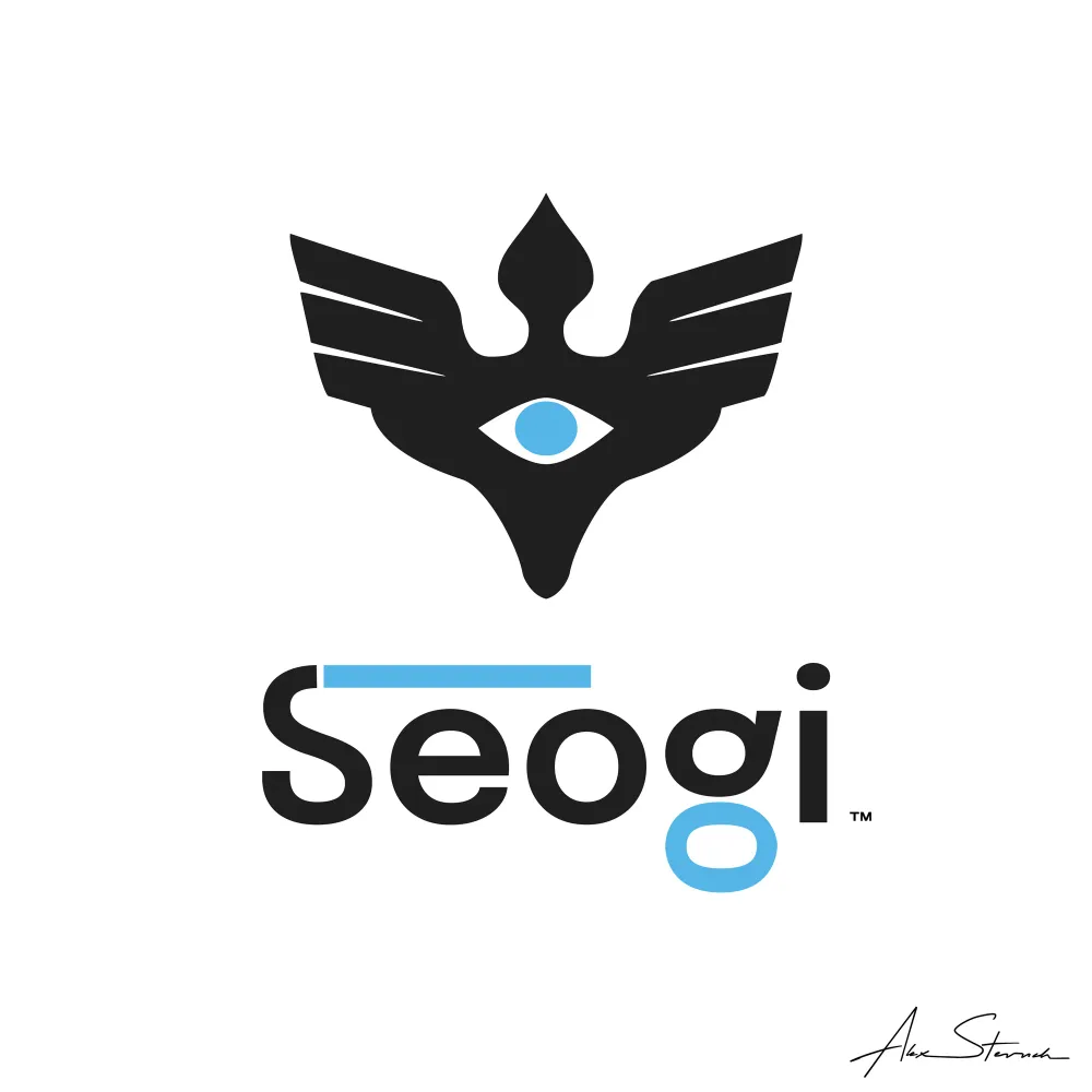
- Seogi Illustrated Square Logo Crest
- Vector illustration
- Original artwork by Alex Stevovich
- © Alex Stevovich
Illustrated Mask
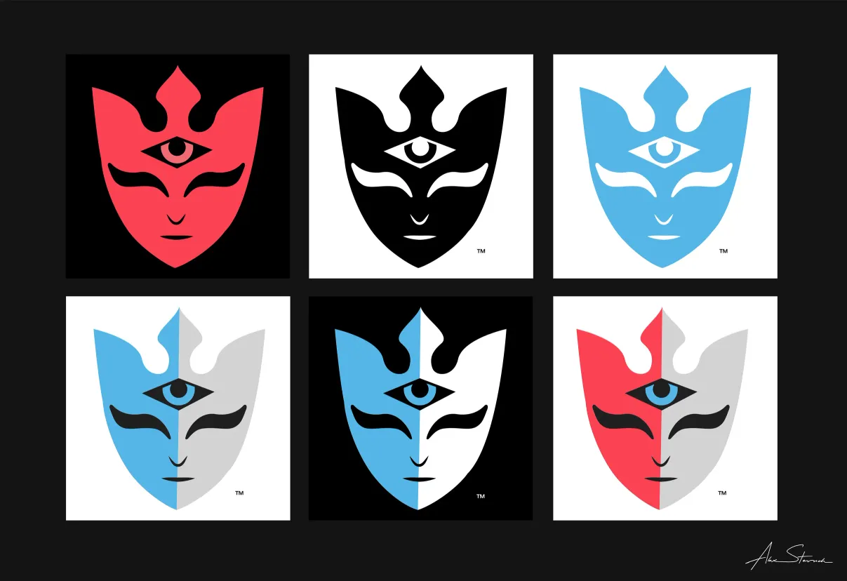
- Illustrated Graphic Mask Examples.
- Vector illustration
- Original artwork by Alex Stevovich
- © Alex Stevovich
Alongside the more abstracted graphic emblem, a fuller illustrated version of the mask was developed as its own branding element, closer in style to a rendered face than a geometric mark. This version carries more detail in the eye, brow, and jaw shaping, and served as the reference the graphic emblem was distilled from. It appears across a grid of color and style treatments, including solid red, solid blue, black on white, white on black, and split two tone versions dividing the face between blue and grey or red and grey. As with the square logo, these function as flexible color alternates rather than a fixed variant system.
Variants
- Seogi Blue Wordmark on Dark Background
- Vector illustration
- Original artwork by Alex Stevovich
- © Alex Stevovich
Dark background versions were developed for both the wordmark and the mask emblem, maintaining legibility and impact against black.
Vector Artwork
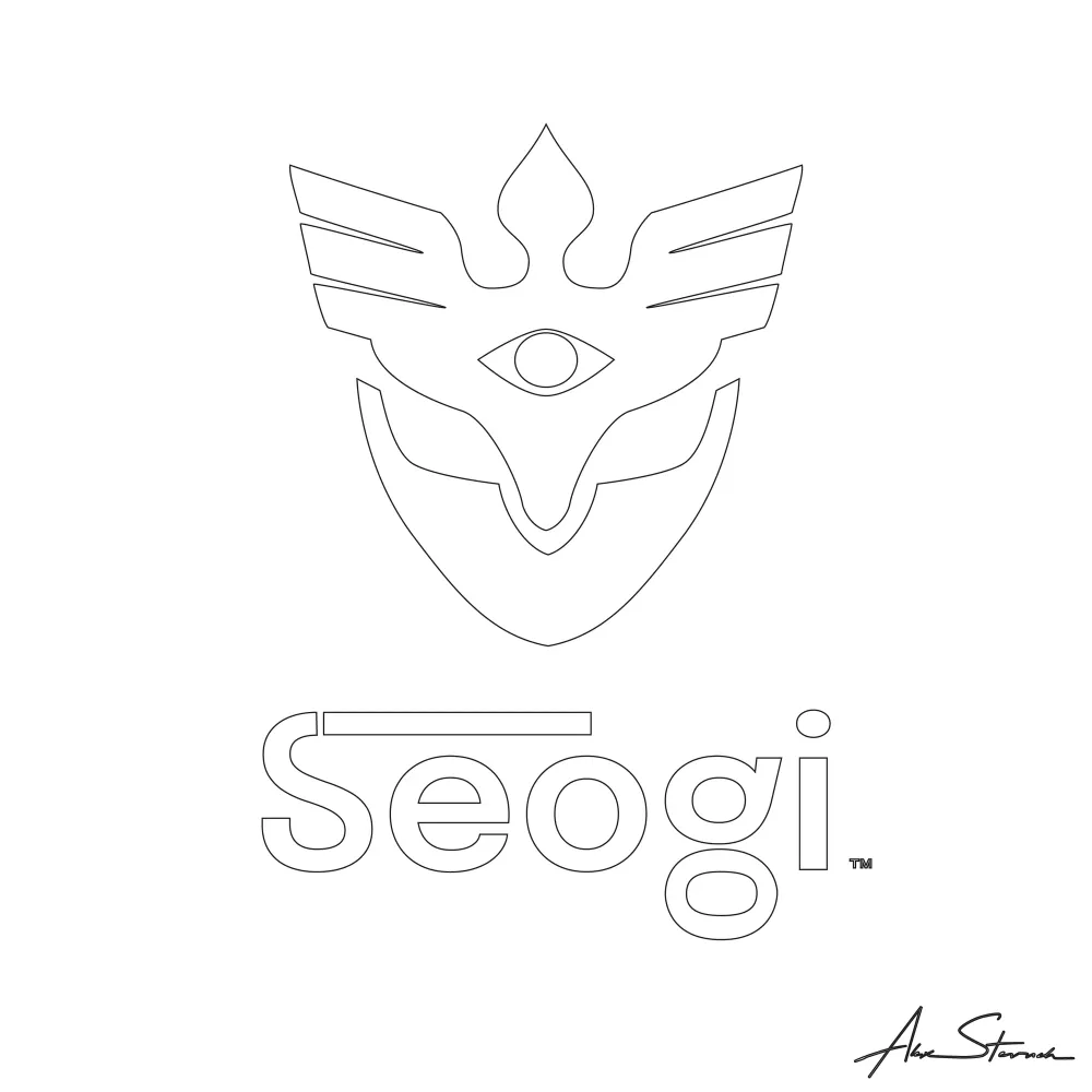
- Demonstration of underlying vector-lines for the Seogi Illustrated Square Logo
- Original artwork by Alex Stevovich
- © Alex Stevovich
All final artwork was produced as digital vector illustrations.