Service Overview
I design exhibition title treatments and wordmarks with a focus on fine-art, museum-level typography. With hundreds of exhibitions completed for prominent museums, galleries, and institutions, I bring a practiced understanding of the quiet authority required in exhibition titling — typography that respects both the artwork and the historical weight surrounding it.
Refined Typographic Presence
Exhibition titles must hold presence without competing with the work they introduce. My approach favors controlled structure, proportion, and restraint — allowing the title to register clearly, confidently, and without theatrical excess.
The goal is a typographic voice that feels inevitable rather than designed.
Institutional Integration
Each title is developed in close consideration of its institutional setting. I study the visual language, legacy, and expectations of the hosting venue, blending that framework with the voice of the artist or exhibition.
This produces title treatments that feel native to their environment — aligned with institutional standards while still giving the exhibition its own identity.
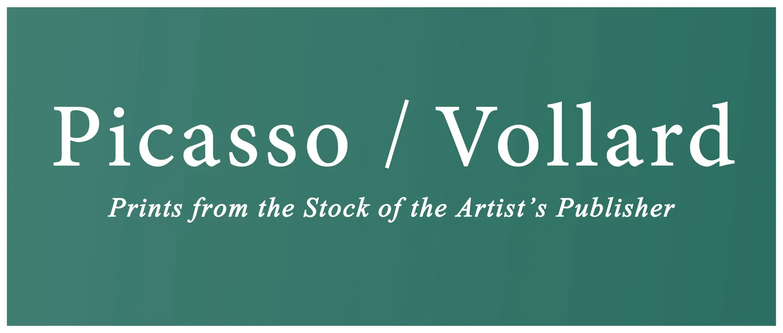
- Wordmark for Picasso / Vollard: Prints from the Stock of the Artist's Publisher exhibition
- Client: Marc Rosen Fine Art
- Visit figure page
Production Awareness
I understand the physical realities of applying typography in exhibition spaces. Titles are designed with materials, finishes, lighting, and scale in mind, whether applied as wall vinyl, dimensional lettering, printed panels, or environmental graphics.
When needed, I coordinate directly with fabricators and print shops to ensure production methods match the typographic intent.
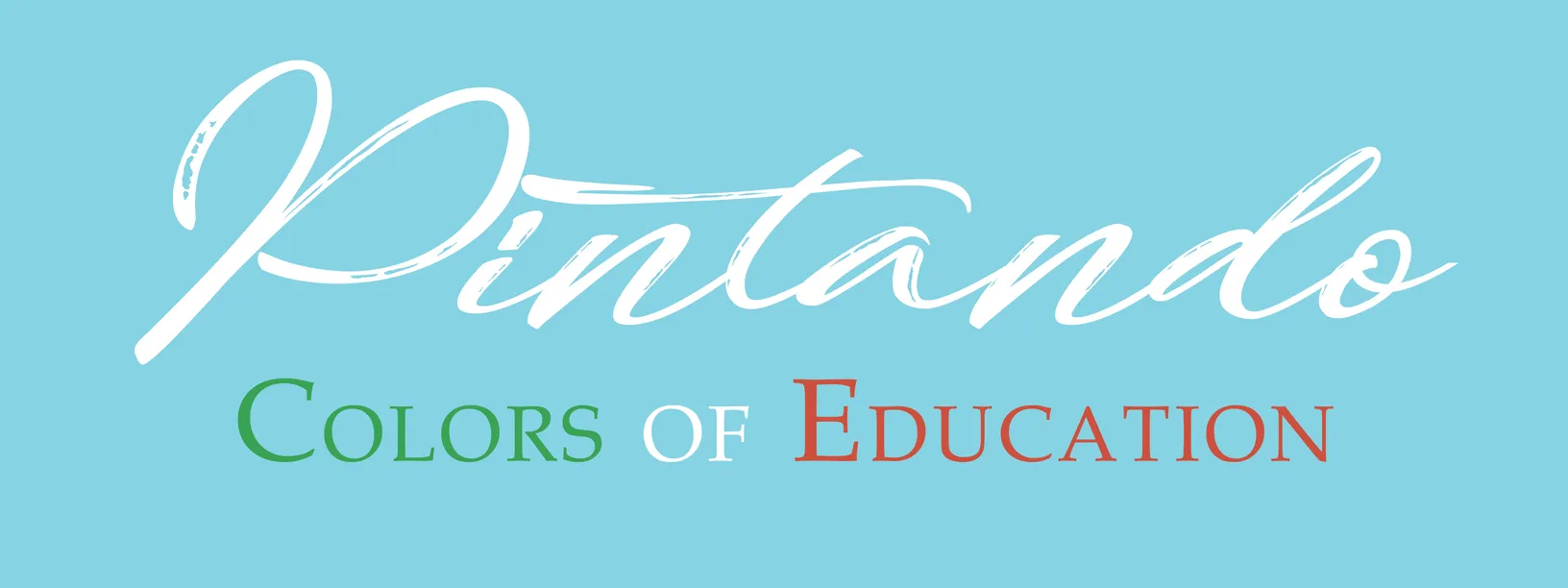
- Wordmark for the Pintando: Colors of Education exhibition
- Client: Lehman College Art Gallery
- Visit figure page
Deliverables
Title designs can be delivered in any required format, including clean vector files, scale-adjusted versions, and context-specific variations for different materials, lighting conditions, and spatial applications.
Each system is prepared to function consistently across exhibition walls, publications, invitations, catalogs, and promotional materials.
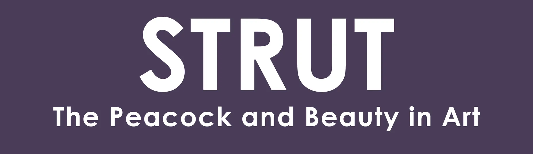
- Wordmark for STRUT: The Peacock and Beauty in Art exhibition
- Client: Hudson River Museum
- Visit figure page