Service Overview
I provide fine-art layout services specializing in the presentation of artwork in print and digital formats. I have completed hundreds of projects for top-tier museums and galleries, working directly with significant artworks and cultural material.
This work carries a particular responsibility: the layout must support the art without competing with it. My role is to shape structure, rhythm, and clarity around the artwork so its meaning, presence, and integrity are preserved.
Designing Around the Artwork
Fine-art layout differs fundamentally from commercial or expressive graphic design. The artwork is the focal point, and every design decision exists to serve it.
I approach each project with an understanding of the artwork’s historical, cultural, and aesthetic context, allowing layout decisions to remain respectful, precise, and appropriate to the material.
Visual Spacing and Proportion
My layouts follow the subtle spacing logic expected in fine-art publishing. Margins, proportions, and rhythm are carefully calibrated so that pages feel balanced, quiet, and museum-true.
Particular attention is paid to the relationship between artwork, captions, and negative space, ensuring that each element has room to breathe without feeling isolated or decorative.
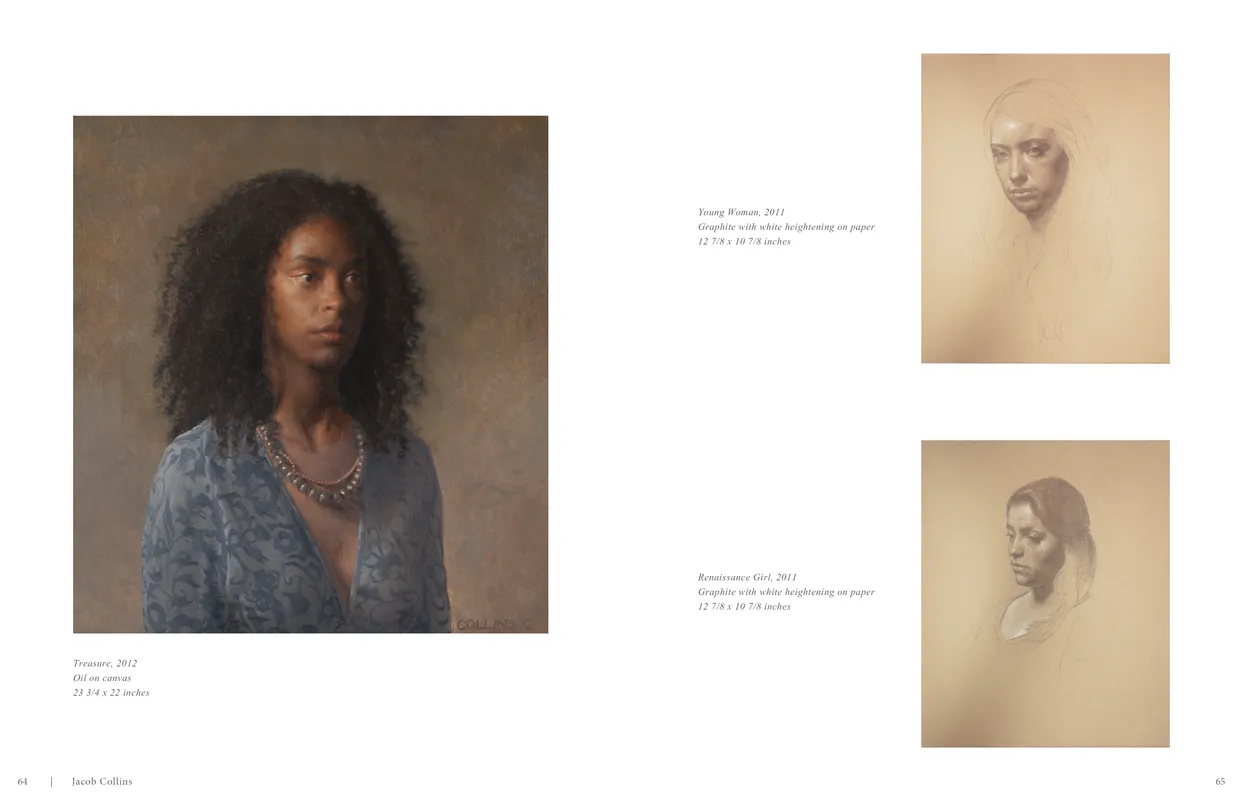
- Jacob Collins (2015) exhibition catalog, pages 64-65
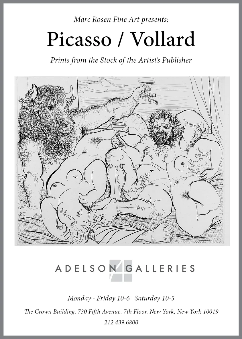
- Client: Adelson Galleries
- Visit figure page
Scholarly Typographic Handling
Fine-art material demands typography that communicates authority without drawing attention to itself. I select, size, and space type to align with the tone of the artwork and its historical or academic context.
Captions, labels, essays, and supporting text are treated as integral components of the layout, supporting scholarship and readability without competing visually with the work.
Artwork Integration and Accuracy
Every artwork is handled with care: consistent scaling, accurate color reproduction, correct sequencing, and thoughtful placement within the narrative structure of the publication or material.
Whether presenting a single work or a multipart plate spread, the goal is always to allow the artwork to carry its full presence without interference or distortion.
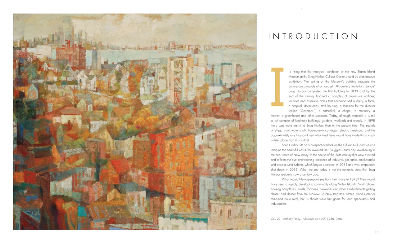
- Staten Island SEEN exhibition catalog, pages 12-13
- Client: Staten Island Museum
- Visit figure page
Applications
I apply fine-art layout principles across a wide range of materials, including exhibition catalogs, scholarly publications, art documentation, video and presentation graphics, invitations, brochures, and institutional materials.
In each case, the same standards apply: clarity, restraint, and respect for the artwork and its audience.
Grounded in Art History
My layout work is supported by a deep understanding of art history, allowing design decisions to align with the significance and meaning of the work being presented.
This scholarly foundation ensures that layouts do not merely look appropriate, but are intellectually and culturally coherent—meeting the expectations of museums, galleries, and academic audiences alike.