


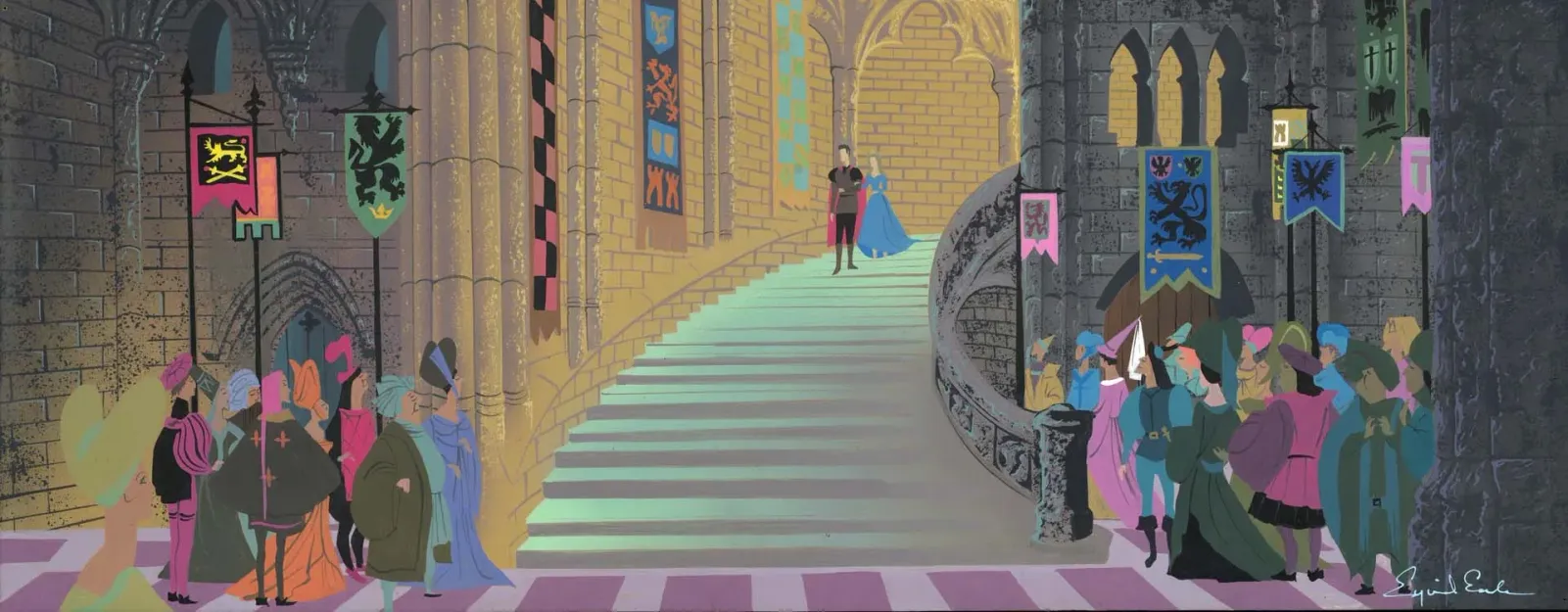
- Sceen capture from Sleeping Beauty (1959)
- Output of cel shade plastic on background art
- Demonstrating the landscape framing and unity of art direction.
- © Rights held by the respective copyright holders
I consider Disney’s output at the mid twentieth century to represent a break through in the commercial arts — proof that 2D, mixed-media production could operate as a legitimate art form, not merely entertainment assets. This was the ambition of Walt Disney, though I didn’t understand that history when I first encountered the work.
At first, the films of this era simply felt right. They were beautiful without announcing why. Like many people, I carried a degree of childhood nostalgia for them, but what kept drawing me back was something else entirely. As my own work in production arts deepened — illustration, environment concept, character design, animation — I kept finding myself returning to this period from different professional angles. Again and again, it held up.
Among all of these works, one stood out above the rest: Sleeping Beauty. A film that redefined Disney’s visual identity for the next fifty years, and whose aesthetic became so foundational that it is still synonymous with the studio today. It is, I would argue, one of the primary reasons Disney is remembered as an artistic institution rather than merely an entertainment brand.
When you begin to study Sleeping Beauty seriously — not as a story, but as a production artifact — a pattern emerges. The composition, the severity of the landscapes, the disciplined use of color and shadow, the way the world itself carries emotion. Follow those qualities far enough, and all paths lead to Eyvind Earle.
This essay is not first and foremost about Earle’s independent paintings. It is about what happens when a master artist operates inside a commercial production system and is briefly allowed to steer it — and what that moment proves about commercial art as a transcendent medium. Earle’s work matters here because it demonstrates that production art, under the right conditions, can be everything.
A Brief Biography
Eyvind Earle’s life reads as the story of a disciplined man shaped early by adversity and relentless practice. I don’t have enough insight to speak meaningfully about him beyond the published material I’ve encountered, and this piece isn’t about his life in a biographical sense—it’s about the impact of his work. Still, some context helps frame how that work came to be:
- He spent parts of his childhood between New York and Hollywood.<--Fact Check
- He survived polio at a young age, which left part of his face paralyzed; his brother did not survive.
- His father encouraged—or required—a daily creative output, either a painting or a poem. Where that line fell between encouragement and demand is difficult to say.
- He developed an early focus on landscape, solitude, and structure, and began his career as a postcard illustrator doing largely on landscapes.
- He later pivoted toward fine-art painting, and before joining Disney his work was already being exhibited and collected, including placement in the Metropolitan Museum of Art, though the specific works are difficult to review at the time of writing due to unavailable archival pages.
- Over his career, he worked across postcards, fine art, watercolor, gouache, printmaking, and eventually large-scale production art.
What matters most to me here is the sense of a man on a mission: deep discipline, sustained focus, and a desire to culminate that effort not merely as a job, but as a lifelong pursuit. It is also significant that Earle arrived at Disney not as a commercial artist for hire, but as a fine artist already in possession of a mature visual language, and already regarded as a noteworthy figure of his time.
The Visual Style of the Mid 20th Century
I’ll briefly note that the mid-twentieth century carries a strong shared visual language, particularly across illustration, animation, and commercial design. There is an unavoidable blur of ownership here — a broad homogenization of stylization that makes certain traits feel as much of the time as of any single artist. Because of this, some elements resist clean attribution, and it becomes difficult to say where an individual voice ends and a cultural moment begins.
That limitation is real, but it isn’t disqualifying. Even within a shared aesthetic, nuance emerges. Artists still make distinct decisions about composition, restraint, emphasis, and tone — decisions that separate mastery from mere participation in a style. I think it’s important to acknowledge the broader visual culture of the era while still allowing space to recognize where individual authorship asserts itself within those boundaries.
Across the commercial arts of this period, a few recognizable currents emerge — not as rigid categories, but as overlapping tendencies that shaped how illustration functioned in print, animation, packaging, and design.
Decorative Modernism

- Sceen capture from Sleeping Beauty (1959)
- Output of cel shade plastic on background art
- Demonstrating the landscape framing and unity of art direction.
- © Rights held by the respective copyright holders
Much of this work can be described as a form of decorative modernism — a softening of earlier modernist severity and a melting of Art Deco’s harder geometry into something more elegant and humane. It favors clarity and rhythm over realism, using simplified forms, deliberate curves, and carefully limited palettes. Ornament isn’t rejected, but disciplined; abstraction is present without becoming cold.
In this mode, color does emotional labor. Contrast is high, palettes are intentional, and shapes are allowed to carry meaning on their own terms. Light and shadow are treated as compositional devices rather than naturalistic effects. The result is work that feels modern without austerity — refined, graphic, and emotionally legible.
A clear example of this approach can be seen in the work of Charley Harper, whose illustrations reduce natural forms to flat, geometric relationships while retaining warmth and wit. He described this as "Minimal Realism".
Whimsy and Narrative Illustration
- Sceen capture from Sleeping Beauty (1959)
- Output of cel shade plastic on background art
- Demonstrating the landscape framing and unity of art direction.
- © Rights held by the respective copyright holders
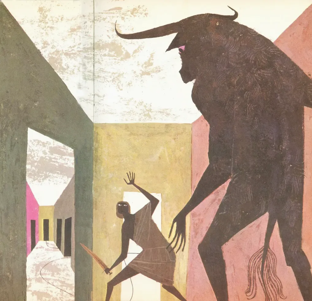
Running alongside this decorative modernism is a more playful, narrative-driven strain — one that leans into whimsy without abandoning structure. Here, illustration often feels tactile, as if assembled from cut paper, patterned fabric, or stamped textures. Shapes overlap and layer rather than recede into perspective, and surfaces are allowed to feel designed rather than rendered.
The work of Alice and Martin Provensen is emblematic of this tendency. Their illustrations balance modern abstraction with warmth, humor, and storytelling. Typography becomes part of the image, pattern is embraced, and composition remains carefully controlled beneath the apparent looseness.
This strain of the style is especially important because it shows how modernist ideas were made accessible and intimate — not monumental, but domestic, readable, and emotionally immediate.
A Commercial Visual Language
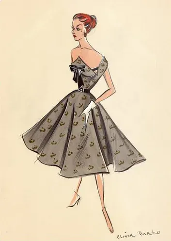
- Elinor Burko, Mid Century Modern Fashion Illustration circa 1950s
- Likely mixed media on paper
- © Rights held by the respective copyright holders
What’s striking is how fully this visual language escaped the boundaries of “art” and entered everyday life. These same principles appear in product packaging, advertising, fashion illustration, and branding. The style reproduced well, read clearly at small scales, and carried an air of elegance that translated naturally into consumer goods — a reason its influence still surfaces today in boutique branding.
This was not accidental. The language endured because it worked — visually, emotionally, and commercially.
Art Deco as Precursor
- Sceen capture from Sleeping Beauty (1959)
- Output of cel shade plastic on background art
- Demonstrating the landscape framing and unity of art direction.
- © Rights held by the respective copyright holders
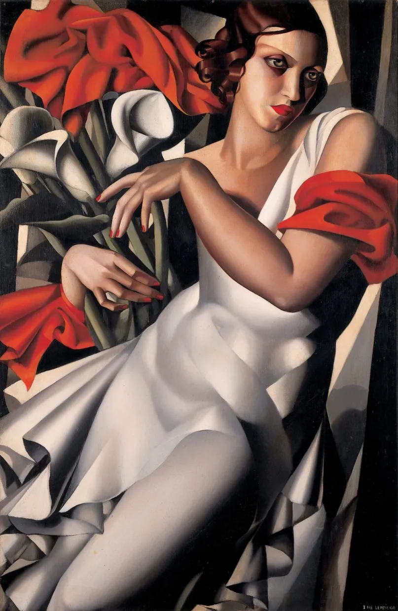
Still uncoined formally the defining visual language of the interwar period was becoming solidifed as a classic but the emerging decorative modernism remains deeply tied to it. What changes is emphasis: ornament becomes pattern rather than structure, geometry softens, symmetry relaxes, and illustration increasingly replaces realism. The theatrical rigidity of Deco gives way to rhythm and flow, setting the stage for the illustration-driven modernism that followed.
Earle within Disney
To understand Earle’s role at Disney, it’s necessary to understand the studio’s ambition at the time. Walt Disney was actively seeking to move animation away from its earlier identity as slapstick entertainment or children’s comedy. He wanted animation to operate on fine-arts principles: composition, restraint, mood, abstraction, and emotional gravity.
This was a deliberate shift. Disney was recruiting painters, illustrators, and designers with fine-arts sensibilities—not simply training animators to draw better. The goal was not decoration, but transcendence.
Earle was hired into this moment. His sensibilities aligned precisely with what the studio was reaching toward.
Walt Disney’s Fine-Arts Ambition
To understand Earle’s role at Disney, it’s necessary to understand the studio’s ambition at the time. Walt Disney was actively seeking to move animation away from its earlier identity as slapstick entertainment or children’s comedy. He wanted animation to operate on fine-arts principles: composition, restraint, mood, abstraction, and emotional gravity.
This was a deliberate shift. Disney was recruiting painters, illustrators, and designers with fine-arts sensibilities—not simply training animators to draw better. The goal was not decoration, but transcendence.
Earle was hired into this moment. His sensibilities aligned precisely with what the studio was reaching toward.
Commercial Arts and Credit
One of the central challenges in discussing commercial art is determining authorship at all. Large productions obscure responsibility by design, and some of the most significant artistic contributions go unnamed or are absorbed into a collective output. Commercial art, historically, has suffered from forsaken credits.
Focusing on Eyvind Earle does not imply that he was solely responsible for the mastery of the works discussed here.
- Sceen capture from Sleeping Beauty (1959)
- Output of cel shade plastic on background art
- Demonstrating the landscape framing and unity of art direction.
- © Rights held by the respective copyright holders
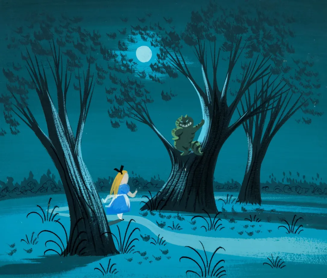
My critical judgment comes from observing correlations. When I study the concept work or fine-art output of directors and production artists, certain signatures become legible. With Mary Blair, for example, I see her color logic, her use of dark shadow, and her framing echoed in the most hauntingly beautiful moments of the films she worked on. That is the evidence available to me.
In discussing production art, I remain conscious that brilliance in it is rarely isolated. Many contributions go unnoticed, unnamed, or are easily misattributed, and some of that may inevitably happen here as well. This is not a dismissal of collaboration, but my belief that commercial art is a serious art form if allowed to be, and Disney of this era was certainly allowing that.
The Art Culture of Disney
Earle’s Disney work represents one portion of his artistic identity. It is dramatic, theatrical, and narrative-driven—his strengths adapted into an existing production culture. His independent work represents the other half: quieter, more reflective, and unconcerned with spectacle.
The difference is not one of quality, but of volume.
At Disney, his landscapes amplify story. Outside Disney, they contemplate existence. In both cases, the same tools are at work: geometry, silhouette, repetition, and restraint. Seeing these bodies of work together clarified something essential for me—his Disney art was not the source of his vision, but a carefully tuned expression of it
Mary Blair
- Eyvind Earle
- Sceen capture from Sleeping Beauty (1959)
- Output of cel shade plastic on background art
- Demonstrating the landscape framing and unity of art direction.
- © Rights held by the respective copyright holders
Lorem ipsum dolor sit amet, consectetur adipiscing elit, sed do eiusmod tempor incididunt ut labore et dolore magna aliqua. Ut enim ad minim veniam, quis nostrud exercitation ullamco laboris nisi ut aliquip ex ea commodo consequat. Duis aute irure dolor in reprehenderit in voluptate velit esse cillum dolore eu fugiat nulla pariatur. Excepteur sint occaecat cupidatat non proident, sunt in culpa qui officia deserunt mollit anim id est laborum.
Disney Generalist
- Eyvind Earle
Described the learning process and what it was like at disney, his style was constantly in flux and this proves his mastery and what i consider the greatest trait of a commercial artist
Lady and the Tramp
- Sceen capture from Sleeping Beauty (1959)
- Output of cel shade plastic on background art
- Demonstrating the landscape framing and unity of art direction.
- © Rights held by the respective copyright holders
Belanote, Post-Spaghetti
- Sceen capture from Sleeping Beauty (1959)
- Output of cel shade plastic on background art
- Demonstrating the landscape framing and unity of art direction.
- © Rights held by the respective copyright holders
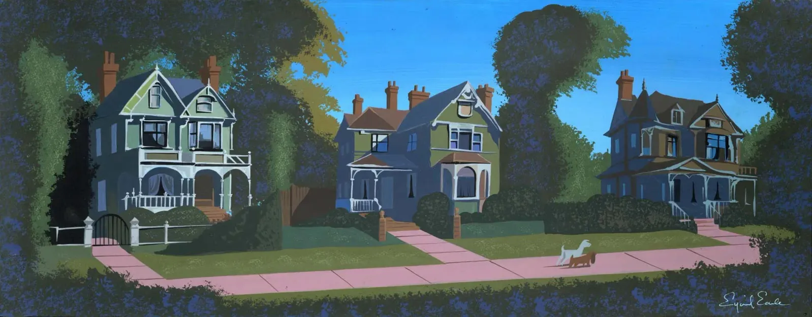
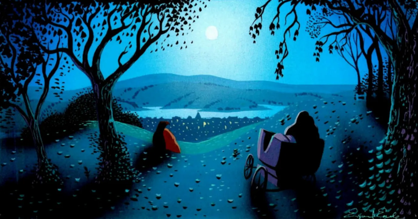
Earle was given oversight over one of the most memorable scenes in the animation Lady and the Tramp (date), the scene which outroed the infamous belanote love scene where the characters share a plate of spaghetti then fall in love in the park. While I can't say if it was, I view this as a sort of trial run of Earle to set the stage for the next grand project to come. He showcased his beauitful backgrounds, and still frames emerge each as art pieces which I feel is an essential criteria to accomplish disney's fine art goal.
Night as Intimacy

- Sceen capture from Sleeping Beauty (1959)
- Output of cel shade plastic on background art
- Demonstrating the landscape framing and unity of art direction.
- @ Disney
Mention that in this era, dark shadows and dim lit scenes were common compared to the more modern bright disney, and Earle was a master of using this space with light and pallette to show intimacy and warmth in the darkness. Earle’s night scenes are not lonely—they are intimate.
Moonlight pools gently. Shadows embrace rather than obscure. Darkness becomes a space of quiet romance and reflection, not fear. In these moments, his landscapes withdraw from melodrama and approach poetry.
This sensibility appears throughout his personal work and quietly informs his most tender Disney sequences. Night, for Earle, is not absence—it is presence without noise.
Sleeping Beauty, a Tour de'Force of vision
Sleeping Beauty stands as Earle’s singular tour de force within Disney.
He was given an unusual degree of authority, and he used it uncompromisingly. Production ran long. Animators were frustrated by the demands placed on them. Redos were frequent. The standard was severe.
Earle left the project before its release, and the final film softened some of his sharpest edges. Still, the tone he established endured. Sleeping Beauty became a defining work—not just for Disney, but for the visual identity of 2D animation for decades to come.
It demonstrated that animation could be transcendent—that it could operate as cultural art, not merely entertainment.
- Floyd Norman
- Disney Legend, animator and storyman
Landscape as the Protagonist

- Sceen capture from Sleeping Beauty (1959)
- Output of cel shade plastic on background art
- Demonstrating the landscape framing and unity of art direction.
- © Rights held by the respective copyright holders
Earle was primarily tasked with background and concept art, yet when given authority, the background ceased to behave like background.
In Sleeping Beauty, the landscape becomes both protagonist and antagonist. The ground rises and fractures. Trees claw and tangle. Cliffs threaten. The sky presses down. Characters move through environments that feel alive—sometimes hostile, sometimes romantic, always present.
This is what happens when a specialist in landscape is allowed to lead a project. The world no longer supports the narrative; it is the narrative.
Even in moments of action—the dragon confrontation, the flight through thorns—the terrain participates emotionally. The land itself strikes, resists, and looms.
- Floyd Norman
- Disney Legend, animator and storyman
Geometry Is Emotion
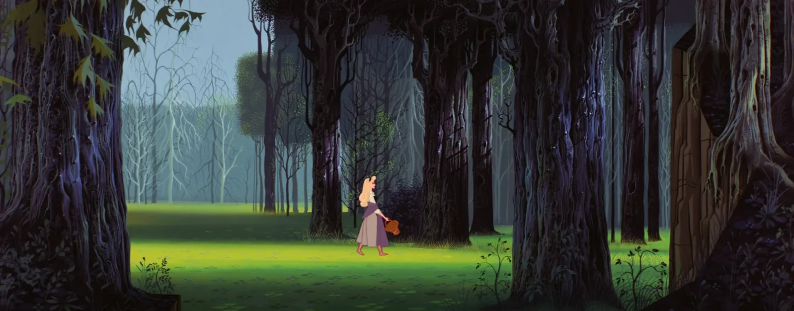
- Sceen capture from Sleeping Beauty (1959)
- Output of cel shade plastic on background art
- Demonstrating the landscape framing and unity of art direction.
- © Rights held by the respective copyright holders
One of Earle’s most radical contributions to Disney’s visual language was his use of geometry as an emotional instrument.
Sharp angles are not merely stylistic—they are oppressive. Long, rigid verticals feel authoritarian. Massive planar forms dwarf human figures, instilling awe or vulnerability. His geometry does emotional labor.
This approach distinguished him from earlier Disney artists. Where previous backgrounds softened space, Earle structured it. Where others framed action, he constrained it. It is easy to see why Walt Disney was enamored with this severity—it introduced a layer of visual intelligence that aligned with his fine-arts ambitions.
This era of Disney allowed darkness. Scenes were grounded in deep shadows. Bright colors were permitted, but always anchored by heavy darks and long casting silhouettes. Earle’s landscapes thrived under those conditions.
Storybook Diorama: An illusion of materials
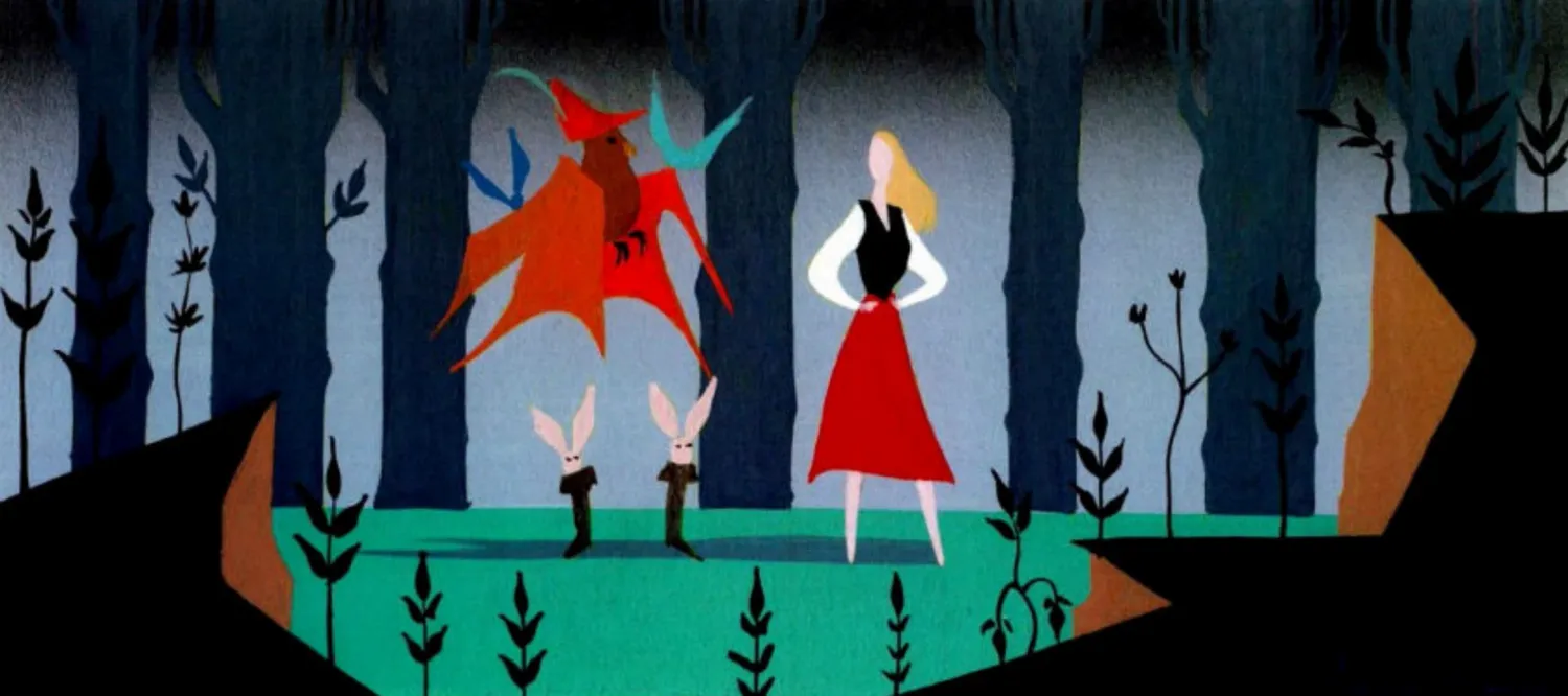
- Sceen capture from Sleeping Beauty (1959)
- Output of cel shade plastic on background art
- Demonstrating the landscape framing and unity of art direction.
- © Rights held by the respective copyright holders
Earle’s work often feels tactile, despite its flatness. Patterns repeat like stamps. Foliage clusters rhythmically. Stones feel gritty while other elements suggest paper collage or lace.
These are illusions, carefully constructed. His paintings and serigraphs borrow from printmaking logic, folk illustration, and storybook aesthetics without becoming ornamental. Texture is not decoration—it reinforces structure.
This quality links his film work seamlessly to his independent art. Whether on screen or on paper, his worlds feel composed rather than painted.
After Disney
After leaving Walt Disney Studios, Earle remained actively engaged in animation, working across television, commercial, and independent projects. This period reflects continuity rather than departure, with Earle applying the same compositional discipline developed at Disney across a broader range of formats.
- Sceen capture from Sleeping Beauty (1959)
- Output of cel shade plastic on background art
- Demonstrating the landscape framing and unity of art direction.
- © Rights held by the respective copyright holders
Return to Painting
After roughly fifteen years in animation and commercial production, Earle returned to painting full time, bringing with him the compositional rigor and abstraction refined through production work.
- Eyvind Earle

- Sceen capture from Sleeping Beauty (1959)
- Output of cel shade plastic on background art
- Demonstrating the landscape framing and unity of art direction.
- © Rights held by the respective copyright holders
Holistic Modes
Earle’s oeuvre appears to operate in three primary modes.
The first is a modern, highly abstracted approach to landscape—clean, primal, and rhythmically composed. This mode underpins much of his fine-art and serigraph work.
The second mode reflects a clear absorption into, and symbiosis with, Disney’s visual culture—a more illustrative and explicitly commercial mode of his practice. Here, Earle demonstrates a flexible command of production art, where narrative, audience legibility, and visual language introduce additional layers of constraint.
The third mode emerges most clearly in his religious work, drawing heavily from medieval and Renaissance traditions. These works reveal a sustained engagement with historical visual languages.
It is within Sleeping Beauty that these modes converge most unexpectedly. Unlike Earle’s earlier Disney work, the film’s visual direction aligns more closely with his religious art. Whether driven by the Gothic nature of the setting or by Earle’s own ambitions, the result stands apart—both within Disney’s canon and within his own career.
To speak on medium: with Earle, it seems almost inconsequential. If the underlying form and design are his, the work retains its charm and speaks his visual language—even in derivatives, such as metal commemorative pieces or postcard variations sold by the Met. His compositions function in a near-Platonic way: the underlying form carry the work regardless of the particular instance through which it is realized.
Insights into Visual Arts
Having traced Eyvind Earle’s career in broad strokes, the focus now shifts away from history and toward the work itself. I am primarily drawn to his production art, and Earle is highly unusual in this regard. Few artists with strong fine-art credentials were entrusted with sustained visual oversight within a major production. The impact he had on both the work and the institution remains deeply influential to me.
Research limitations are also present, as documentation for much of his work—particularly early pieces—is limited or inaccessible.
What follows is my study of Earle’s visual grammar and approach.
International Gothic
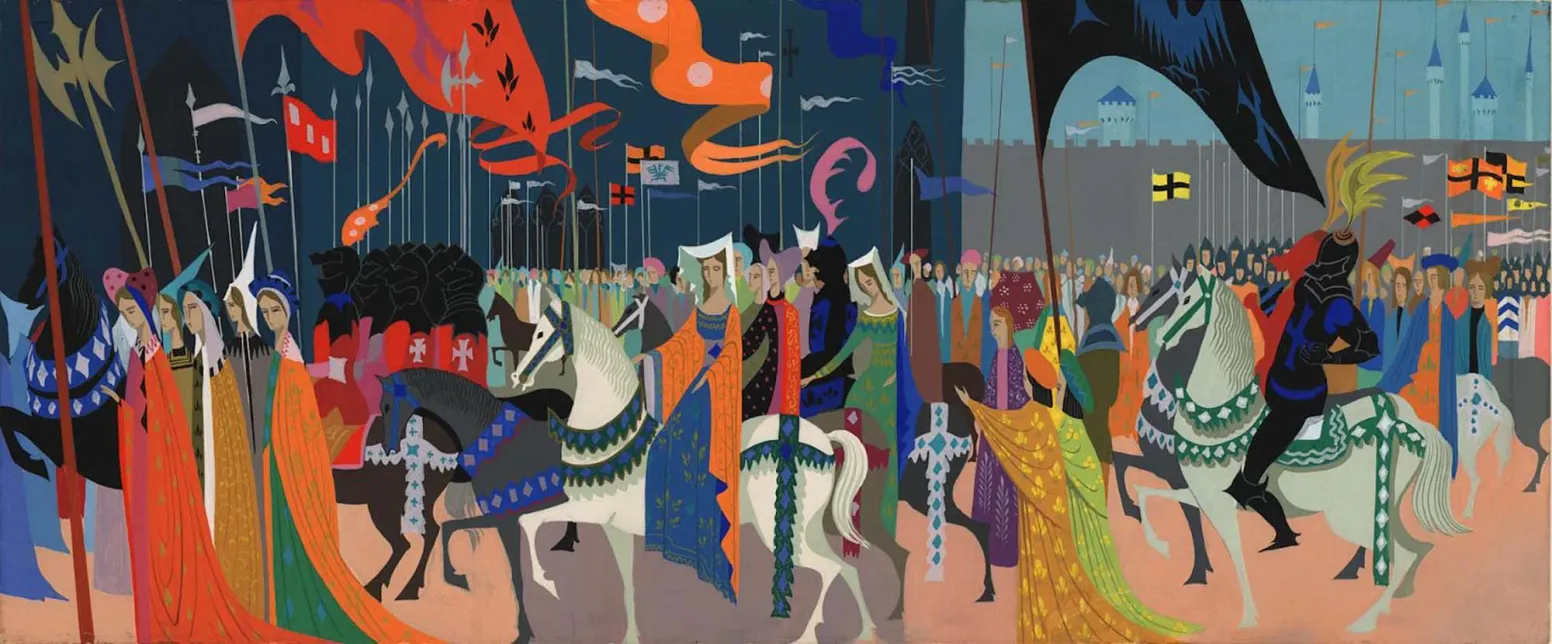
Procession
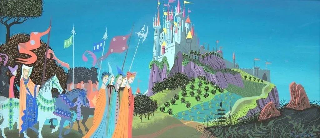
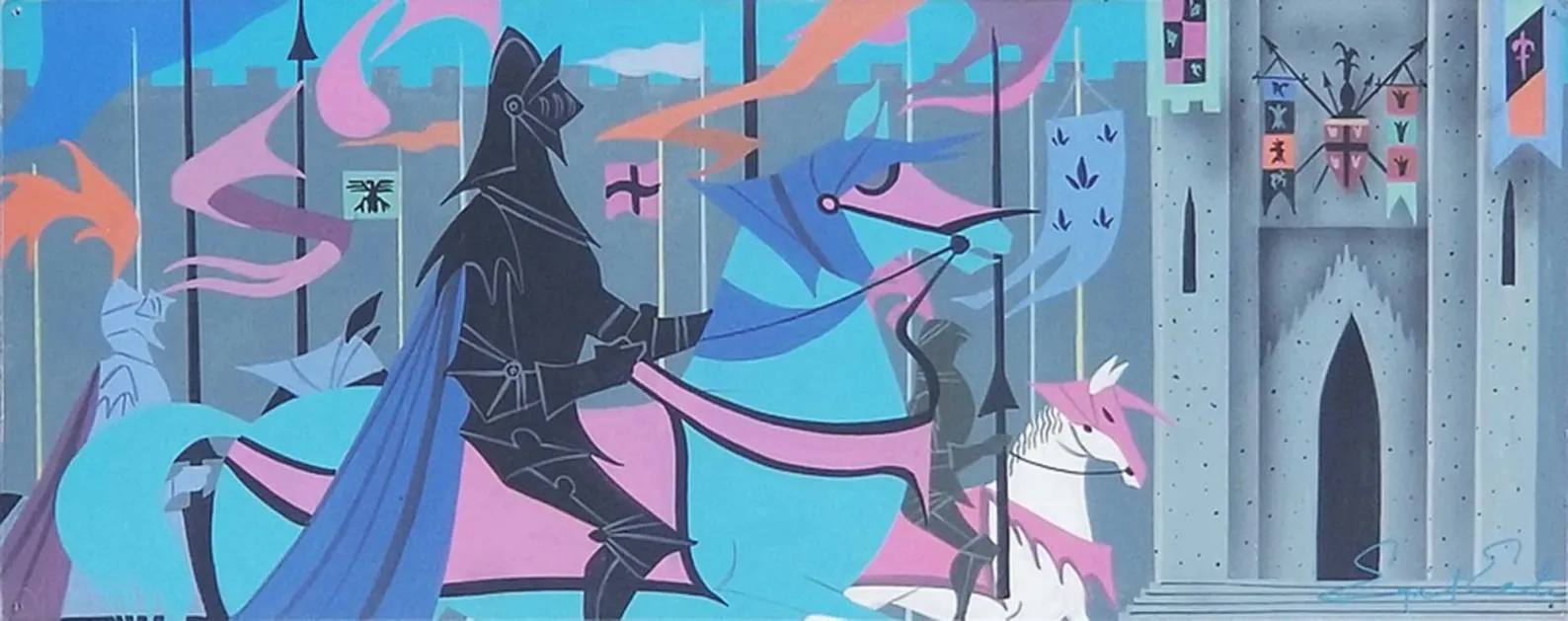
- Eyvind Earle, Concept art for Disney's Sleeping Beauty<>y (1959), 1958
- Gouache-on-board
- The procession on the left highlights an International Gothic influence Earle's direction when approaching subject matter around the castle.
- © Rights held by the respective copyright holders
Eyvind Earle’s processional scene before the castle from Sleeping Beauty presents the medieval court not as a dynamic narrative space, but as a ceremonial arrangement of color, pattern, and rhythm. Figures advance laterally in a controlled procession, their elongated bodies and flowing garments functioning as repeating visual units rather than individualized actors. Horses, banners, and robes are simplified into flat ornamental shapes, while the castle rises as a patterned backdrop rather than a believable structure. Motion is implied but restrained, subordinated to visual order. The result is an image that feels less like a moment unfolding in time and more like a designed surface, where hierarchy and meaning are communicated through repetition, silhouette, and color harmony.
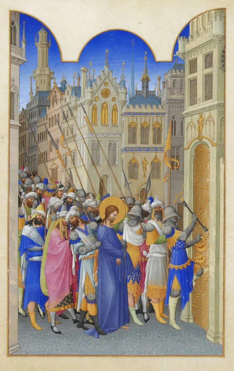
- Très Riches Heures du Duc de Berry
- Folio 143 recto, "Christ Led to the Praetorium"
- By the Limbourg brothers (Paul, Jean, and Herman), c. 1412–1416
- Illumination on vellum, housed at the Musée Condé, Chantilly
- Included to showcase the influence of International Gothic on Earle's work
This visual logic was not unique to a single work or artist in the medieval period, but part of a widely shared visual language spanning manuscripts, panel paintings, and tapestries. Among countless possible parallels, the Très Riches Heures du Duc de Berry offers a particularly clear point of comparison, and is selected here not as a definitive source but as a representative example. In miniatures such as Christ Led to the Praetorium (folio 143r), figures compress into a shallow plane and move in rhythmic procession across the page, framed by architecture that functions more as ornament than as spatial environment. Bright, saturated colors, flattened forms, and a carefully controlled sense of motion echo the same visual priorities seen in Earle’s scene. The similarity lies not in subject matter, but in a shared approach to designing movement and form as pattern, where narrative clarity is achieved through visual structure rather than realism.
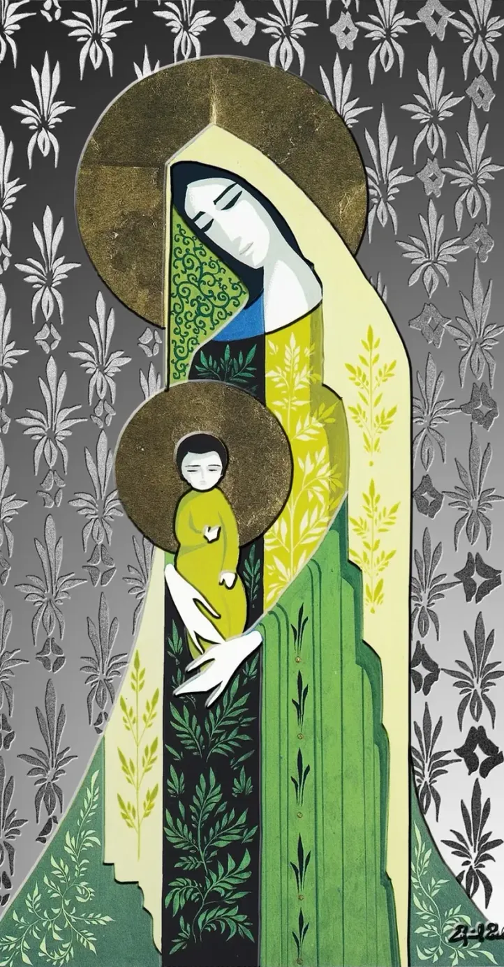
- Eyvind Earle, Concept art for Disney's Sleeping Beauty<>y (1959), 1958
- Gouache-on-board
- The procession on the left highlights an International Gothic influence Earle's direction when approaching subject matter around the castle.
- © Rights held by the respective copyright holders
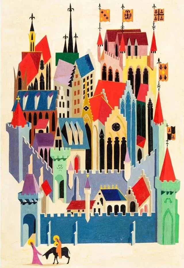
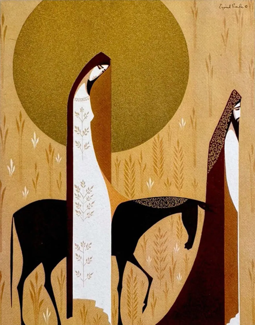
A different facet of Earle’s engagement with this visual lineage appears in his Madonna and Child composition, later realized as a commemorative, estate-authorized coin. While this particular object was produced after Earle’s lifetime and based on an original work that I have been unable to locate, the composition itself was personally striking enough to warrant inclusion. Detached from its religious subject, the image is compelling for the way Earle reduces figures to architectural silhouettes, organizing the scene through vertical rhythm, internal patterning, and calm, contained geometry.
I can’t help but note that I was struck by this coin piece itself. I was surprised by how effectively the metal medium is brought to life through Earle's elegant shapes and delicate patterns. The use of metal—intentionally or not—recalls the gilded techniques that define much of the medieval art referenced throughout this discussion.
Medieval Perspective
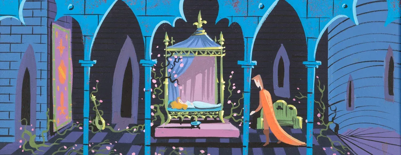
- Eyvind Earle, Concept art for Disney's Sleeping Beauty<>y (1959), 1958
- Gouache-on-board
- The procession on the left highlights an International Gothic influence Earle's direction when approaching subject matter around the castle.
- © Rights held by the respective copyright holders
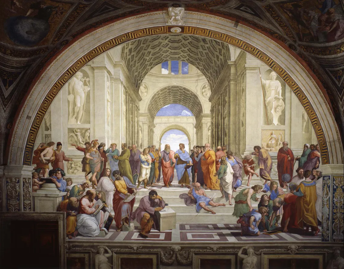
The chamber scene from Sleeping Beauty draws heavily from medieval spatial logic rather than Renaissance naturalism. Space is organized architecturally and symbolically, not optically. Depth is suggested through layered arches and receding planes, but the scene resists realistic perspective in favor of clarity, rhythm, and compositional order. Figures are subordinated to structure, and the architecture functions as the primary organizing force of the image.
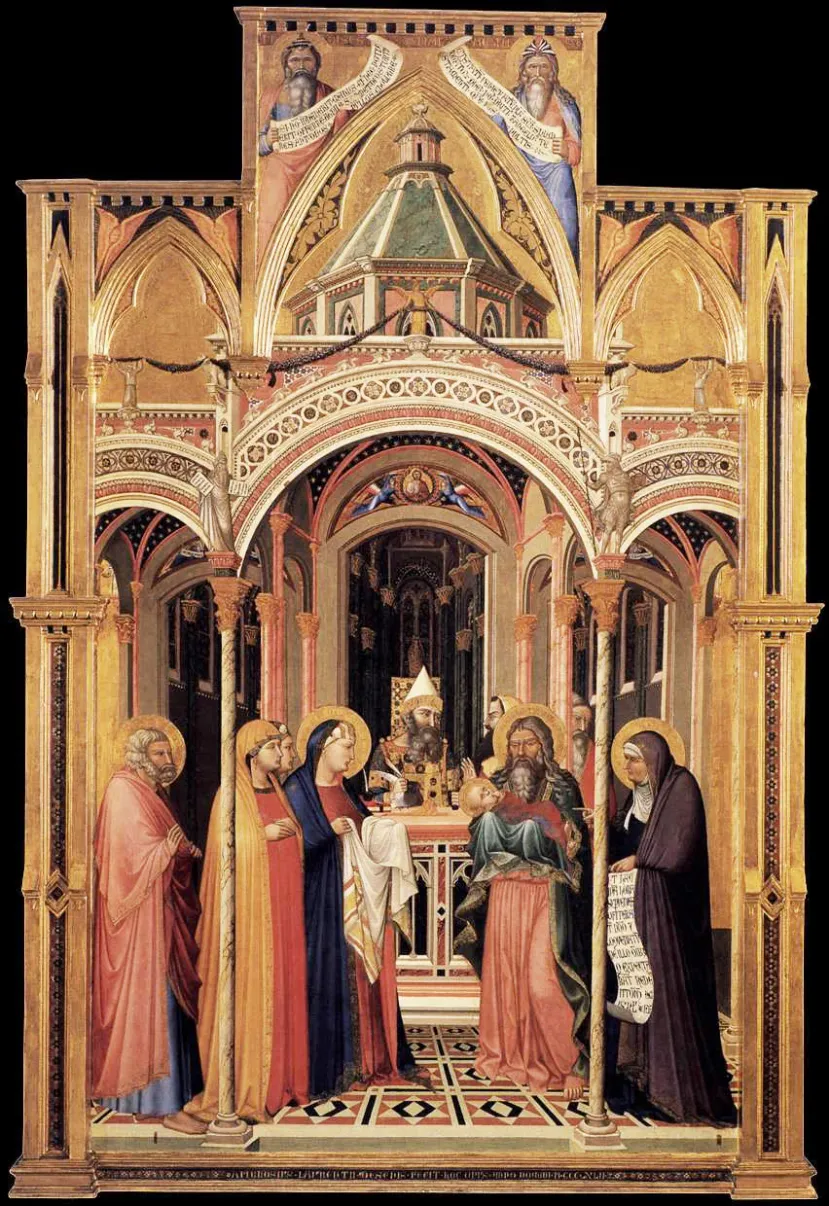
- Eyvind Earle, Concept art for Disney's Sleeping Beauty<>y (1959), 1958
- Gouache-on-board
- The procession on the left highlights an International Gothic influence Earle's direction when approaching subject matter around the castle.
- © Rights held by the respective copyright holders
This approach closely parallels traditions found in International Gothic and late medieval panel painting, where architecture frames narrative action rather than receding invisibly behind it. In works such as **Ambrogio Lorenzetti’s Presentation in the Temple, architectural elements establish hierarchy, symmetry, and ceremonial focus. The figures exist within a constructed spatial schema that prioritizes meaning and order over naturalistic depth.
In both images, arches act as visual divisions, guiding the viewer’s eye laterally across the composition while reinforcing a sense of ritual and containment. The space feels deliberate and enclosed, designed to support narrative gravity rather than movement. This shared reliance on planar construction, frontal staging, and architectural rhythm underscores how Earle’s production work draws not from illusionistic realism, but from older visual systems where composition serves structure first and atmosphere second.
The Gothic Portal
- Eyvind Earle, Concept art for Disney's Sleeping Beauty<>y (1959), 1958
- Gouache-on-board
- The procession on the left highlights an International Gothic influence Earle's direction when approaching subject matter around the castle.
- © Rights held by the respective copyright holders
Lorem ipsum dolor sit amet, consectetur adipiscing elit, sed do eiusmod tempor incididunt ut labore et dolore magna aliqua. Ut enim ad minim veniam, quis nostrud exercitation ullamco laboris nisi ut aliquip ex ea commodo consequat. Duis aute irure dolor in reprehenderit in voluptate velit esse cillum dolore eu fugiat nulla pariatur. Excepteur sint occaecat cupidatat non proident, sunt in culpa qui officia deserunt mollit anim id est laborum.
Architecture
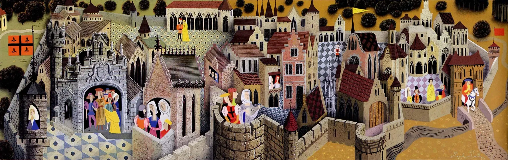
- Eyvind Earle, Concept art for Disney's Sleeping Beauty<>y (1959), 1958
- Gouache-on-board
- The procession on the left highlights an International Gothic influence Earle's direction when approaching subject matter around the castle.
- © Rights held by the respective copyright holders
Lorem ipsum dolor sit amet, consectetur adipiscing elit, sed do eiusmod tempor incididunt ut labore et dolore magna aliqua. Ut enim ad minim veniam, quis nostrud exercitation ullamco laboris nisi ut aliquip ex ea commodo consequat. Duis aute irure dolor in reprehenderit in voluptate velit esse cillum dolore eu fugiat nulla pariatur. Excepteur sint occaecat cupidatat non proident, sunt in culpa qui officia deserunt mollit anim id est laborum.
Color
- Sceen capture from Sleeping Beauty (1959)
- Output of cel shade plastic on background art
- Demonstrating the landscape framing and unity of art direction.
- © Rights held by the respective copyright holders
Lorem ipsum dolor sit amet, consectetur adipiscing elit, sed do eiusmod tempor incididunt ut labore et dolore magna aliqua. Ut enim ad minim veniam, quis nostrud exercitation ullamco laboris nisi ut aliquip ex ea commodo consequat. Duis aute irure dolor in reprehenderit in voluptate velit esse cillum dolore eu fugiat nulla pariatur. Excepteur sint occaecat cupidatat non proident, sunt in culpa qui officia deserunt mollit anim id est laborum.
- Sceen capture from Sleeping Beauty (1959)
- Output of cel shade plastic on background art
- Demonstrating the landscape framing and unity of art direction.
- © Rights held by the respective copyright holders
Limited Palettes
Quiet Tones
Playful & Bold
Electric Highlights
Black
- Sceen capture from Sleeping Beauty (1959)
- Output of cel shade plastic on background art
- Demonstrating the landscape framing and unity of art direction.
- © Rights held by the respective copyright holders
Lorem ipsum dolor sit amet, consectetur adipiscing elit, sed do eiusmod tempor incididunt ut labore et dolore magna aliqua. Ut enim ad minim veniam, quis nostrud exercitation ullamco laboris nisi ut aliquip ex ea commodo consequat. Duis aute irure dolor in reprehenderit in voluptate velit esse cillum dolore eu fugiat nulla pariatur. Excepteur sint occaecat cupidatat non proident, sunt in culpa qui officia deserunt mollit anim id est laborum.
Light
Light Temperature & Flood
- Eyvind Earle, Concept art for Disney's Sleeping Beauty<>y (1959), 1958
- Gouache-on-board
- The procession on the left highlights an International Gothic influence Earle's direction when approaching subject matter around the castle.
- © Rights held by the respective copyright holders
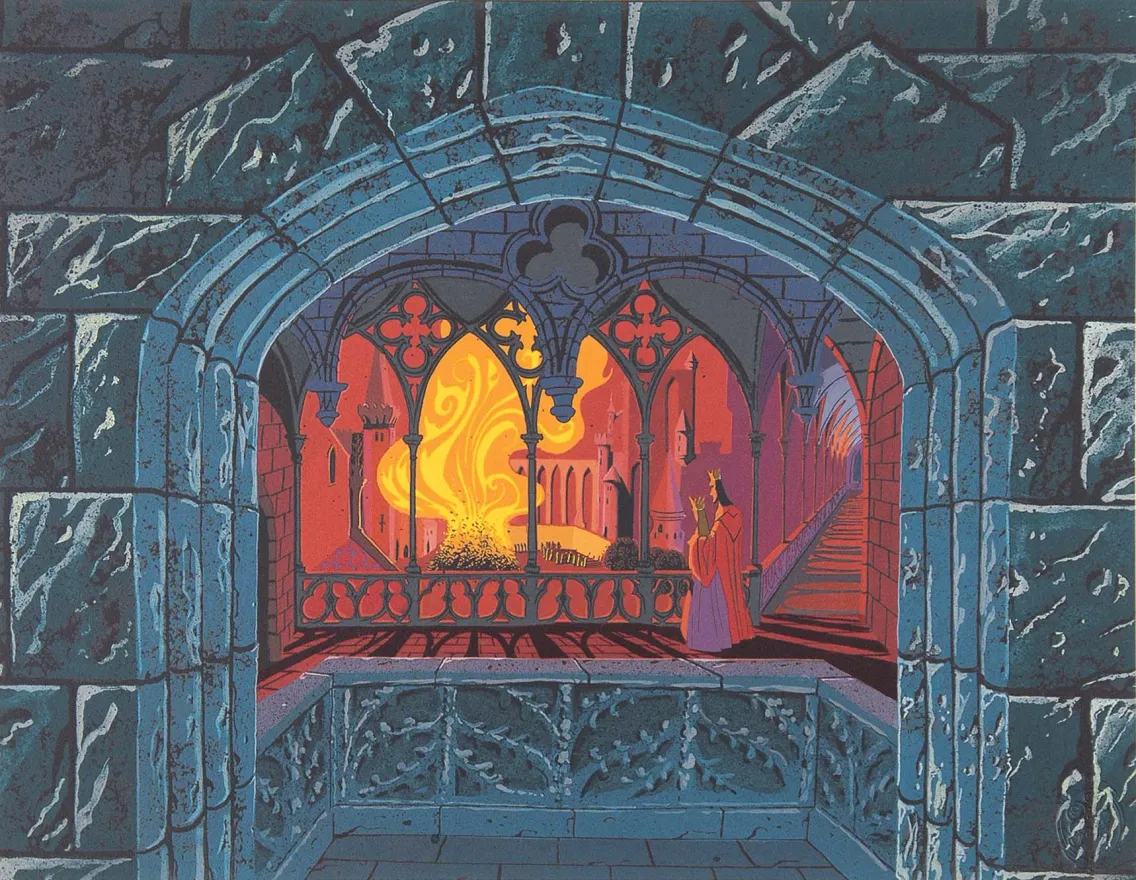
One of the most striking memories many viewers carry from Sleeping Beauty is the way entire rooms seem to be flooded in warmth or cold—spaces glowing from within while surrounded by night, stone, or shadow. This effect is not incidental. As seen in Earle’s concept studies, it is a deliberate and foundational feature of his approach to light.
In the image above, the interior chamber is saturated with warm reds and oranges, while the surrounding stone architecture is rendered in deep, cool blues. This contrast does more than create visual appeal; it communicates the emotional temperature of the space. The chamber feels inhabited, alive, and heated, not because individual light sources are described in detail, but because the entire volume of the room is treated as warm light.
An additional and crucial element here is shadow. Long, directional shadows stretch across the floor and architecture, radiating outward from the fire. These shadows give the warmth physical force—they suggest heat radiating through space.
Earle carefully organizes the scene into distinct tonal regions: the cold blue of the stone, the muted purple transitions between interior and exterior, the dominant red flood filling the chamber, and the intense yellow-orange core of the fire itself. Each temperature marks a different zone of heat and emotional intensity. The red fills the geometric interior almost completely, while the Gothic structures—arches, columns, and stairways—are handled in cooler tones that rise upward, reinforcing depth, structure, and enclosure.
Particularly striking is the treatment of the arches along the staircase, which remain cool and restrained even as they pass through warmer space. The subtle pink hue near the banister acts as a gentle intermediary between temperatures, preventing the composition from collapsing into a single dominant tone. As a final note, the stylized fire itself—ornamental, graphic, and alive with motion—stands as a reminder that even the most expressive elements remain carefully designed rather than chaotic.
Here, light temperature, flood, and shadow work together to shape drama. The result is a space that feels both theatrical and architectural—heated, enclosed, and emotionally charged—demonstrating how Earle uses light not simply to illuminate environments, but to define their meaning.
Drama of Light
- Eyvind Earle, Concept art for Disney's Sleeping Beauty<>y (1959), 1958
- Gouache-on-board
- The procession on the left highlights an International Gothic influence Earle's direction when approaching subject matter around the castle.
- © Rights held by the respective copyright holders
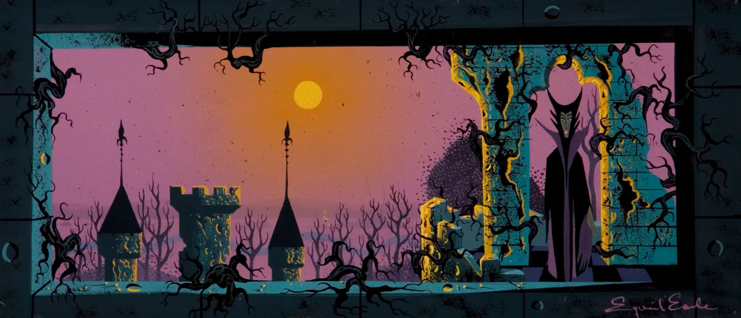
Rim lighting emerges as a distinctive feature of illustration in the mid-twentieth century, and would go on to become a staple of modern stylized work—eventually nearing an essential role in delivering clear, dramatic visual language. At its core, rim lighting is light catching along the edges of surfaces, creating halos that define form through silhouette rather than fill.
This technique develops as part of a broader visual language forming during the period. Earle was not its inventor, but he clearly embraced it, contributed to its refinement, and demonstrated how powerfully it could be wielded in service of drama.
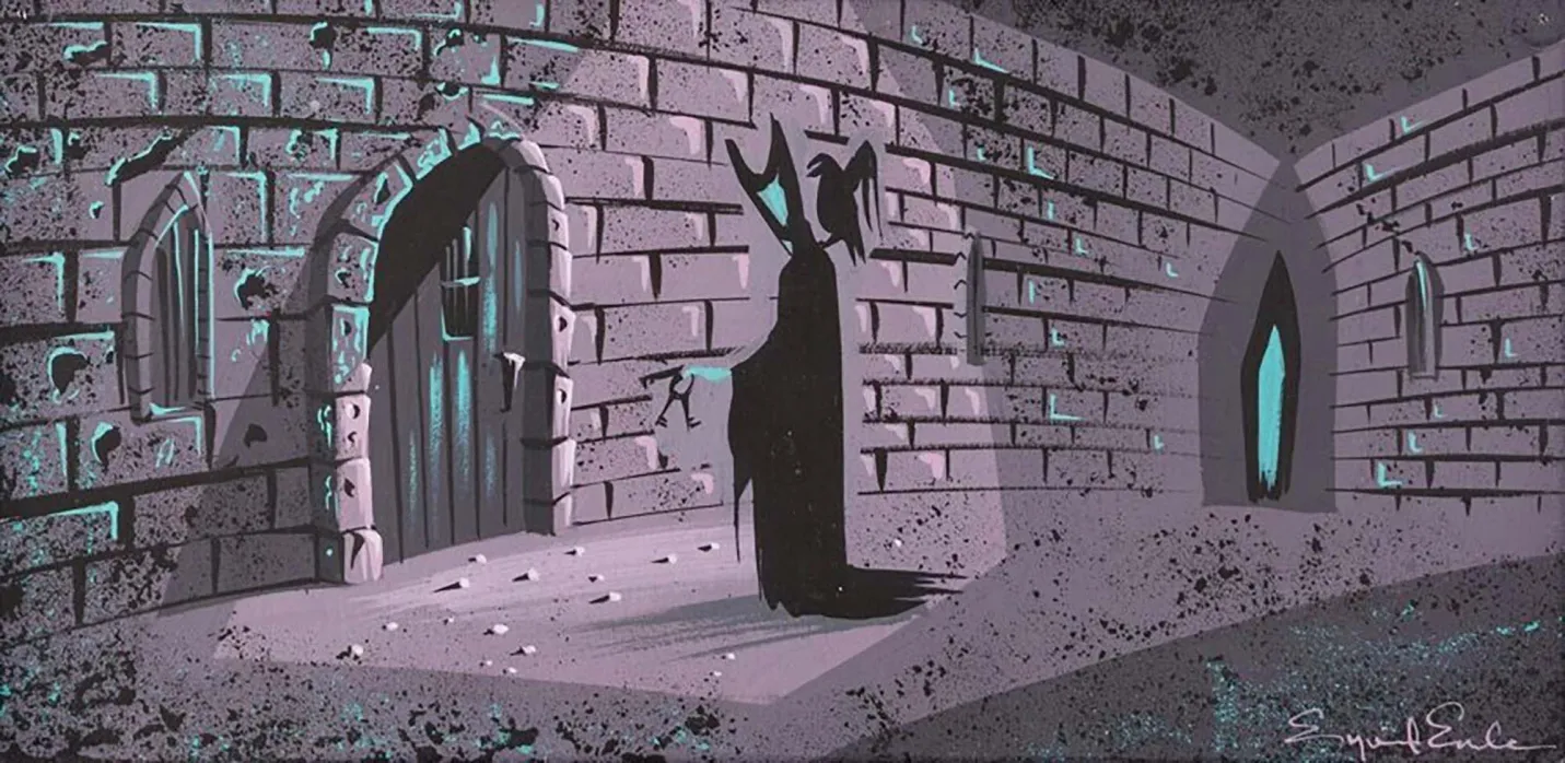
In the Maleficent concept art above, sunlight grazes the edges of stone, catching corners, bevels, and irregularities—allowing otherwise flat shapes to read as dimensional, angled, and materially present. The light does not describe surfaces fully; instead, it hints at their structure, letting the viewer’s eye complete the form.
Rim lighting is a dramatic, emotionally charged feature of light, but Earle’s broader lighting decisions amplify that drama further. The use of an unnatural, hostile pink sky and haze around the sun signals moral and environmental corruption, turning light itself into a narrative device rather than a neutral presence.
As a continuation of Earle’s mastery of light temperature, the rim light itself is warm—often a muted gold—while the mass it defines recedes into cool turquoise and blue-green shadow. Warmth is not asserted directly; it is earned through contrast. The stone feels cold because the light feels precious.
Form, temperature, and emotion are bound together in Earle’s wielding of light.

- Eyvind Earle, Concept art for Disney's Sleeping Beauty<>y (1959), 1958
- Gouache-on-board
- The procession on the left highlights an International Gothic influence Earle's direction when approaching subject matter around the castle.
- © Rights held by the respective copyright holders
Today, rim lighting has become a foundational element of cinematography, both stylized and film.
A contemporary example—one among countless others—can be seen in Cyberpunk: Edgerunners. Here, rim lighting again performs the work of rendering shape, separating form from atmosphere, carving out the texture of rocks,and charging the figure with dramatic energy. The technique is unmistakably inherited. The rim light is a decisive red, suggesting industrial heat, violence, and technological brutality rather than the enchanted warmth of Earle’s golden light.
Viewed compositionally—the atmospheric sky, the foliage set in black silhouettes, the geometry which juts and frames the scene—this Edgerunners image invites comparison to the Maleficent piece. It is easy to imagine the modern scene translated into Earle’s visual language. Despite the near century that separates them, the underlying grammar remains intact. The tools have changed, the symbols have shifted, but the mastery of light as a carrier of drama, shape, and meaning has endured.
Shadows
- Eyvind Earle, Concept art for Disney's Sleeping Beauty<>y (1959), 1958
- Gouache-on-board
- The procession on the left highlights an International Gothic influence Earle's direction when approaching subject matter around the castle.
- © Rights held by the respective copyright holders
Lorem ipsum dolor sit amet, consectetur adipiscing elit, sed do eiusmod tempor incididunt ut labore et dolore magna aliqua. Ut enim ad minim veniam, quis nostrud exercitation ullamco laboris nisi ut aliquip ex ea commodo consequat. Duis aute irure dolor in reprehenderit in voluptate velit esse cillum dolore eu fugiat nulla pariatur. Excepteur sint occaecat cupidatat non proident, sunt in culpa qui officia deserunt mollit anim id est laborum.
Figures
- Eyvind Earle, Concept art for Disney's Sleeping Beauty<>y (1959), 1958
- Gouache-on-board
- The procession on the left highlights an International Gothic influence Earle's direction when approaching subject matter around the castle.
- © Rights held by the respective copyright holders
Lorem ipsum dolor sit amet, consectetur adipiscing elit, sed do eiusmod tempor incididunt ut labore et dolore magna aliqua. Ut enim ad minim veniam, quis nostrud exercitation ullamco laboris nisi ut aliquip ex ea commodo consequat. Duis aute irure dolor in reprehenderit in voluptate velit esse cillum dolore eu fugiat nulla pariatur. Excepteur sint occaecat cupidatat non proident, sunt in culpa qui officia deserunt mollit anim id est laborum.
- Sceen capture from Sleeping Beauty (1959)
- Output of cel shade plastic on background art
- Demonstrating the landscape framing and unity of art direction.
- © Rights held by the respective copyright holders
Lorem ipsum dolor sit amet, consectetur adipiscing elit, sed do eiusmod tempor incididunt ut labore et dolore magna aliqua. Ut enim ad minim veniam, quis nostrud exercitation ullamco laboris nisi ut aliquip ex ea commodo consequat. Duis aute irure dolor in reprehenderit in voluptate velit esse cillum dolore eu fugiat nulla pariatur. Excepteur sint occaecat cupidatat non proident, sunt in culpa qui officia deserunt mollit anim id est laborum.
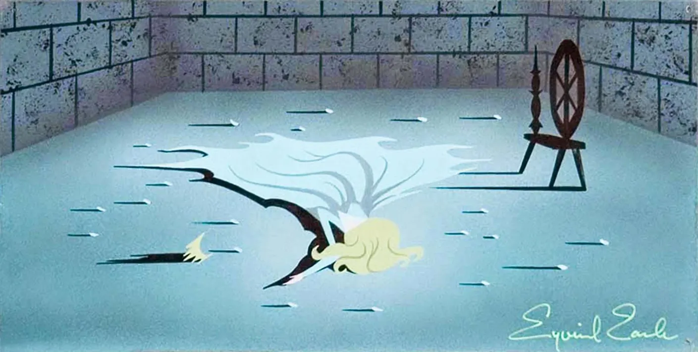
- Sceen capture from Sleeping Beauty (1959)
- Output of cel shade plastic on background art
- Demonstrating the landscape framing and unity of art direction.
- © Rights held by the respective copyright holders
Lorem ipsum dolor sit amet, consectetur adipiscing elit, sed do eiusmod tempor incididunt ut labore et dolore magna aliqua. Ut enim ad minim veniam, quis nostrud exercitation ullamco laboris nisi ut aliquip ex ea commodo consequat. Duis aute irure dolor in reprehenderit in voluptate velit esse cillum dolore eu fugiat nulla pariatur. Excepteur sint occaecat cupidatat non proident, sunt in culpa qui officia deserunt mollit anim id est laborum.
Storyboarding
- Eyvind Earle, Concept art for Disney's Sleeping Beauty<>y (1959), 1958
- Gouache-on-board
- The procession on the left highlights an International Gothic influence Earle's direction when approaching subject matter around the castle.
- © Rights held by the respective copyright holders

- Eyvind Earle, Concept art for Disney's Sleeping Beauty<>y (1959), 1958
- Gouache-on-board
- The procession on the left highlights an International Gothic influence Earle's direction when approaching subject matter around the castle.
- © Rights held by the respective copyright holders
Lorem ipsum dolor sit amet, consectetur adipiscing elit, sed do eiusmod tempor incididunt ut labore et dolore magna aliqua. Ut enim ad minim veniam, quis nostrud exercitation ullamco laboris nisi ut aliquip ex ea commodo consequat. Duis aute irure dolor in reprehenderit in voluptate velit esse cillum dolore eu fugiat nulla pariatur. Excepteur sint occaecat cupidatat non proident, sunt in culpa qui officia deserunt mollit anim id est laborum.
- Sceen capture from Sleeping Beauty (1959)
- Output of cel shade plastic on background art
- Demonstrating the landscape framing and unity of art direction.
- © Rights held by the respective copyright holders
Surface Texture
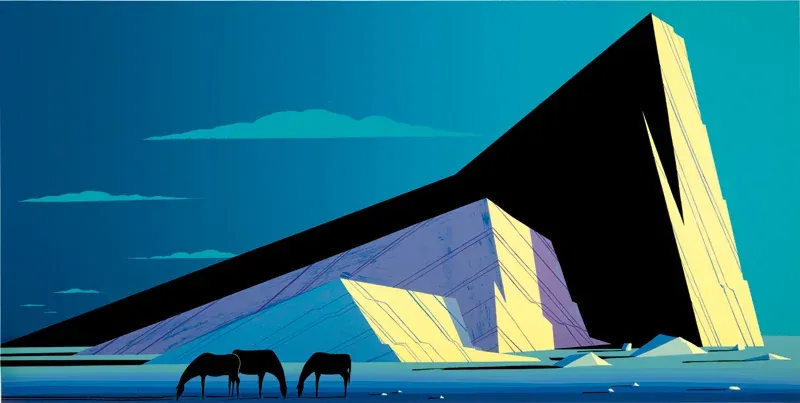
- Eyvind Earle, Concept Painting for Sleeping Beauty (1959), 1959
- 24 x 9 inches
- Demonstrating the techniques to express roughness and shadow in a unified visual lanuage.
- © Rights held by the respective copyright holders
Lorem ipsum dolor sit amet, consectetur adipiscing elit, sed do eiusmod tempor incididunt ut labore et dolore magna aliqua. Ut enim ad minim veniam, quis nostrud exercitation ullamco laboris nisi ut aliquip ex ea commodo consequat. Duis aute irure dolor in reprehenderit in voluptate velit esse cillum dolore eu fugiat nulla pariatur. Excepteur sint occaecat cupidatat non proident, sunt in culpa qui officia deserunt mollit anim id est laborum.
Composition

- Sceen capture from Sleeping Beauty (1959)
- Output of cel shade plastic on background art
- Demonstrating the landscape framing and unity of art direction.
- © Rights held by the respective copyright holders
Lorem ipsum dolor sit amet, consectetur adipiscing elit, sed do eiusmod tempor incididunt ut labore et dolore magna aliqua. Ut enim ad minim veniam, quis nostrud exercitation ullamco laboris nisi ut aliquip ex ea commodo consequat. Duis aute irure dolor in reprehenderit in voluptate velit esse cillum dolore eu fugiat nulla pariatur. Excepteur sint occaecat cupidatat non proident, sunt in culpa qui officia deserunt mollit anim id est laborum.
- Sceen capture from Sleeping Beauty (1959)
- Output of cel shade plastic on background art
- Demonstrating the landscape framing and unity of art direction.
- © Rights held by the respective copyright holders
Lorem ipsum dolor sit amet, consectetur adipiscing elit, sed do eiusmod tempor incididunt ut labore et dolore magna aliqua. Ut enim ad minim veniam, quis nostrud exercitation ullamco laboris nisi ut aliquip ex ea commodo consequat. Duis aute irure dolor in reprehenderit in voluptate velit esse cillum dolore eu fugiat nulla pariatur. Excepteur sint occaecat cupidatat non proident, sunt in culpa qui officia deserunt mollit anim id est laborum.
Landscapes of Sleeping Beauty
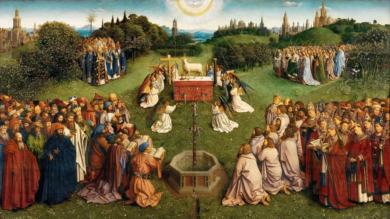
- Hubert van Eyck, The Adoration of the Mystic Lamb, , c. 1425–1432
- Lower central panel of the Ghent Altarpiece
- Depicts a style of landscape reminscent of the language Earle choose for his concept art for Sleeping Beauty.
Lorem ipsum dolor sit amet, consectetur adipiscing elit, sed do eiusmod tempor incididunt ut labore et dolore magna aliqua. Ut enim ad minim veniam, quis nostrud exercitation ullamco laboris nisi ut aliquip ex ea commodo consequat. Duis aute irure dolor in reprehenderit in voluptate velit esse cillum dolore eu fugiat nulla pariatur. Excepteur sint occaecat cupidatat non proident, sunt in culpa qui officia deserunt mollit anim id est laborum.
Dreamscapes
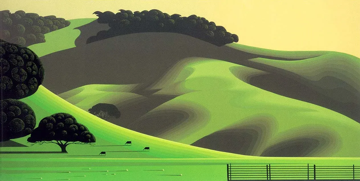
- Sceen capture from Sleeping Beauty (1959)
- Output of cel shade plastic on background art
- Demonstrating the landscape framing and unity of art direction.
- © Rights held by the respective copyright holders
Lorem ipsum dolor sit amet, consectetur adipiscing elit, sed do eiusmod tempor incididunt ut labore et dolore magna aliqua. Ut enim ad minim veniam, quis nostrud exercitation ullamco laboris nisi ut aliquip ex ea commodo consequat. Duis aute irure dolor in reprehenderit in voluptate velit esse cillum dolore eu fugiat nulla pariatur. Excepteur sint occaecat cupidatat non proident, sunt in culpa qui officia deserunt mollit anim id est laborum.
Surreal Nature
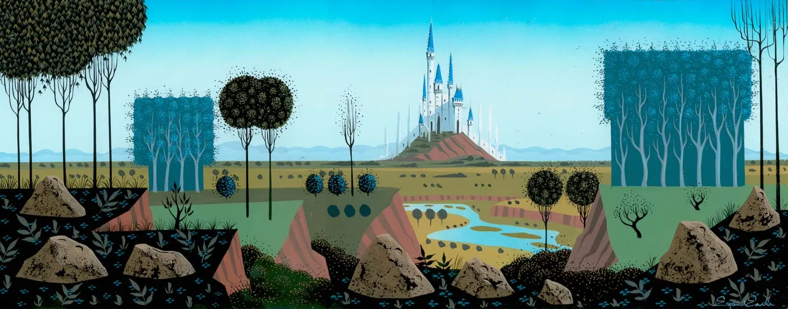
- Sceen capture from Sleeping Beauty (1959)
- Output of cel shade plastic on background art
- Demonstrating the landscape framing and unity of art direction.
- © Rights held by the respective copyright holders
Lorem ipsum dolor sit amet, consectetur adipiscing elit, sed do eiusmod tempor incididunt ut labore et dolore magna aliqua. Ut enim ad minim veniam, quis nostrud exercitation ullamco laboris nisi ut aliquip ex ea commodo consequat. Duis aute irure dolor in reprehenderit in voluptate velit esse cillum dolore eu fugiat nulla pariatur. Excepteur sint occaecat cupidatat non proident, sunt in culpa qui officia deserunt mollit anim id est laborum.
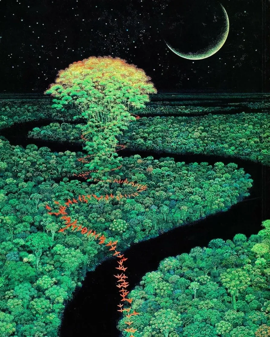
- Sceen capture from Sleeping Beauty (1959)
- Output of cel shade plastic on background art
- Demonstrating the landscape framing and unity of art direction.
- © Rights held by the respective copyright holders
Lorem ipsum dolor sit amet, consectetur adipiscing elit, sed do eiusmod tempor incididunt ut labore et dolore magna aliqua. Ut enim ad minim veniam, quis nostrud exercitation ullamco laboris nisi ut aliquip ex ea commodo consequat. Duis aute irure dolor in reprehenderit in voluptate velit esse cillum dolore eu fugiat nulla pariatur. Excepteur sint occaecat cupidatat non proident, sunt in culpa qui officia deserunt mollit anim id est laborum.
Diorama Space
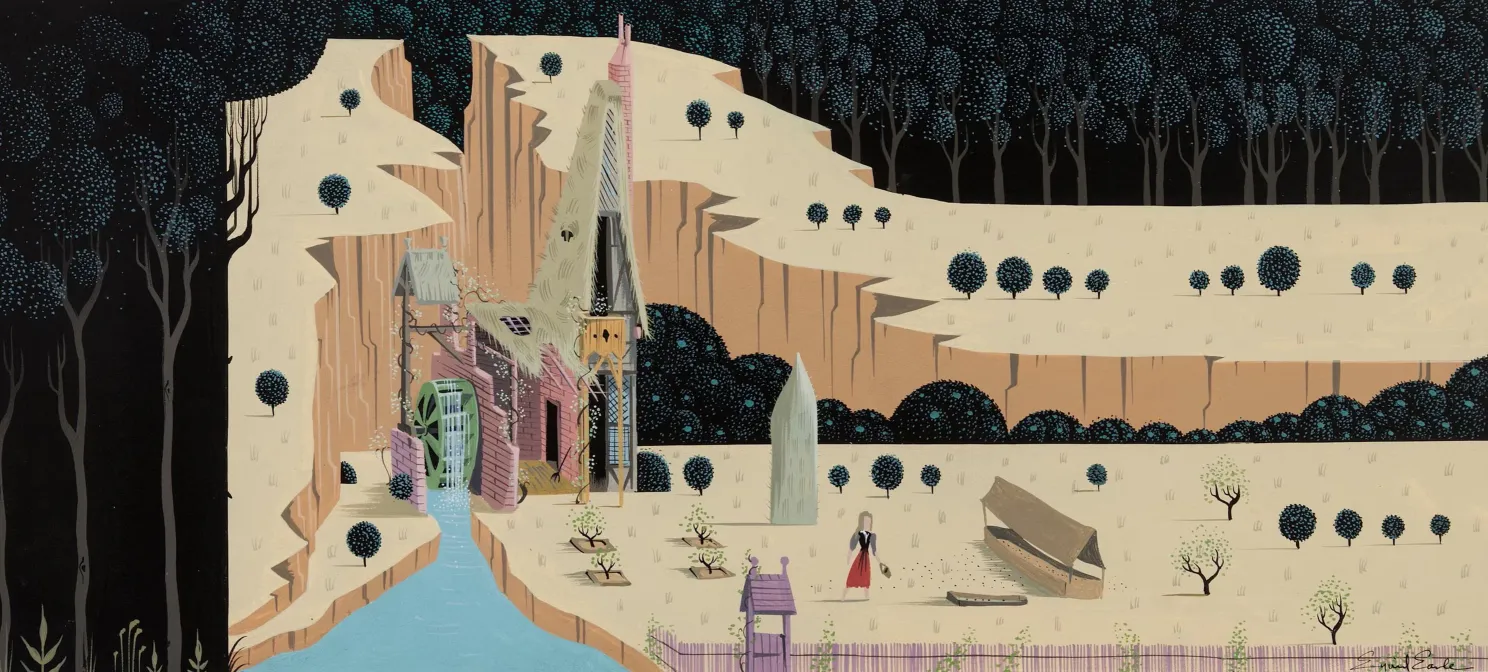
- Sceen capture from Sleeping Beauty (1959)
- Output of cel shade plastic on background art
- Demonstrating the landscape framing and unity of art direction.
- © Rights held by the respective copyright holders
Lorem ipsum dolor sit amet, consectetur adipiscing elit, sed do eiusmod tempor incididunt ut labore et dolore magna aliqua. Ut enim ad minim veniam, quis nostrud exercitation ullamco laboris nisi ut aliquip ex ea commodo consequat. Duis aute irure dolor in reprehenderit in voluptate velit esse cillum dolore eu fugiat nulla pariatur. Excepteur sint occaecat cupidatat non proident, sunt in culpa qui officia deserunt mollit anim id est laborum.
Minimalism
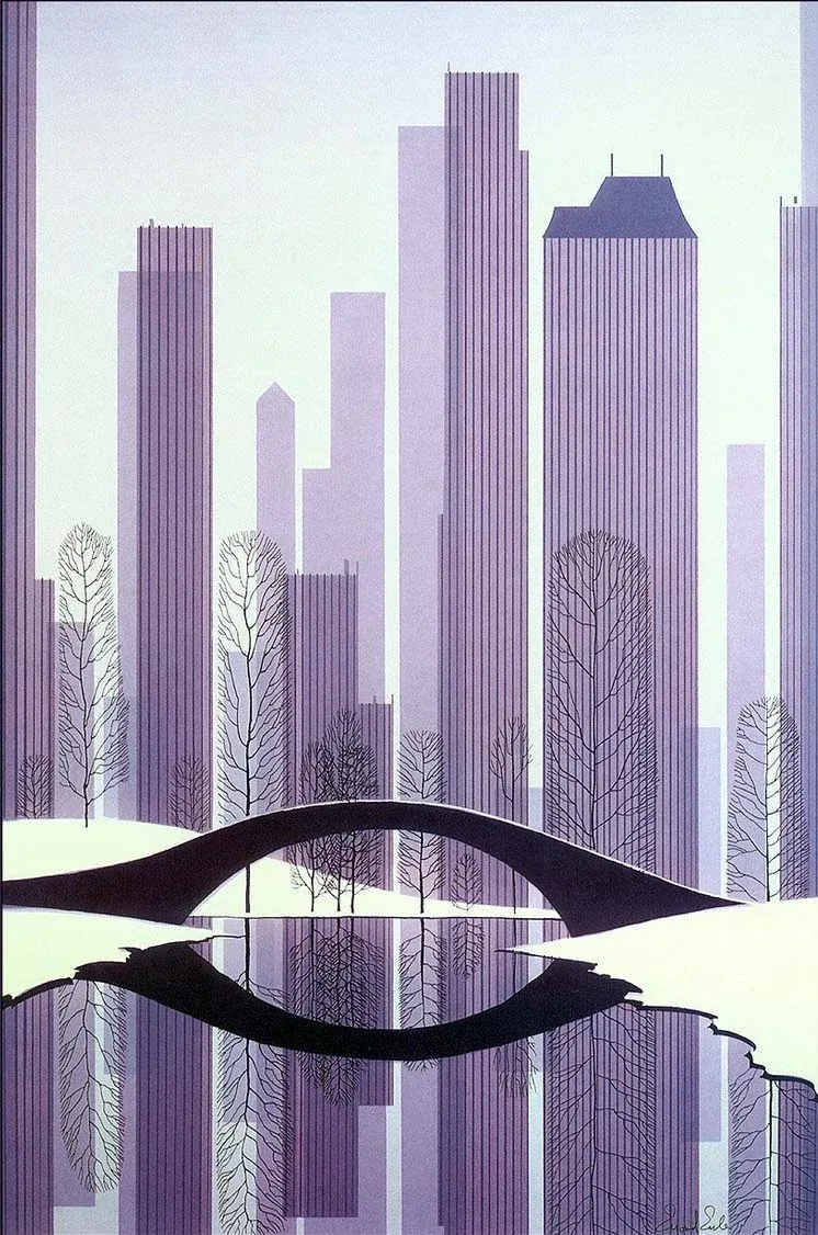
- Sceen capture from Sleeping Beauty (1959)
- Output of cel shade plastic on background art
- Demonstrating the landscape framing and unity of art direction.
- © Rights held by the respective copyright holders
Lorem ipsum dolor sit amet, consectetur adipiscing elit, sed do eiusmod tempor incididunt ut labore et dolore magna aliqua. Ut enim ad minim veniam, quis nostrud exercitation ullamco laboris nisi ut aliquip ex ea commodo consequat. Duis aute irure dolor in reprehenderit in voluptate velit esse cillum dolore eu fugiat nulla pariatur. Excepteur sint occaecat cupidatat non proident, sunt in culpa qui officia deserunt mollit anim id est laborum.
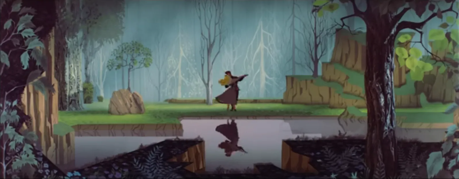
- Sceen capture from Sleeping Beauty (1959)
- Output of cel shade plastic on background art
- Demonstrating the landscape framing and unity of art direction.
- © Rights held by the respective copyright holders
Lorem ipsum dolor sit amet, consectetur adipiscing elit, sed do eiusmod tempor incididunt ut labore et dolore magna aliqua. Ut enim ad minim veniam, quis nostrud exercitation ullamco laboris nisi ut aliquip ex ea commodo consequat. Duis aute irure dolor in reprehenderit in voluptate velit esse cillum dolore eu fugiat nulla pariatur. Excepteur sint occaecat cupidatat non proident, sunt in culpa qui officia deserunt mollit anim id est laborum.
Insights in Production Arts
Lorem ipsum dolor sit amet, consectetur adipiscing elit, sed do eiusmod tempor incididunt ut labore et dolore magna aliqua. Ut enim ad minim veniam, quis nostrud exercitation ullamco laboris nisi ut aliquip ex ea commodo consequat. Duis aute irure dolor in reprehenderit in voluptate velit esse cillum dolore eu fugiat nulla pariatur. Excepteur sint occaecat cupidatat non proident, sunt in culpa qui officia deserunt mollit anim id est laborum.
Stylized Conviction
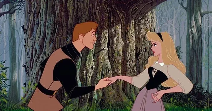
- Sceen capture from Sleeping Beauty (1959)
- An example of flat shaded bright characters with no rendering whatsoever, over a rich, rough and rendered background.
- © Rights held by the respective copyright holders
There is a modern dilemma in stylized production art that Disney’s mid-century work — and Earle’s direction in particular — answers with surprising clarity.
In contemporary stylized 3D, environments are often softened to match appealing characters. Sharp edges are avoided. Surfaces are smoothed. Roughness is minimized. Shadows are made friendly or diffuse. This isn’t purely an aesthetic choice — it’s a technical one. Three-dimensional worlds insist on light. They cast shadows. They reflect. They reveal surface truth whether the artist wants them to or not.
Stylized characters, by contrast, can be tightly controlled. Cel shading, hard shadow breaks, and simplified lighting can be applied from a fixed or authored angle. Landscapes cannot be treated so selectively. They must respond to light from all directions, which makes consistent stylization difficult without flattening the world entirely or washing it in uniformly soft lighting.
As a result, many modern stylized productions resolve this tension by smoothing the environment until it becomes visually inoffensive — pleasant, readable, but rarely assertive.

- Sceen capture from Sleeping Beauty (1959)
- Output of cel shade plastic on background art
- Demonstrating the landscape framing and unity of art direction.
- © Rights held by the respective copyright holders
There are exceptions. Arcane is one, but its solution was extreme: lighting and painterly detail were effectively authored frame by frame atop a 3D composite. The result is extraordinary, but it comes at a cost few studios could ever afford. This level of intervention requires a scale of resources available only to companies like Riot, Disney, or Blizzard — underscoring how expensive it is to resist visual neutrality within modern pipelines.
In 2D, this dilemma simply does not exist. All light is painted. All shadow is authored. Nothing appears unless it is deliberately placed there. For many contemporary productions, this freedom would be a relief — it allows environments to be softened completely, stripped of roughness, and rendered harmless without technical friction.
Earle chose the opposite.
Even within the total control of 2D, he embraced rough stone, severe shadow, and unapologetic black as structural elements rather than flaws. These choices were applied consistently across architecture, forest, and terrain, forming a unified visual language that did not seek comfort or neutrality.
What stands out is not the absence of limitation, but the presence of conviction. We know the animators were a bit upset by it, we know modern stylized productions would rarely consider it, yet Earle insisted on it, and he we are with a masterpiece.
Monumental
Eyvind Earle’s work helped legitimize concept and production art as a true artistic medium, one capable of carrying vision, authorship, and consequence at scale. His career shows the breadth of what the medium can hold when viewed through the right lens — not as support material, but as a primary vehicle for art.
This was a rare moment. Disney, at that time, was not seeking to simply produce commercial output, but to pursue art through production. In that pursuit, an artist was given room to lead, and the medium expanded beyond backgrounds, cel-shaded characters, or storyboards. It became a coherent, total vision — one where every frame carried tone, intention, and restraint. Earle was not the source of that ambition, but he was a conduit for it, and under his influence it shaped an institution, defined an era, and echoed through culture for decades.
His work beyond Disney clarifies this further. Removed from narrative and production constraint, his independent paintings reveal the same hand, now unsoftened — the geometry, the silence, the structure, the patience. Seeing that body of work in context brought into focus many of the subtleties I had long responded to in his film work but could not fully isolate within the totality of animation.
Taken together, his career stands as a testament to what production art can become when guided by artistic intent rather than commerce alone. It shows how a medium can widen, how vision can travel through it, and how, in rare alignment, art can emerge from within a system built to produce.
That is what makes this moment — and this work — monumental.
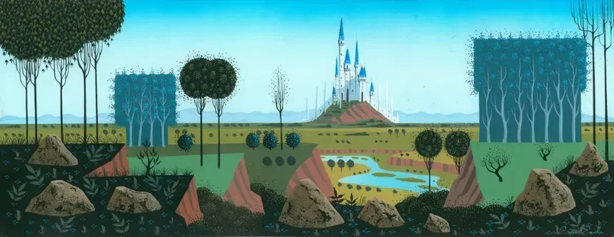
- Sceen capture from Sleeping Beauty (1959)
- Output of cel shade plastic on background art
- Demonstrating the landscape framing and unity of art direction.
- © Rights held by the respective copyright holders