


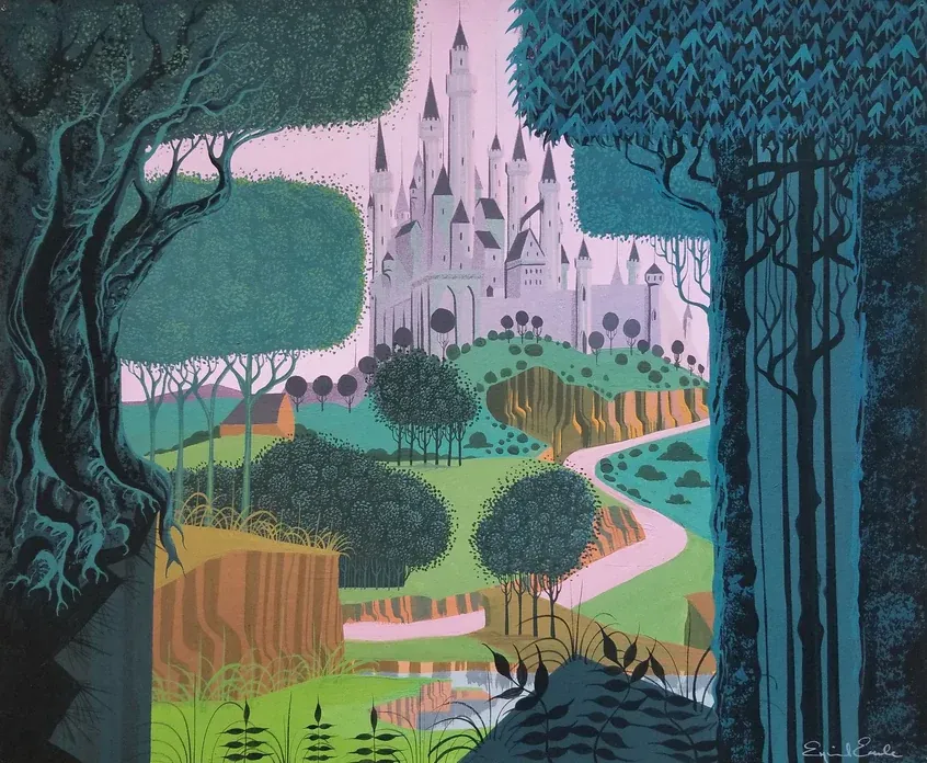
- 1.1 - Eyvind Earle, King Stefan's Castle Concept Painting for Sleeping Beauty, 1959. Gouache on illustration board
- © Rights held by the respective copyright holders.
I. Introduction
I consider Disney's output at the mid-twentieth century to represent a breakthrough in the commercial arts, proof that 2D, mixed-media production could operate as a legitimate art form. This was Walt Disney's ambition, though I didn't understand that history when I first encountered the work.
At first, the films of this era simply felt right. They were beautiful, simply. Like many people, I carried a degree of childhood nostalgia for them, but what kept drawing me back was something else entirely. As my own work in production arts deepened, illustration, environment concept, character design, animation, I kept finding myself returning to this period from different professional angles. Again and again, it held up, and taught me many lessons.
Sleeping Beauty is a film whose visual language remained one of Disney's defining artistic identities for decades and whose aesthetic became so foundational that it's still synonymous with the studio today. It is, I would argue, one of the primary reasons Disney is remembered as an artistic institution rather than merely an entertainment brand.
When you begin to study Sleeping Beauty seriously, not as a story, but as a production artifact, a pattern emerges: the composition, the severity of the landscapes, the disciplined use of color and shadow, the way the world itself carries emotion. Follow those qualities far enough, and all paths lead to Eyvind Earle.
What follows is analysis, not documentation. I'm not reconstructing Earle's stated intentions or claiming access to his private reasoning. I'm looking at the work itself, primarily as a trained artist, and scholar where I offer my own critical judgment on what I see from the history I can assemble.
Much of Eyvind Earle's work is difficult to discover, and I am unable to independently verify all artwork details, including titles, media, dates, dimensions, and other catalog information. This paper remains a work in progress and will continue to be refined before its final publication.
II. Context
The Mid 20th Century
The mid-twentieth century developed a strong shared visual language, particularly across illustration, animation, and commercial design. This shared vocabulary is now often grouped under the broader banner of mid-century modern and treated as a coherent style, with flattened forms, simplified geometry, and limited, deliberate palettes frequently cited among its defining characteristics. Styles and techniques were widely shared across artists, which makes clean attribution difficult at times.
Decorative Modernism

- 2.1 - Charley Harper, Collie, 1955. Gouache and cut paper on illustration board, 12.5 × 17.5 in.
- Created for the Lincoln-Mercury Times (September–October 1955 issue).
- © Rights held by the respective copyright holders.
Much of this work can be described as a form of decorative modernism, a broad visual tendency that emerged across illustration, animation, and commercial design during the mid-twentieth century. It softens the severity of earlier modernism, where Art Deco's harder geometry melts into something more elegant and human. It favors clarity over realism through simplified forms, deliberate curves, and disciplined use of color and ornament. The result feels modern without austerity, refined and graphic.
The work of Charley Harper provides a clear example. His illustrations reduce natural forms to flat, geometric relationships while retaining warmth and wit, an approach he described as "Minimal Realism."
Illustration
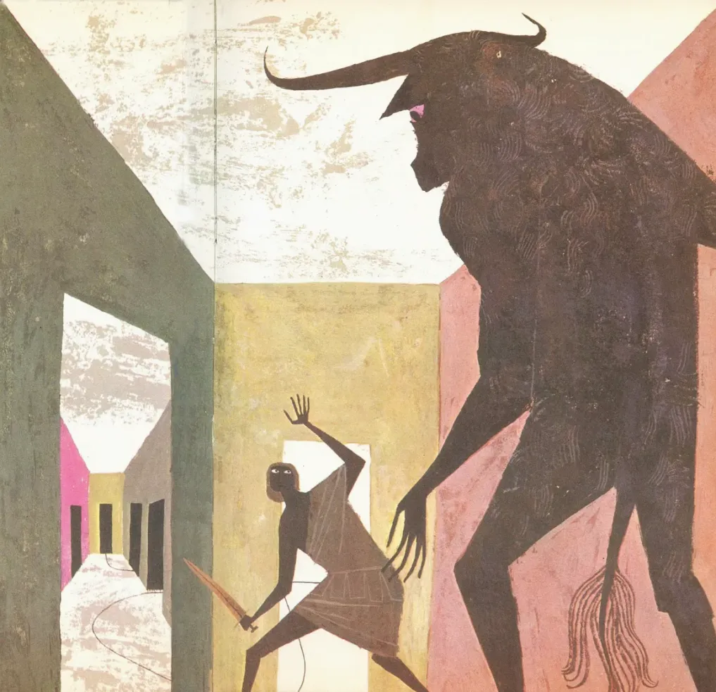
- 2.2 - Alice and Martin Provensen, “Theseus and the Minotaur,” illustration for Anne Terry White (adapt.), The Golden Treasury of Myths and Legends (New York: Golden Press, 1959). Gouache and watercolor on paper, 1959.
- © Rights held by the respective copyright holders.
The visual language of the period extended well beyond painting into illustration, packaging, advertising, and fashion. That's part of what gives the period such a cohesive visual identity. Illustration in this period often leaned playful and narrative. The work of Alice and Martin Provensen shows this well.
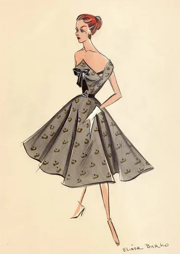
- 2.3 - Elinor Burko, Mid-Century Modern Fashion Illustration, c. 1950s. Watercolor and pencil on paper.
- © Rights held by the respective copyright holders.
Fashion illustration adopted the same visual language. Elinor Burko's mixed media fashion work from the 1950s carries the same clarity and elegance, simplified figures, confident color, an easy read even at a glance. It's a good example of how well this style worked outside of fine art, in things people actually bought and wore.
The style endured because it worked: visually, emotionally, and commercially.
Art Deco
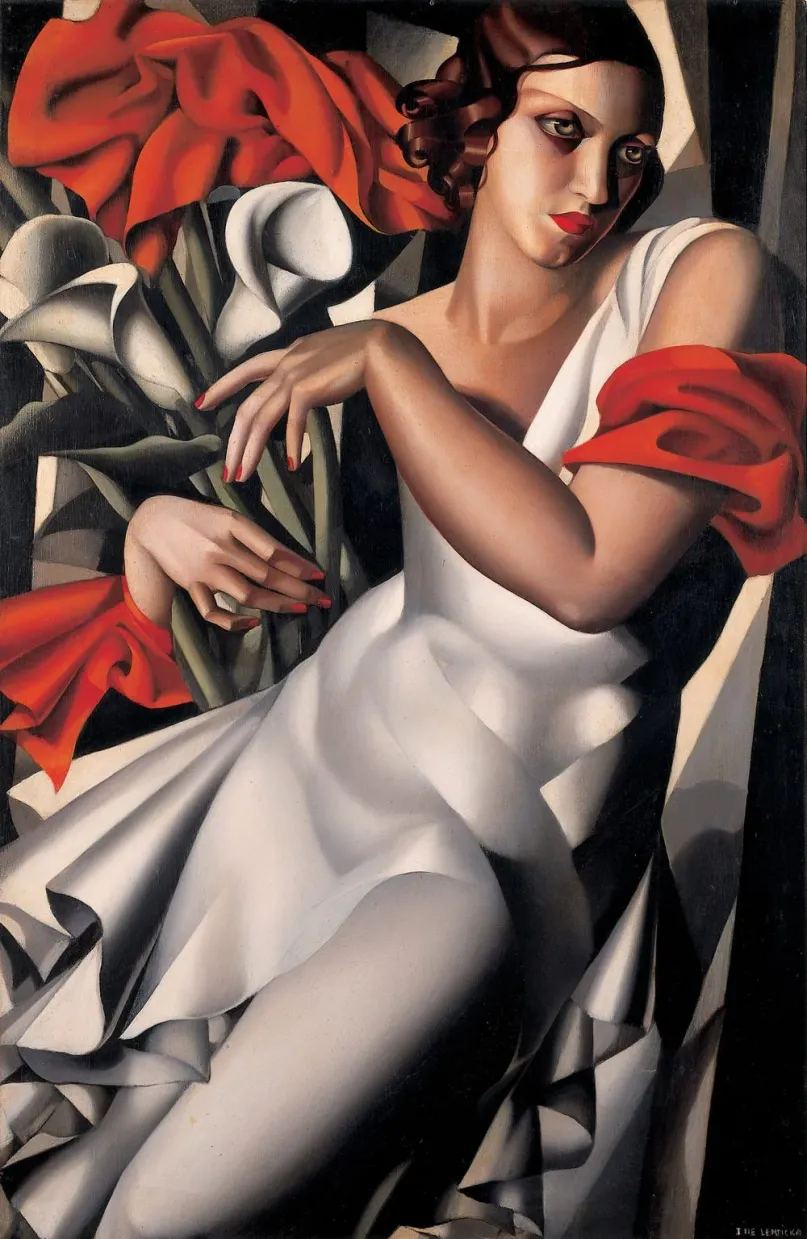
- 2.4 - Tamara de Lempicka, Portrait d'Ira P., 1930. Oil on panel, 100 × 65 cm.
- © Rights held by the respective copyright holders.
Although Art Deco had not yet been formally named, its visual language was already well established. By the mid-twentieth century it had entered the latter part of its influence, yet remained deeply embedded across architecture, illustration, advertising, and design. The decorative modernism discussed here developed alongside this continuing Deco tradition, and the two often overlapped, making their visual languages difficult to separate cleanly.
Commercial Arts
One of the central challenges in discussing commercial art is determining authorship at all. Large productions obscure individual responsibility by design, and some of the most significant contributions go unnamed, absorbed into a collective output. Commercial art has long suffered from forsaken credit. Focusing on Eyvind Earle here does not mean he was solely responsible for the mastery of the work discussed.
My judgment comes from observing correlations. Studying the concept and fine-art output of directors and production artists, certain signatures become legible. With Mary Blair, for example, I see her color logic and use of shadow echoed in the most striking moments of the films she worked on. That's the evidence available to me.
Brilliance in production art is rarely isolated. Contributions go unnoticed or misattributed often enough that some of that may happen here too. This isn't a dismissal of collaboration, it's a belief that commercial art is a serious art form when it's allowed to be, and Disney of this era allowed it.
III. Career
Eyvind Earle's life reads as the story shaped early by adversity and relentless practice. I don't have enough insight to speak meaningfully about him beyond the published material I've encountered, and this piece isn't about his life in a biographical sense, it's about the impact of his work.
Early Life
He was born in New York in 1916, and his family relocated to Hollywood in 1918. As a child he contracted polio, which left part of his face paralyzed for the rest of his life, and by most accounts, an older brother died of the same illness. His father, an artist himself, imposed a daily creative requirement, painting or reading fifty pages, with little room for negotiation. Where that line fell between discipline and something harsher is difficult to say from the outside, but the practice was relentless: Earle held his first solo exhibition at fourteen, while still traveling with his father through Mexico and Europe.
From there, his early career centered on landscape: postcard illustration, populated almost entirely by natural scenery, became his first sustained professional work. He later moved toward fine art painting in earnest, and before ever setting foot at Disney, his work was already being exhibited and collected, including a piece purchased by the Metropolitan Museum of Art in 1939. Over the course of his career, he moved across postcards, fine art, watercolor, gouache, printmaking, and eventually large-scale production art.
What I see is a man of deep discipline and sustained focus, someone who treated his effort not as a job but as a lifelong pursuit.
Disney
From its earliest years, Disney's ambitions extended well beyond entertainment. Walt Disney wanted animation taken seriously as a fine art, on par with painting or sculpture, not dismissed as children's amusement. That ambition would eventually crystallize around Sleeping Beauty itself, conceived, in part, as the studio's definitive claim to a place in fine art history. But that goal had been building for decades before Earle ever arrived, shaped by a succession of artists Walt brought in specifically to push the studio's visual identity forward.
I will briefly discuss a few of many legendary artists at Disney to set the stage for Earle's arrival.
Gustaf Tenggren
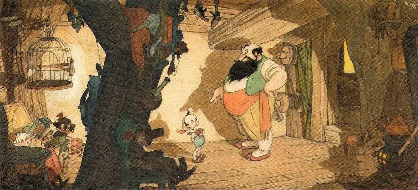
- 3.1 - Gustaf Tenggren, Pinocchio inside Stromboli's Caravan Concept Painting for Pinocchio, 1940. Ink and watercolor on paper, 13.4 × 9.8 in.
- The illustration demonstrates Gustaf Tenggren's style, utilizing intricate black ink linework and rich, atmospheric watercolor washes to establish a moody, textures-heavy Old World European aesthetic that defines the dark tone of the sequence.
- © Rights held by the respective copyright holders.
Gustaf Tenggren joined Disney in 1936, bringing a European, old-world illustrative tradition rooted in the fairy-tale styles of Arthur Rackham and John Bauer. His influence runs through Snow White and the Seven Dwarfs and, even more heavily, Pinocchio, where his contributions shaped everything from Geppetto's workshop to the film's Bavarian village streets. Tenggren's style was disciplined and atmospheric rather than radical: a skilled, traditional illustrator's sensibility, steeped in folklore, brought to bear on a young studio still discovering what its visual identity could be.
Mary Blair
- Eyvind Earle
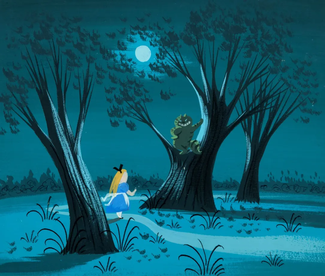
- 3.2 - Mary Blair, Alice and the Cheshire Cat Concept Painting for Alice in Wonderland, 1951. Gouache on artist's board, 7 × 6.25 in.
- The painting demonstrates Mary Blair's concept art style, prioritizing bold, non-naturalistic color values and flattened, playful geometric shapes to establish the film's whimsical, surrealistic emotional architecture.
- © Rights held by the respective copyright holders.
Mary Blair joined Disney in 1940, left after a year feeling creatively restrained, and returned in 1941 following a research trip through Latin America that changed the course of her work entirely. She came back with a boldness no one at the studio had seen before, unmixed color, deliberately clashing palettes, a flattened, modernist sense of form. Animator Frank Thomas remembered her as the first artist he knew to place different shades of red directly beside one another, a combination convention said couldn't work, and that she made work anyway. From that point through the early 1950s, across Cinderella, Alice in Wonderland, and Peter Pan, Blair became the studio's defining visionary, the artist most responsible for introducing real modernism into Disney's visual language.
Mary Blair was the event horizon leading this innovation in Disney's visual language and she was highly prominent in Disney's culture of this era.
Blair concluded at disney in 1953, two years after Earle joined in 1951.
Disney: Earle's Early Years
- Eyvind Earle
Earle joined Disney in 1951 as an assistant background painter. He was hired already as an established fine-artist. In this era it was very common for artists to move between fine-art and production art. Over the next several years, he moved across a range of projects and departments, work that put him in daily contact with an unusually concentrated pool of talent.
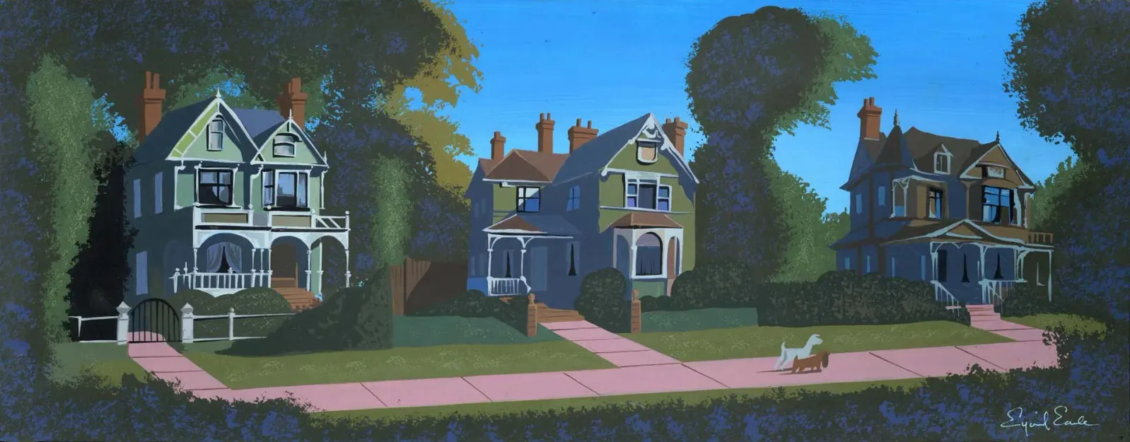
- 3.3 - Eyvind Earle, Visual Development Concept Painting for Lady and the Tramp, 1955. Gouache on paper, 24 × 9 in.
- The panorama scene depicts a neighborhood sidewalk layout prepared for the film's “Bella Notte” sequence.
- © Rights held by the respective copyright holders.
His output over these years shows him merging with the evolving Disney style of the era, folding his own natural talent and instincts into a visual language he'd inherited rather than invented. That flexibility is an essential trait of a production artist: the ability to move into an existing visual language rather than staying confined to a single style or mode of expression.
Bella Notte Park Sequence
- Eyvind Earle
- Horizon Bound on a Bicycle
In 1955, four years before Sleeping Beauty, Walt Disney gave Earle a specific assignment: design the backgrounds for the "Bella Notte" sequence in Lady and the Tramp, the moonlit walk through the park following the film's famous spaghetti dinner.
It was a smaller commission than what would come later, a single sequence rather than an entire film, but it gave Earle real creative latitude within it.
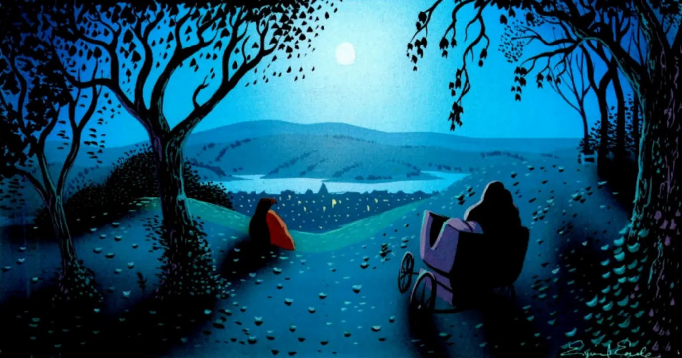
- 3.4 - Eyvind Earle, Nocturnal Cityscape Concept Painting for Lady and the Tramp, 1955. Gouache on board, 14 × 6 in.
- The panoramic background features a hillside view of the city cityscape prepared for the film's “Bella Notte” sequence.
- © Rights held by the respective copyright holders.
His park backgrounds stand apart from the rest of the film, built from the same geometric clarity, cool blues and greens, and stylized, knotted tree bark that would define his later work, a sharp contrast to the softer, sunnier backgrounds the rest of the film's artists were painting.

- 3.5 - Lady and the Tramp, 1955. Film still, Walt Disney Animation Studios.
- The widescreen CinemaScope frame captures a pair of swans gliding across a moonlit pond during the “Bella Notte” sequence, highlighting the stylized background layout designed by Eyvind Earle.
- © Rights held by the respective copyright holders.
Here Earle used darkness as a tool rather than an obstacle. His backgroudns don't read as empty or foreboding. Moonlight settles softly and shadow hold the scene. Where darkness usually signals danger, Earle lets it hold warmth instead, a romance rather than a threat.
Disney: Sleeping Beauty
- Walt Disney
- Quoted in John Canemaker's book The Art and Flair of Mary Blair
Sleeping Beauty is Earle's tour de force within Disney.
He was given an unusual degree of authority, and he used it uncompromisingly. Production ran long, animators were frustrated by the demands placed on them, and redos were frequent. The standard was severe.
Earle left the project before its release, and the final film softened some of his sharpest edges. Still, the tone he established endured. Sleeping Beauty became a defining work, not just for Disney, but for the visual identity of 2D animation for decades to come.
It demonstrated that animation could be transcendent, that it could operate as cultural art, not merely entertainment.
- Floyd Norman
- Disney Legend, animator and storyman
Landscape as the Hero and Villain
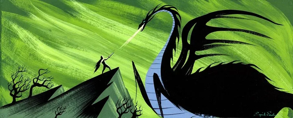
- 3.6 - Eyvind Earle, Prince Phillip Battling Maleficent as a Dragon Concept Painting for Sleeping Beauty, 1959. Gouache on illustration board, 21 × 9 in.
- The dramatic composition utilizes sharp silhouettes and stylized landscapes to map out the climactic confrontation scene.
- © Rights held by the respective copyright holders.
Earle was primarily tasked with background and concept art, yet when given authority, the background ceased to behave like background.
In Sleeping Beauty, the landscape becomes both protagonist and antagonist. The ground rises and fractures. Trees claw and tangle. Cliffs threaten. The sky presses down. Characters move through environments that feel alive, sometimes hostile, sometimes romantic, always present.
This is what happens when a specialist in landscape is allowed to lead a project. The world no longer supports the narrative, it is the narrative.
Even in moments of action, the dragon confrontation, the flight through thorns, the terrain participates emotionally. The land itself strikes, resists, and looms.
- Floyd Norman
- Disney Legend, animator and storyman
Geometry as Emotion
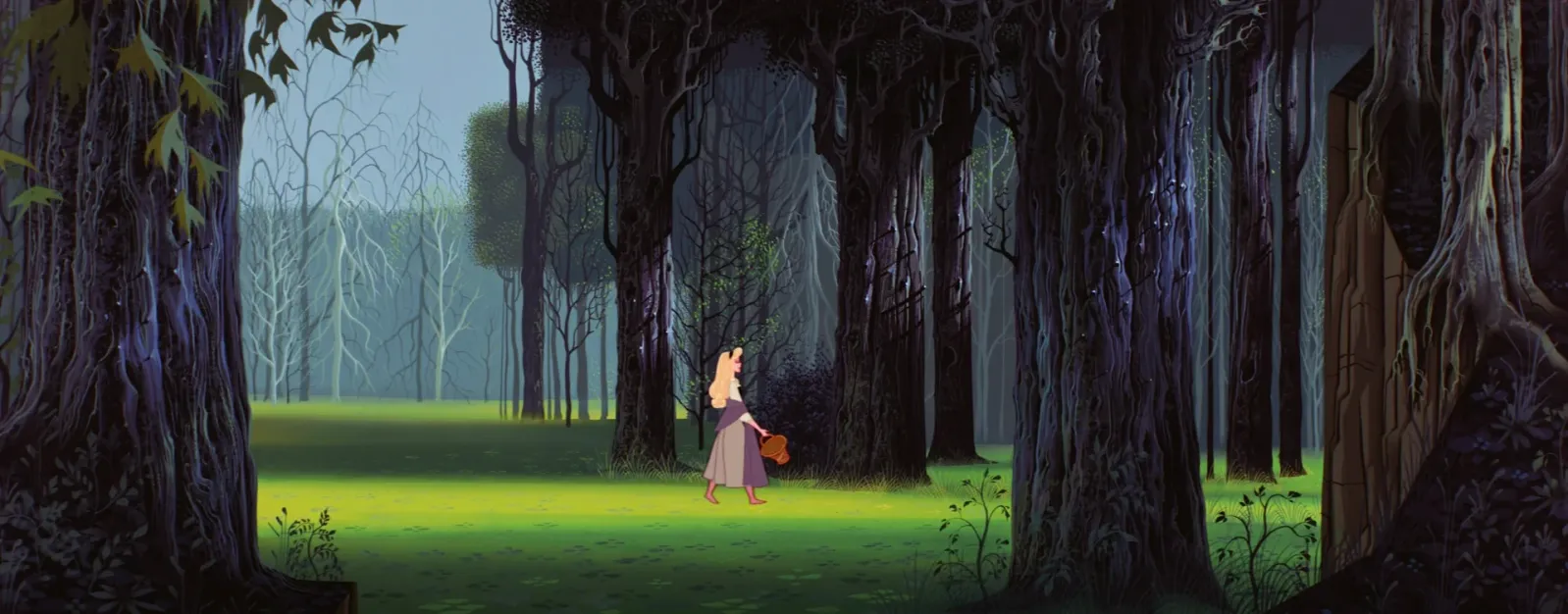
- 3.7 - Sleeping Beauty, 1959. Film still, Walt Disney Animation Studios.
- The panoramic frame captures Princess Aurora (as Briar Rose) walking through the deep woods, surrounded by the distinctive vertical trees and medieval tapestry-inspired background art styled by Eyvind Earle.
- © Rights held by the respective copyright holders.
One of Earle's most radical contributions to Disney's visual language was his use of geometry as an emotional instrument.
Sharp angles are not merely stylistic, they are oppressive. Long, rigid verticals feel authoritarian. Massive planar forms dwarf human figures, instilling awe or vulnerability. His geometry does emotional labor.
This approach distinguished him from earlier Disney artists. Where previous backgrounds softened space, Earle structured it. Where others framed action, he constrained it. It is easy to see why Walt Disney was enamored with this severity, it introduced a layer of visual intelligence that aligned with his fine-arts ambitions.
This era of Disney allowed darkness. Scenes were grounded in deep shadows. Bright colors were permitted, but always anchored by heavy darks and long, casting silhouettes. Earle's landscapes thrived under those conditions.
A Handcrafted Storybook
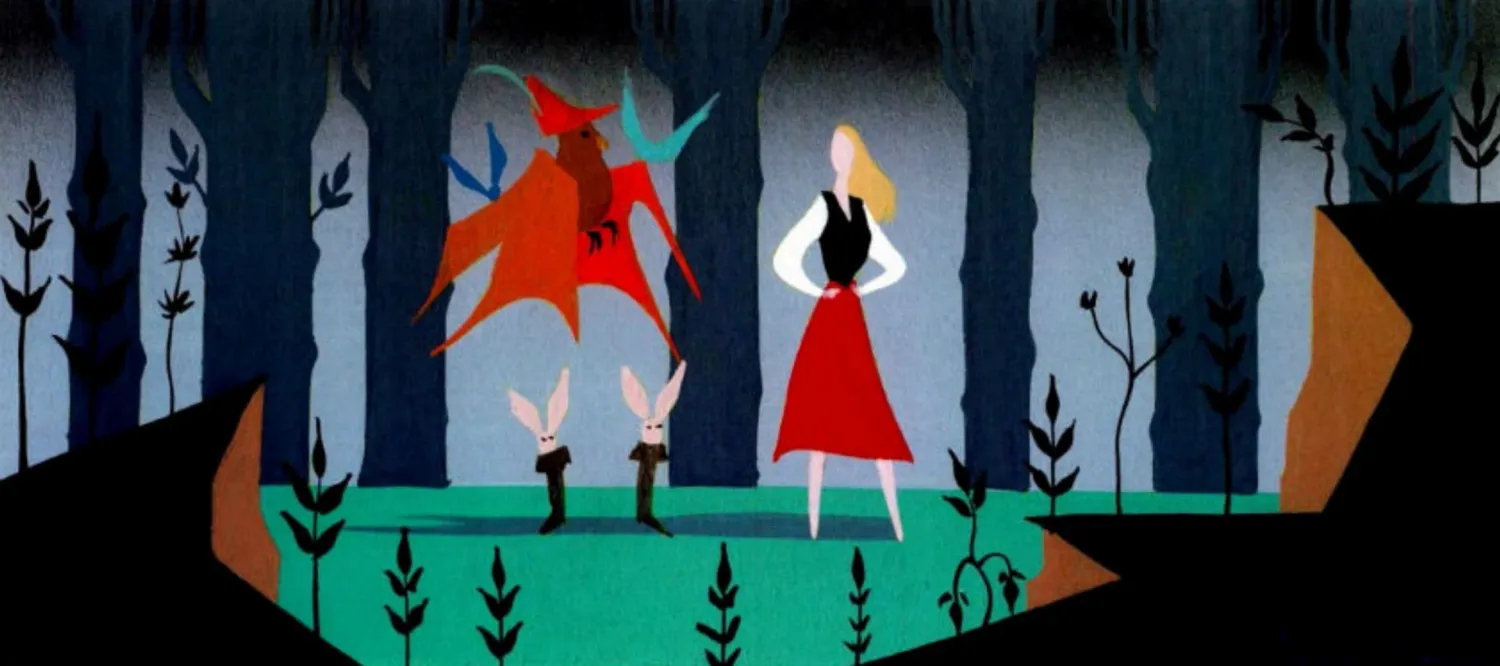
- 3.8 - Eyvind Earle, The Forest Concept Painting for Sleeping Beauty, 1959. Gouache on illustration board, 14 × 6 in.
- The composition establishes a stylized forest layout utilizing rigid vertical planes, geometric trees, and a bold yet muted palette.
- © Rights held by the respective copyright holders.
Earle's concept art is flat, but it rarely looks it. Surfaces read like paper cutouts, woven cloth, or pressed collage, patterns repeating like stamps, foliage clustering in rhythmic bursts, stone rendered with a gritty, tactile weight it doesn't actually have. Nothing on the page is dimensional, yet everything suggests it was built rather than drawn.
That illusion carries into the finished film, where texture starts doing real work. It tells you what something is made of, how heavy or dense it feels, and it sets emotional tone before a character even moves through the scene. The thorns feel like they could cut you. The castle stone feels cold and immovable. The forest feels thick enough to get lost in.
Much of this has a diorama quality, the kind of intricate, hand-built world you'd find behind glass in an elaborate holiday display, every layer placed with visible care. It shows up again and again: in the thorns, the castle, the forest, in nearly every major scene.
Post-Disney
Earle left Disney in 1958, a year before Sleeping Beauty's release, and worked briefly for John Sutherland Productions before starting his own studio, Eyvind Earle Productions, in 1961. There, he produced an 18-minute animated Nativity sequence for a television special, The Story of Christmas, hoping to carry his own vision into animation on his own terms. The special aired only once, and for reasons that had little to do with the work itself, it was never picked up again.
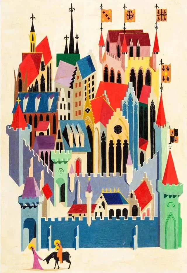
- 3.9 - Eyvind Earle, The Story of Christmas Painted Illustration, 1963. Gouache on canvas.
- The production prototype utilizes mid-century modern geometric architecture to represent Jerusalem, functioning as an early design concept for Earle's eighteen-minute Nativity animation in the 1963 NBC television special.
- © Rights held by the respective copyright holders.
Alongside his painting, Earle had another commercial practice that ran through nearly his entire career: Christmas card design. He began designing cards for the American Artist Group in the late 1930s, before Disney, and never really stopped, eventually producing over 800 designs and, by his own estimate, selling more than 300 million copies over his lifetime.

- 3.10 - Eyvind Earle, Ocean Splash, 1991. Serigraph on paper, 36 × 24 in.
- The dramatic composition strips away traditional atmospheric perspective, reducing the ocean wave and coastal topography into stark silhouettes and flat, geometric planes.
- © Rights held by the respective copyright holders.
In 1974, he began making limited edition serigraphs, a natural extension of that same instinct: reproducible, accessible work that carried his fine art sensibility to a wide audience rather than keeping it behind gallery glass. It's a part of his output that's easy to overlook next to Sleeping Beauty, but it clearly mattered to him, and it remains heavily featured in how his estate presents his legacy today.
Earle continued painting, printing, and exhibiting until his death on July 20, 2000.
IV. Analysis of Earle's Art
- Eyvind Earle
Having traced Earle's career, the focus now shifts from history to the work itself. I'm drawn primarily to his production art. Earle is unusual in this regard, few artists with real fine-art credentials were ever given sustained visual oversight within a major studio production, and the impact he had on both the work and the institution has stayed with me.
Some limits apply here too: documentation for much of his output, especially earlier pieces, is thin or hard to access.
What follows is my study of Earle's visual grammar and approach.
Modes
Earle's work appears to operate in three primary modes.
The first is a modern, highly abstracted approach to landscape: clean, primal, and rhythmically composed. This mode underpins much of his fine-art and serigraph work.
The second reflects a symbiosis with Disney's visual culture, a more illustrative and explicitly commercial mode of his practice. Here, Earle demonstrates a flexible command of production art, where narrative, audience legibility, and visual language introduce additional layers of constraint.
The third mode emerges most clearly in his religious work, drawing heavily from medieval and Renaissance traditions. These works reveal a sustained engagement with historical visual languages.
It's within Sleeping Beauty that these modes converge most unexpectedly. Unlike Earle's earlier Disney work, the film's visual direction aligns more closely with his religious art than his commercial one. Whether driven by the Gothic nature of the setting or by Earle's own ambitions, the result is unique, both within Disney's canon and within his own career.
Belletristic Sensibilities
I'll note a subjective embellishment I feel strongly about after studying Earle's work. His use of color leads me to believe that sometimes he isn't working in realism, or language, or homage at all, but simply in a choice that denotes craftsmanship, mastery of art for its own sake. It reads to me as something belletristic, prose written for the beauty of its own execution, form and flourish valued apart from the story it happens to be telling, but rendered here in a visual language instead of a written one. He deploys choices I can't fully account for beyond the fact that they're beautiful decisions, made simply because he could make them.
International Gothic
International Gothic refers to a style that spread across European art from roughly the late fourteenth through early fifteenth centuries, prized for elegant, elongated figures, rich color, dense pattern, and a flattened, ornamental sense of space that favored decorative clarity over naturalistic depth. It shows up across illuminated manuscripts, panel paintings, and tapestries of the period, less a single artist's invention than a shared visual language across courts and workshops throughout Europe. It's a style Earle references directly and, in his own way, reinvents. It can be traced through nearly all of his work, but nowhere more heavily than in Sleeping Beauty, where its rhythms, patterning, and architectural framing shape nearly every scene.
Procession
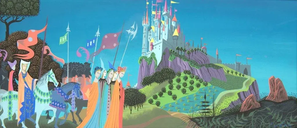
- Eyvind Earle, Castle on a Hill Concept Painting for Sleeping Beauty, c. 1958. Gouache on board, 23.5 × 8.5 in. The Hilbert Collection, Hilbert Museum of California Art.
- The composition features Earle's signature verticality with towering spires and stylized, flowing foliage influenced by Gothic illuminated manuscripts.
- © Rights held by the respective copyright holders.
Earle's processional scene before the castle plays out as a ceremonial arrangement of color, pattern, and rhythm. Figures move laterally in tight procession, their elongated bodies and flowing garments repeating like visual units more than individuated actors. Horses, banners, and robes flatten into ornamental shapes, and the castle behind them reads as a patterned surface rather than a modeled structure. Motion stays restrained, subordinate to the composition's larger visual order. Meaning accumulates through repetition, silhouette, and color harmony, a designed rhythm more than a captured instant.
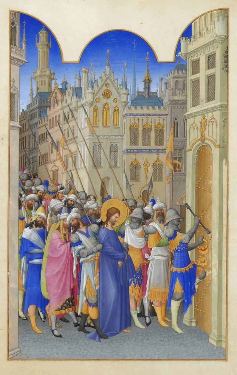
- Limbourg brothers (Paul, Jean, and Herman), “Christ Led to the Praetorium,” folio 143r, from Très Riches Heures du Duc de Berry. Illumination on vellum, c. 1412–1416. Musée Condé, Chantilly.
- The procession on the left highlights an International Gothic influence on Earle's direction when approaching subject matter around the castle.
This visual logic was not confined to any single artist. It recurs across manuscripts, panel paintings, and tapestries throughout the late medieval period, a shared vocabulary developed across many hands and regional workshops. Among the many works that share this vocabulary, the Très Riches Heures offers a particularly legible comparison, cited here as representative of the broader tradition rather than as a documented source for Earle's own work. In Christ Led to the Praetorium, figures compress into a shallow plane and advance in a comparable rhythmic procession, framed by architecture that reads as ornament rather than as spatial setting. The saturated color, flattened form, and controlled sense of motion echo the same visual priorities at work in Earle's scene. The connection lies in a shared approach: movement and form organized as pattern, with visual clarity built through structure rather than illusionistic depth.
Medieval Perspective
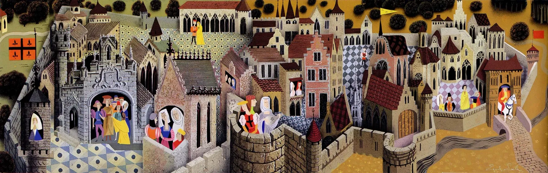
- Eyvind Earle, Medieval Promenade Concept Painting for Sleeping Beauty, c. 1957–1958. Gouache on board.
- The composition explicitly rejects true mathematical linear perspective in favor of a flattened, multi-tiered medieval hierarchy, utilizing intimate daily life vignettes as intricate structural embellishments across the town landscape.
- © Rights held by the respective copyright holders.
Medieval art is often organized by a kind of non-linear spatial logic, one that doesn't converge toward a single vanishing point the way post-Renaissance perspective does. Buildings stack and tilt against each other, scale shifts from figure to figure depending on importance rather than distance, and multiple moments or vantage points can sit within the same frame. It's a genuinely difficult phenomenon to explain with any certainty. I'm inclined to see it as a stage in the long development of visual language itself, an image-making technology still working out how to represent space, rather than a fully settled choice. Whether this was a limitation of the period or an intentional feature of how these artists wanted to construct meaning, I can't say with confidence, and I'm wary of claiming either.
In Earle's case we know this departure is deliberate. In pieces that lean most heavily on International Gothic language, Sleeping Beauty chief among them, he embraces this older spatial logic playfully, pulling it into his own decorative modernist vocabulary rather than simply reviving it.
One effect of this borrowed logic is a diorama-like intricacy. Throughout these pieces, tiny scenes of daily life unfold independently of the main action, each one a small vignette a viewer can pause on and puzzle out. Streets fill with these moments, and windows and doorways offer brief, private glimpses into lives happening alongside the main scene, unrelated to it but somehow part of the same world.
The Portal and Stage
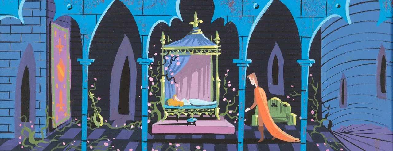
- Eyvind Earle, “The Kiss” Concept/Color Key Painting for Sleeping Beauty, 1959. Gouache on illustration board, 9.75 × 4.75 in.
- The dramatic composition establishes the color layout for Prince Phillip approaching the sleeping Princess Aurora inside the castle chamber.
- © Rights held by the respective copyright holders.
The chamber scene from Sleeping Beauty draws heavily on medieval spatial logic rather than Renaissance naturalism. Space is organized architecturally and symbolically rather than optically. Depth comes through layered arches and receding planes, but the scene favors clarity, rhythm, and compositional order over realistic perspective. Figures stay subordinate to structure, and the architecture itself becomes the primary organizing force of the image.
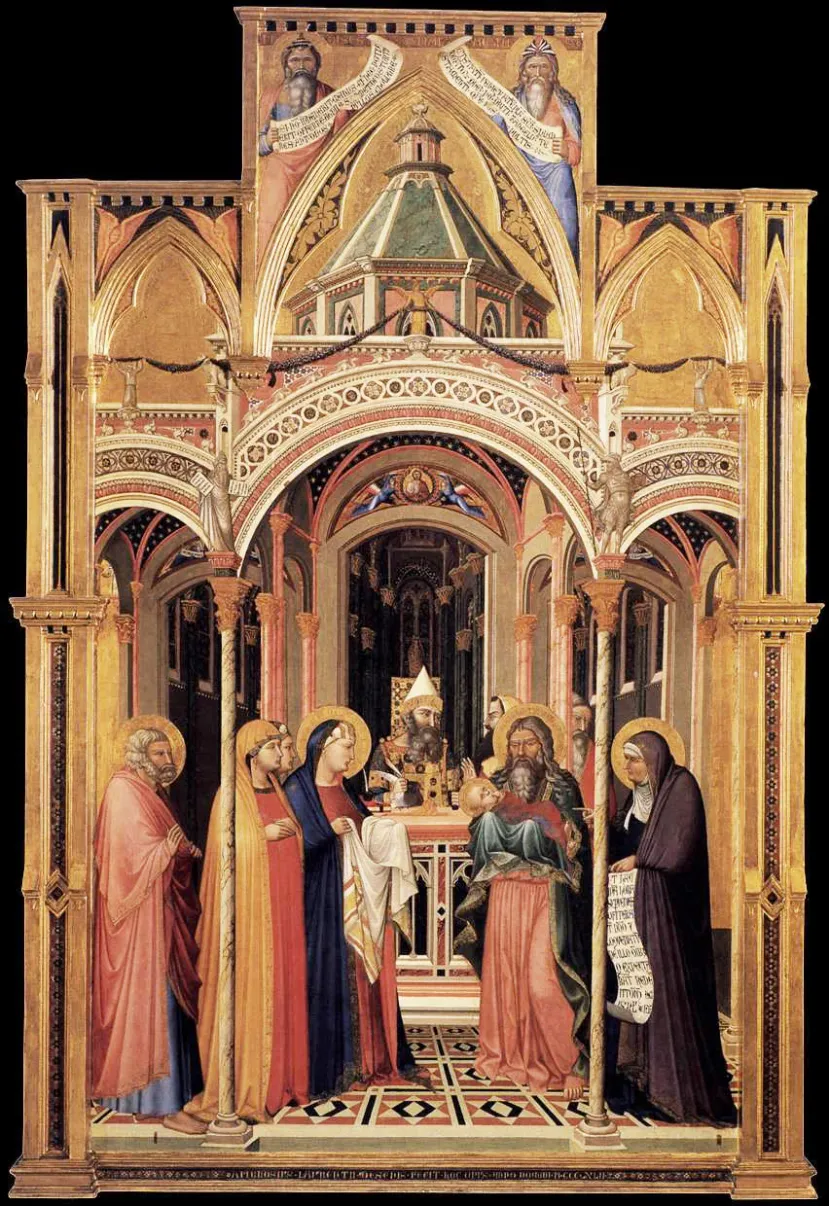
- Ambrogio Lorenzetti, The Presentation in the Temple, 1342. Tempera and gold ground on panel, 257 × 168 cm. Uffizi Gallery, Florence.
This approach closely parallels traditions found in International Gothic and late medieval panel painting, where architecture frames narrative action directly rather than receding invisibly behind it. In Lorenzetti's Presentation in the Temple, architectural elements establish hierarchy, symmetry, and ceremonial focus, and the figures exist within a constructed spatial schema built to prioritize meaning and order over naturalistic depth.
In both images, arches act as visual divisions, guiding the eye laterally across the composition while reinforcing a sense of ritual and containment. The space feels deliberate and enclosed, built to carry narrative weight rather than movement. This shared reliance on planar construction, frontal staging, and architectural rhythm shows how Earle's production work draws on older visual systems, ones where composition serves structure first and atmosphere second.
This kind of architectural framing has deep roots. Medieval and early Renaissance panel painting often staged scenes as though viewed through an architectural threshold, columns, arches, and painted frames doubling as doorways into the scene itself. Triptychs took this literally, hinged panels that physically opened like doors, turning the act of viewing into something closer to entering a space than looking at a flat image. Earle invokes that same tradition here. The chamber's arches don't just organize the composition, they frame it the way a portal or an altarpiece wing might, inviting the viewer to look inward through a threshold rather than simply at a picture.
Earle's Gothic
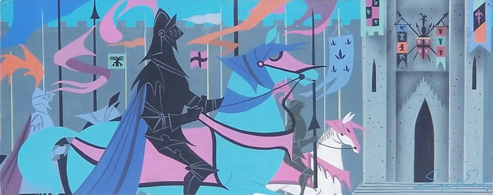
- Eyvind Earle, Concept Art for Sleeping Beauty (Knight in Black). Gouache on illustration board, c. 1957–1958.
- © Rights held by the respective copyright holders.
The black knight procession shows Earle modernizing the language of International Gothic, filtering it through decorative modernism and, in the process, arriving at something distinctly his own. The bones are still Gothic: the procession, the banners, the stacked verticals of lances against the citadel wall. But everything sitting on top of that structure has been reinvented.
The shapes throughout are whimsical, cut and curved with a looseness that has little to do with historical accuracy and everything to do with graphic wit. Even the citadel behind the procession gets pulled into this, its door and paired windows arranged into something like a face, caught in what reads as wide-eyed shock at the knight passing beneath it. Shadow is rendered on stone despite the composition's flatness to pull the banners forward. Color is generously switched like in the medieval processions but also unreal by design: a turquoise horse with pink armor plating to name one, choices with no basis in the natural world, gesturing at a notion of artistic craft by breaking rules to communicate emotion or a visual epiphany. Banners are solid but colorful streams alternating their light and shadowed tones, and plumes flare like colorful stylized fire and ink from the figures.
The knight is rendered in solid black. That choice carries real weight for the period, solid black used this way was something of a Disney signature at the time, a shorthand for danger and tension that needed no further explanation to a viewer. Set against the surrounding riot of color, it does exactly that work here.
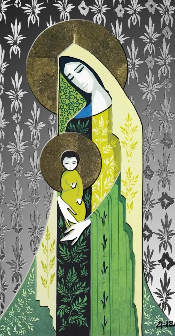
- Eyvind Earle, “Icons of Faith” Fine Silver Coin (Madonna and Child). Minted by PAMP, distributed by the Royal Canadian Mint, 2015; adapted from Madonna and Child, oil on board, 1986.
- © Rights held by the respective copyright holders.
That same instinct carries into his religious figures. Elongated forms stretch toward the pencil thin, and long fields of flowing cloth read like fabric cut and layered rather than painted. Faces stay minimal, just a few essential strokes, yet carry a modernized charisma even in their restraint.
This visual lineage appears in his Madonna and Child composition, later realized as a commemorative, estate-authorized coin. While this particular object was produced after Earle's lifetime, the composition itself is based on an original work. Detached from its religious subject, the image is compelling for the way Earle reduces figures to architectural silhouettes, organizing the scene through vertical rhythm, internal patterning, and calm, contained geometry.
I can't help but note that I was struck by this coin piece itself. I was surprised by how effectively the metal medium is brought to life through Earle's elegant shapes and delicate patterns. The use of metal, intentionally or not, recalls the gilded techniques that define much of the medieval art referenced throughout this discussion.
Color, Light, and Shadow
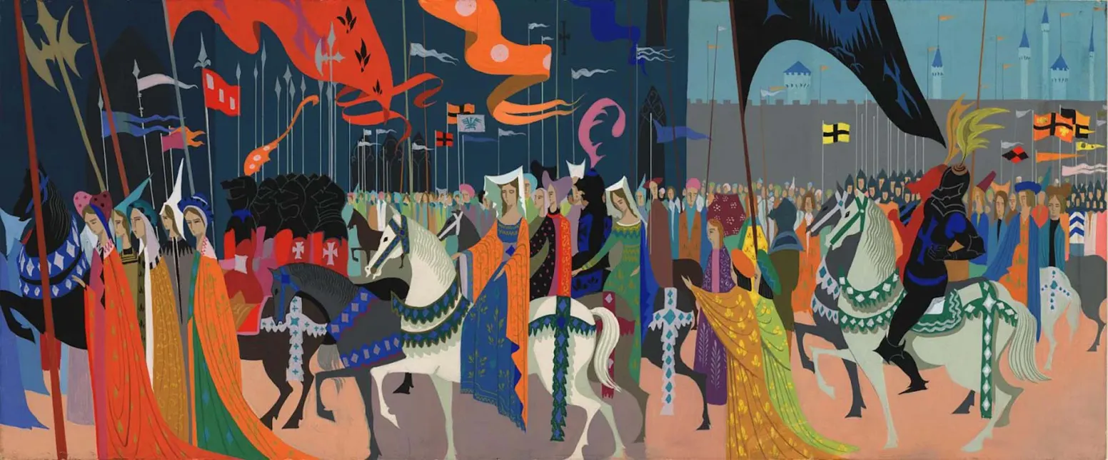
- Eyvind Earle, Royal Procession Concept Painting for Sleeping Beauty, 1959. Gouache on paper.
- Earle utilizes highly saturated, opaque gouache to bridge mid-century modernism with 15th-century French medieval manuscript traditions, mirroring the palette densities found in the Très Riches Heures.
I must first state that Earle's color is unfathomably brilliant to me. It's so subtle and so grand at once that I can gesture toward it in nearly every piece, an unusual color choice denoting soft lighting, emotion, or a deliberate juxtaposition. I can't really find a rule or a guideline, just regular epiphanies of brilliance. This extends to his handling of light and shadow as well, it feels innate to the work itself.
I'd guess this came from some combination of natural talent and the environment he described at Disney, surrounded by remarkable generational artistic talent of the time. Color as emotion, and not only color but light and shadow used the same way, does seem to be an iconic feature of Disney's work in this era, something the studio pushed further than almost anywhere else at the time.
His mastery likely extends far beyond what I can fully grasp. In general, all I can honestly say is that it's incredible. What follows is my attempt to isolate what I can, in study.
General Color
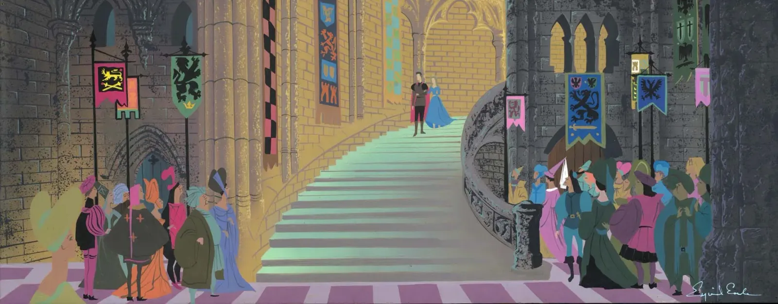
- Eyvind Earle, Castle Interior Concept Painting for Sleeping Beauty, c. 1953–1958. Gouache on illustration board.
- © Rights held by the respective copyright holders.
Rendering
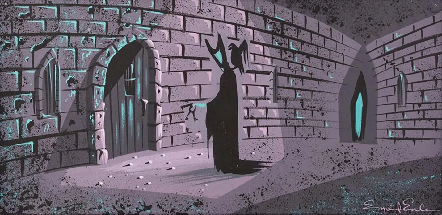
- Eyvind Earle, Maleficent and Diablo in the Dungeon Storyboard Painting for Sleeping Beauty, 1959. Gouache on illustration board, 10.5 × 5 in.
- The scene utilizes a strictly limited palette saturated by an unnaturally colored, eerie green light source, using crisp rim lighting and deep shadow effects to simulate the rough, jagged texture of the stone dungeon layout.
- © Rights held by the respective copyright holders.
Black
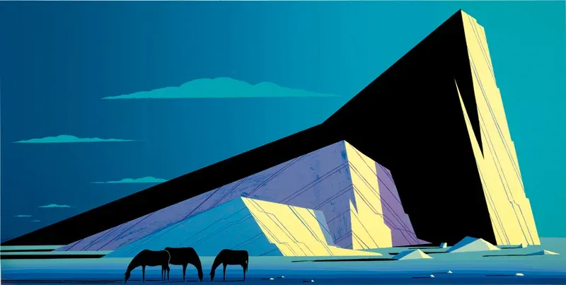
- Eyvind Earle, Three Horses, 1987. Serigraph on paper, 19 × 38 in.
- The composition brilliantly demonstrates Earle's usage of solid black as an active structural property, utilizing dense, stark voids to form the bodies of the horses and the foreground elements, creating high-contrast separation against the geometric mountains.
- © Rights held by the respective copyright holders.
In Three Horses, black claims most of the mountain's face, and it doesn't track cleanly with any single light source, the logic of where the darkness should sit never fully resolves. And yet it works. The mountain isn't menacing here. It's simply monumental, given weight and scale through black rather than through modeled shadow. This is characteristic of how Earle uses black throughout his work: unbound from the physics of observed light, deployed in large, confident blocks wherever a composition calls for weight, drama, presence, or character, whatever that particular moment needs it to be.
This same instinct runs through Disney's output well beyond Earle's own work, and it doesn't always mean the same thing. Chernabog, rising out of the mountain in Fantasia's "Night on Bald Mountain" sequence, is pure black silhouette given monstrous scale, here black does mean danger, threat given form through absence. The Headless Horseman in The Legend of Sleepy Hollow rides the same way, closer to a void than a character, black standing in for menace and mystery both. But Maleficent's dragon in Sleeping Beauty, wings spread black against a black sky, reads differently again, less threat than sheer scale, an immensity too large and too total to be rendered any other way.
Across these examples, black is never doing just one job. Sometimes it's shadow, sometimes it's danger, sometimes it's simply size, a way of making something feel too large, too heavy, too total to exist in ordinary light. What stays consistent isn't the meaning, it's the confidence: figures and forms are allowed to fall completely into black, swallowed rather than shaded, and whatever that black comes to represent, character, scale, threat, weight, it's the artist's choice to make, not a rule light itself imposes.
Light: Temperature and Flood
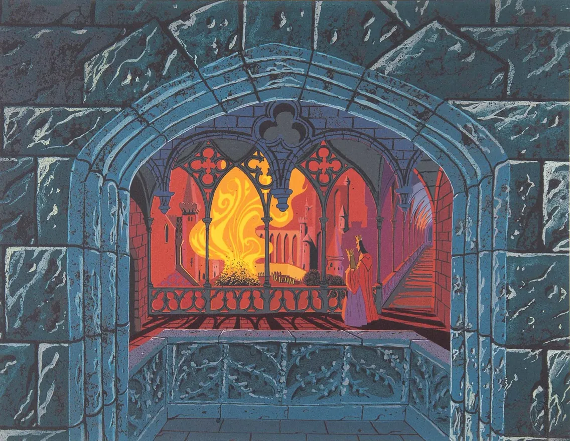
- Eyvind Earle, Burning Spinning Wheels, 1999. Giclée on paper, 20 × 16 in. From The Disney Gallery’s 'Sleeping Beauty Castle Tableaus' series, based on 1957 original production designs.
- The dramatic composition frames the distant fiery landscape through a heavy Gothic stone archway, creating an intense spatial contrast where cool architectural shadow meets an area flooded with blinding, warm light.
- © Rights held by the respective copyright holders.
One of the most striking memories many viewers carry from Sleeping Beauty is how entire rooms feel flooded in warmth or cold, spaces glowing from within while surrounded by night, stone, or shadow. This isn't incidental. As seen in Earle's concept studies, it's a deliberate, foundational feature of how he handles light.
In the image above, the interior chamber is saturated in warm reds and oranges, while the surrounding stone architecture stays deep and cool in blue. The contrast does more than look striking, it communicates the room's emotional temperature. The chamber feels inhabited, alive, heated, not because individual light sources are rendered in detail, but because the entire volume of the space is treated as warm light itself.
Shadow plays an equally important role. Long, directional shadows stretch across the floor and architecture, radiating outward from the fire, and they give that warmth physical force, suggesting heat pushing through the space rather than simply sitting in it.
The scene organizes into distinct tonal zones: cold blue stone, a muted purple transition between interior and exterior, a dominant red flooding the chamber, and the intense yellow-orange core of the fire itself. Each temperature marks its own zone of heat and emotional intensity. Red nearly fills the geometric interior, while the Gothic architecture, arches, columns, stairways, stays in cooler tones as it rises, reinforcing depth, structure, and enclosure.
The staircase arches are a particularly fine touch, staying cool and restrained even as they pass directly through warmer space. A subtle pink near the banister acts as a quiet intermediary between the two temperatures, keeping the composition from collapsing into a single dominant tone. Even the stylized fire itself, ornamental, graphic, alive with motion, stays carefully designed rather than chaotic, a reminder that even Earle's most expressive elements are built with restraint.
Light temperature, flood, and shadow work together here to shape drama. The result feels both theatrical and architectural at once, heated, enclosed, emotionally charged, a clear demonstration of how Earle uses light not simply to illuminate a space, but to define what that space means.
Light: Drama and Narrative
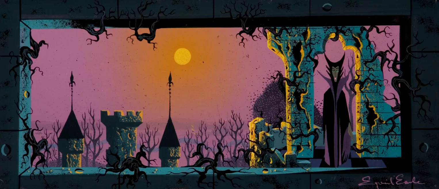
- Eyvind Earle, Maleficent at Dusk Concept Painting for Sleeping Beauty, c. 1953–1958. Gouache and tempera on artist board, 24 × 9.38 in.
- The piece uses lighting to convey the narrative, and drama amplifying the scene’s shifting tone and tension.
- © Rights held by the respective copyright holders.
Rim lighting emerges as a distinctive feature of illustration in the mid-twentieth century, and would go on to become a staple of modern stylized work, eventually nearing an essential role in delivering clear, dramatic visual language. At its core, rim lighting is light catching along the edges of surfaces, creating halos that define form through silhouette rather than fill.
This technique develops as part of a broader visual language forming during the period. Earle was not its inventor, but he clearly embraced it, contributed to its refinement, and demonstrated how powerfully it could be wielded in service of drama.
In the Maleficent concept art above, sunlight grazes the edges of stone, catching corners, bevels, and irregularities, allowing otherwise flat shapes to read as dimensional, angled, and materially present. The light doesn't describe surfaces fully, it hints at their structure and lets the viewer's eye complete the form.
Rim lighting is a dramatic, emotionally charged feature of light on its own, but Earle's broader lighting decisions amplify that drama further. The unnatural, hostile pink sky and the haze around the sun signal moral and environmental corruption, turning light itself into a narrative device rather than a neutral presence.
As a continuation of Earle's mastery of light temperature, the rim light itself runs warm, often a muted gold, while the mass it defines recedes into cool turquoise and blue-green shadow. Warmth isn't asserted directly, it's earned through contrast. The stone feels cold because the light feels precious.
Form, temperature, and emotion are bound together in how Earle wields light. Today, rim lighting has become a foundational element of cinematography, both stylized and live-action film.
Shadows
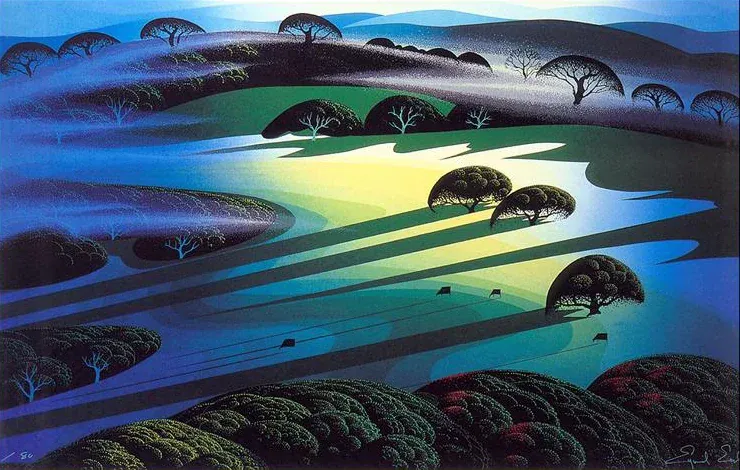
- Eyvind Earle, Silent Meadow, 1990. Serigraph on paper, 26 × 39 in.
- The composition employs dramatic, elongated shadows as prominent geometric shapes, anchoring the landscape's stylized planes while emphasizing Earle's distinct approach to light and structural form.
- © Rights held by the respective copyright holders.
Earle's shadows are rarely obedient. They stretch, exaggerated, reaching across the entire canvas rather than staying close to whatever cast them. Trees throw shadows that run the full width of a scene, as seen above, and the habit extends even to smaller forms, branches, pebbles, anything capable of throwing a line across the ground gets the same treatment. It happens often enough across his work that I read it as a genuine signature, not an occasional flourish.
The effect is almost narrative. The world starts to feel animated in a way that goes beyond the trees and hills themselves, as if the shadow carries its own presence, a character straining to step forward that the composition never quite lets fully into view.
There's a nice tension in how this plays against his verticality elsewhere. Tall, upright trees, so often a defining shape in his landscapes, get striped and cut across by these long horizontal shadows, vertical form and horizontal shadow pulling the eye in two directions within the same image.
His earlier Disney work shows a more classically restrained hand with shadow by comparison, which suggests this later exaggeration isn't incidental. It reads like a tool he came to wield deliberately, a choice made with increasing confidence rather than a habit he simply fell into.
Planes, Bands and Gradients
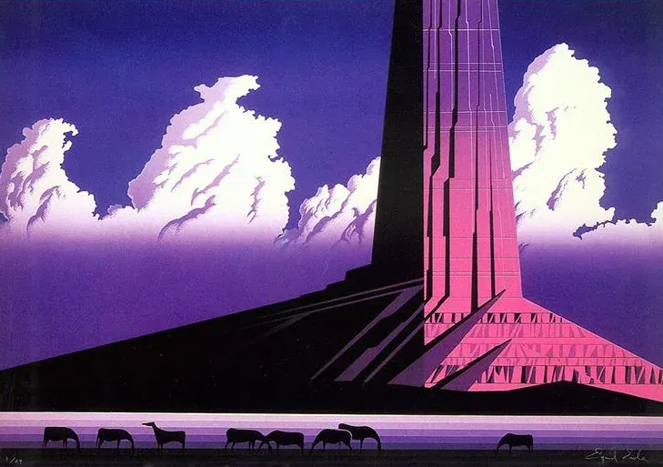
- Eyvind Earle, Purple Monument, 1987. Serigraph on paper, 36 × 24 in.
- The composition demonstrates Earle's masterful usage of sharp color bands, seamless sky gradients, and rigid planar geometry to reduce a colossal rock formation and its cloud environment into a hyper-stabilized, mathematical landscape.
- © Rights held by the respective copyright holders.
Earle returns again and again to a handful of defining visual moves, tools he seems to reach for across mediums and decades. Space gets carved into geometric planes, rigid hard edges, triangulated forms that read more like faceted crystal than observed landscape. Color often breaks into stepped bands, distinct, flattened layers stacked one against another rather than blending smoothly. And running alongside both, gradients: color shifting gradually, almost atmospherically, in direct tension with the hard edges surrounding it. What's striking is how often these seemingly contradictory approaches, rigid geometry, banded flatness, soft gradient, show up together in the same piece, and somehow work.
These aren't narrative devices. They don't carry a literal message or point toward a specific meaning. They function more as a kind of graphic poetry, a way of framing space that shifts how a scene feels without ever quite telling you why.
This piece is a striking example. Its palette stays restrained, pink, purple, and black, and leans hard into that graphic instinct. The black at the base does the work discussed earlier: it renders the mountain monumental, carves its form into clean geometric planes, and sets the silhouettes of the horses against banded color below. Above, multiple gradients run in unison, vertical bands of shifting tone stacked behind the tower's hard-edged geometry.
Every one of these tactics appears here at full intensity, which is what gives the piece its distinctly graphic, almost surreal quality, the same quality that runs through so much of his serigraph work. But the tactics themselves aren't unique to this piece. Subtler versions of the same moves, a stepped band of color here, a quiet gradient there, a plane of hard geometry cutting through an otherwise soft scene, show up throughout Earle's work more broadly. This piece simply pushes each of them as far as they can go.
Figures
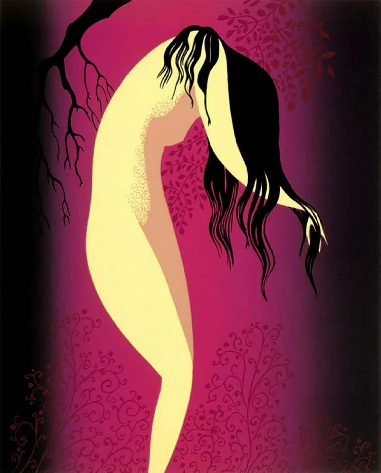
- Eyvind Earle, Deep Crimson, 1988. Serigraph on paper, 8 × 10 in.
- The composition demonstrates a rare integration of figure illustration within his landscape work, rendering a slender female silhouette completely enveloped by delicate, stamped crimson foliage that bleeds natively into a flat, monochromatic background field.
- © Rights held by the respective copyright holders.
Earle's figures follow a consistent stylization across nearly all of his work. They're gracefully elongated, curves and angles pushed and exaggerated within the sensibility of decorative modernism, until the figure reads first as a deliberate shape and only second as an anatomical form. That priority gives them a symbolic weight even outside any narrative context, a body becomes a composition before it becomes a person.
Alone, or set within a larger composition, these figures often function expressively rather than structurally, closer to how a tree or a cresting wave might carry a scene's emotional current than how a character typically anchors a story. In groups, the treatment simplifies further into a shared verticality, an echo of the medieval influence discussed earlier in this essay, bodies stacked and elongated like a procession rather than individuated actors. Faces follow the same logic: reduced to a handful of essential strokes, yet still carrying real charisma, a modern charm drawn from broader mid-century sensibilities even within that restraint.
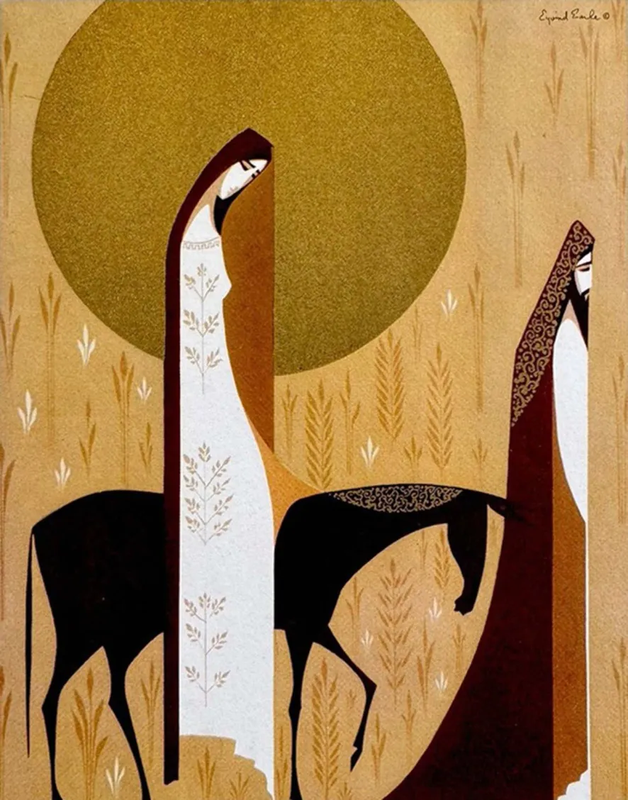
- Eyvind Earle, Mary and Joseph Holiday Illustration, c. 1950s. Offset lithograph on cardstock.
- The illustration demonstrates how Earle approached figures in his religious artwork, utilizing a extreme vertical elongation of form that mirrors Gothic ecclesiastical styles, creating a sharp structural contrast against the flat geometric mass of the background landscape.
- © Rights held by the respective copyright holders.
This elongation reaches its furthest point in his religious work, where figures sometimes stretch to nearly pencil thin. Forms like beards, head coverings, and draped cloth turn almost entirely graphic and geometric, patterned fabric repeating in decorative rhythm until the whole figure takes on a collaged quality, built from layered shapes rather than rendered from observation.
Shading stays largely flat throughout, though Earle occasionally introduces a single hard-edged cel shadow split across a form, and, on rare occasion, a dotted, stippled technique.(Visible in the Deep Crimson image at the start of this section.)
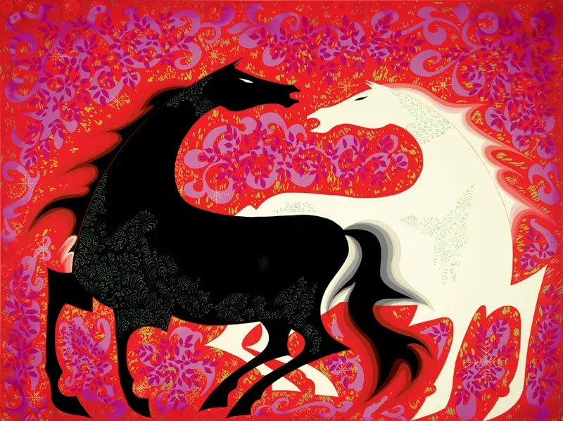
- Eyvind Earle, Two Wild Horses, 1998. Serigraph on paper, 40 × 30 in.
- The composition demonstrates a vibrant variation of Earle's Magic Realism, shifting away from a dark palette to wrap stylized, decorative animal forms in intense red, pink, and yellow hues against a flat, highly saturated background field.
- © Rights held by the respective copyright holders.
His animals follow the same underlying logic. The two horses shown here read like heraldic symbols, black and white in direct confrontation, their forms simplified into bold, opposing silhouettes and dressed in the same dense, repeating pattern he applies to fabric and drapery elsewhere. It's the same visual grammar extended to a different subject. Maleficent's dragon, elsewhere in this essay, falls into this same family of figuration: less a creature rendered with anatomical believability than a shape built for maximum symbolic and graphic force, silhouette and pattern doing the work that detail would otherwise carry.
Many characters fall into solid black.
Storyboarding
Earle's art tends to get taken at face value, admired for its color, its geometry, its sheer visual beauty. That's fair as far as it goes, but it misses something I think matters just as much. Like many of the legendary artists who shaped Disney during this era, Earle's real gift extended beyond how a single image looked, into how well he could tell a story through it. That skill feels genuinely instructive to me, not just for concept art, but for cinematography and environment design more broadly, disciplines that depend on the same instinct: knowing what a frame needs to communicate before a single word is spoken.
I think this is the most underexplored side of Earle. Looking closely at his storyboarding concepts, it becomes clear how deliberately he shaped the film's narrative through his studies, and how many of the most beautiful or most haunting, sequences emerge from these.
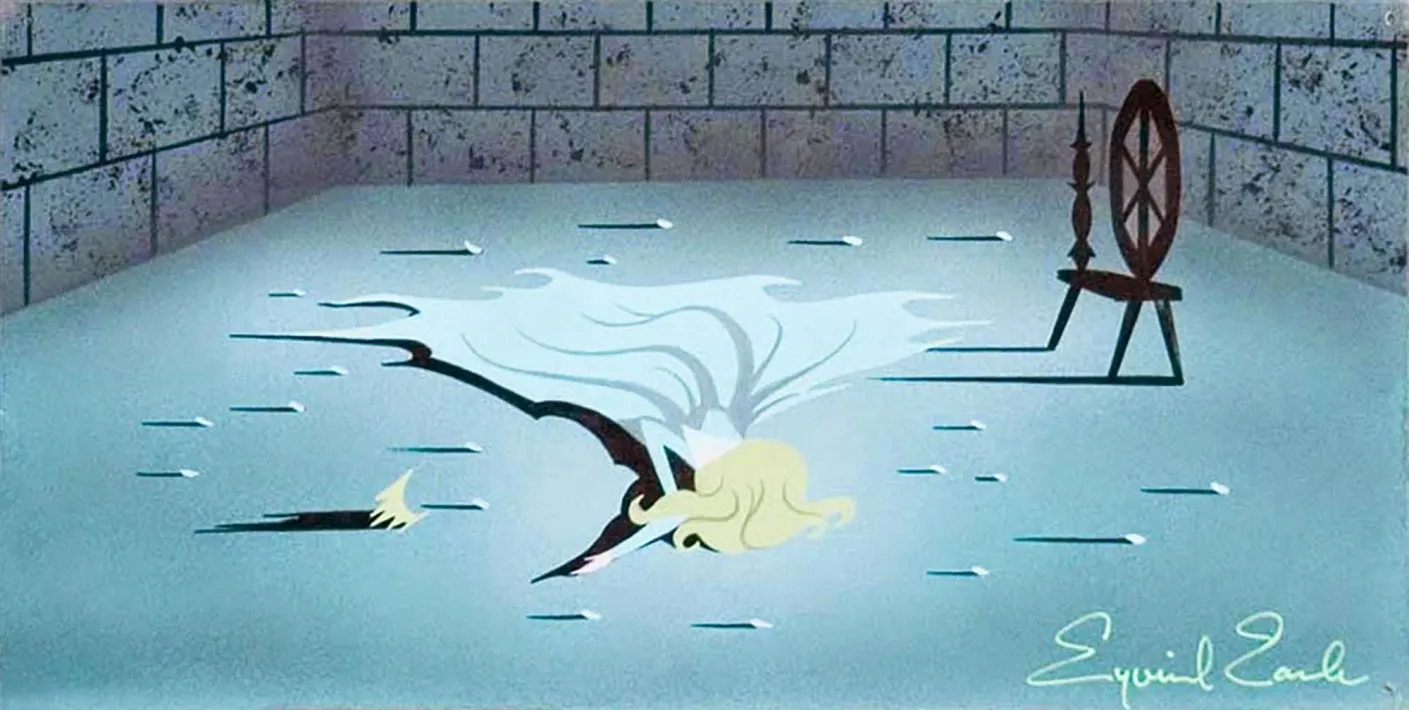
- Eyvind Earle, Princess Aurora at the Spinning Wheel Storyboard Painting for Sleeping Beauty, 1959. Gouache on board, 14.25 × 6 in.
- The frame demonstrates Earle's strategic approach to storyboarding and the communication.
Aurora, stung by the needle, collapses into sleep, and this piece shows Earle uses many of his tools discussed so far in service of a single narrative moment.
His signature long shadows return here, cast even by the scattered pebbles across the floor, tiny, almost incidental details that nonetheless read as if they, too, have gone still, fallen into the same sleep as Aurora, the whole room caught in quiet solidarity with her. Everything shares her stillness except one thing: the spinning wheel, looming at the edge of the frame, upright and untouched, the single element in the room that hasn't succumbed to anything.
Aurora's own shadow breaks from that stillness in as jagged and scythe-like. Her dress, too, has stopped behaving like fabric in repose. It doesn't simply flow, it unravels into disheveled, trailing tendrils, echoed in the same shaded folds gathered at her torso. That same visual language resurfaces later in Maleficent's dragon form, in the shape of her wings, a thread of visual vocabulary for evil and danger that Earle carries across the film.
Her pose still holds the composure of a princess, graceful even in collapse, but the fabric works against her, introducing a tension the pose alone doesn't carry. Muted color, careful, sparse prop placement across an otherwise bare floor, and a soft spotlight isolating her on the ground all reinforce the same mood.
Taken together, this single image shows just how decisively Earle could communicate mood and symbolism at once. It's a strong example of his tactics working in concert, not just building atmosphere, but actually telling a narrative moment through composition, shadow, and symbol alone.
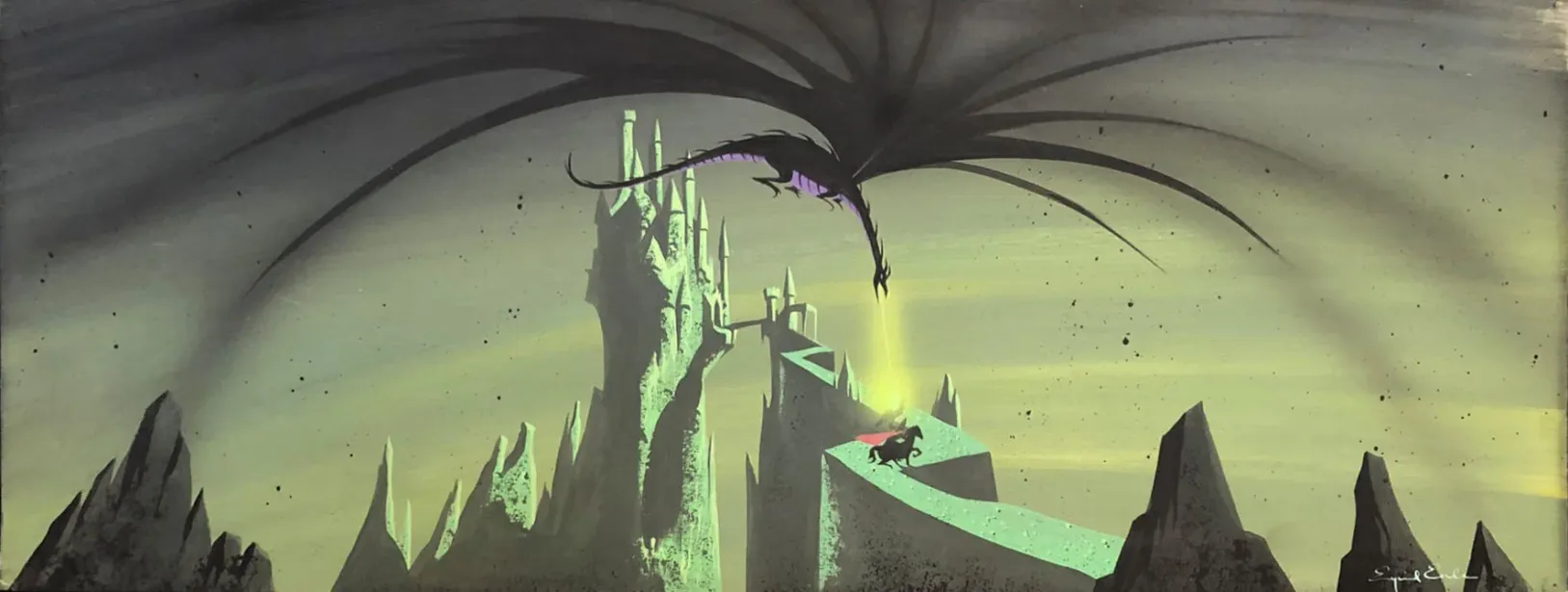
- Eyvind Earle, Prince Phillip Approaching the Forbidden Mountain Concept Painting for Sleeping Beauty, 1959. Gouache on artist's board, 23.5 × 8.5 in.
- The panorama highlights Earle's mastery of storyboarding and narrative communication
- © Rights held by the respective copyright holders.
This piece captures the climax of the film's final confrontation, Maleficent, transformed into her dragon form, diving from above the castle toward Phillip below, and it pulls together nearly every device discussed throughout this essay into a single, decisive image.
The dragon's wings spread black across almost half the frame, wings rendered with the same jagged, tendril-like quality as Aurora's shadow and her disheveled dress in the sleep spell scene, the same visual language of evil carried forward and given its fullest, most literal form. Where in that earlier image the danger was implied through shadow and symbol, here it arrives as the thing itself, wings unfurled directly over the castle like a storm about to break.
The castle beneath is rendered in Earle's familiar decorative modernism, spires and towers reduced to clean, rhythmic verticals, catching a sickly green light that has nothing natural about it. That color choice does real narrative work: this isn't the warm interior glow of the sleep spell scene, it's cold, poisonous, a palette built entirely around threat rather than intimacy.
Phillip, tiny against all of this, rides alone along a narrow path lit by a single shaft of gold, the one warm note in the entire composition, and one of the only sources of scale in the image, everything around him rendered so vast and looming that his size becomes the story. He isn't given detail or expression. He doesn't need it. His scale against the dragon and the mountain says everything the moment requires.
What's striking is how little actually needs to happen for this image to carry full narrative weight. There's no clash yet, no impact, just a dragon descending and a single rider beneath it, and the composition alone tells you everything about the danger of that moment, the imbalance of power, and the fragile courage of riding forward anyway.
Surface, Texture and Physical Properties
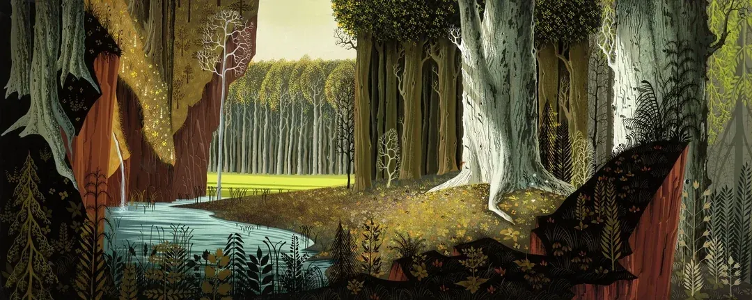
- Eyvind Earle, The Forest Concept Painting for Sleeping Beauty, 1959. Gouache on artist board, 30 × 12.5 in.
- The composition emphasizes Earle's intricate usage of texture, using crisp, repetitive geometric patterns to define the wood grain and foliage rather than relying on atmospheric perspective for environmental depth.
- © Rights held by the respective copyright holders.
Modern 3D production art gives a surface more than just color. A digital asset, a character, a building, a rock, typically carries separate channels controlling properties like roughness or metalness, information that has nothing to do with hue and everything to do with how simulated light behaves once it hits that surface. Two cloths can share the exact same shade of red and still look completely different once lit, one soft and matte like cotton, the other sharp and reflective like silk, because roughness and color are handled as entirely separate decisions.
Earle, working by hand decades before any of this software existed, seems to have understood the same principle instinctively. It's as if he had access to his own analog version of a roughness channel, a tube of guache filled with roughness that he could mix directly into his paint, deciding surface by surface how each one should catch or resist light.
Some elements he renders rough: tree trunks, certain stones, textures built up until they feel tactile, almost dimensional despite sitting on a flat painted surface. Others he leaves completely flat, untouched by any implied physical property at all, no texture, no light interaction, simply color holding its shape. What's notable is that he'll do both within a single canvas, rough and flat sitting side by side, and the contrast doesn't read as inconsistency, it reads as intentional hierarchy, telling the eye which surfaces matter and which ones are meant to recede.
In simpler, more minimal compositions, this shows up mostly through the conflict between light and shadow. The scene's dominant light catches the edges of rocks, while black recedes into every crease and crevice, and the ground gets speckled with dark flecks that suggest roughness without ever fully rendering it. In more detailed pieces, that same instinct extends further, into fuller, more built-out surface rendering that pushes close to realism, visible in the bark of the trees shown here, individual ridges and grooves picked out with real specificity.
Elsewhere, Earle reaches for a different, more playful technique entirely: stamping. Rather than rendering a surface directly, he'll build texture out of small, repeated marks, ideal for something like a field of leaves, or thick grass, or scattered flowers, where a fully rendered, individually detailed surface would be neither practical nor desirable. It's a different tool solving the same underlying problem, giving the eye a sense of density and material without describing every leaf or blade individually. Bark gets rendered. A meadow gets stamped. Both are surface, both carry texture, but each is built through a completely different hand.
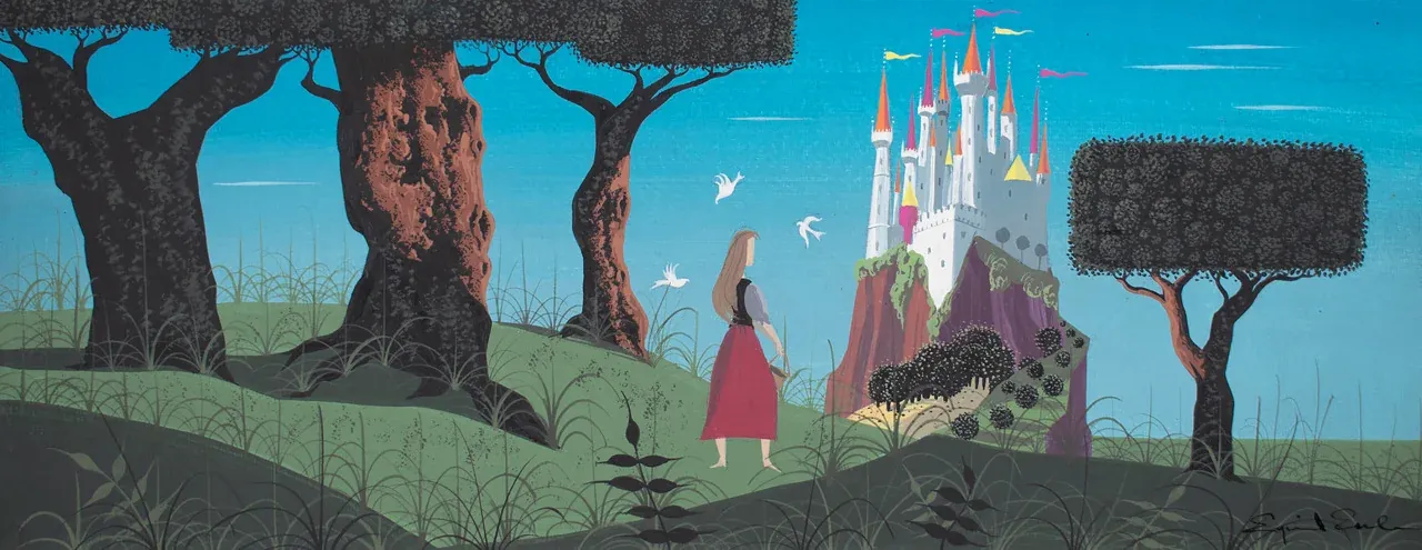
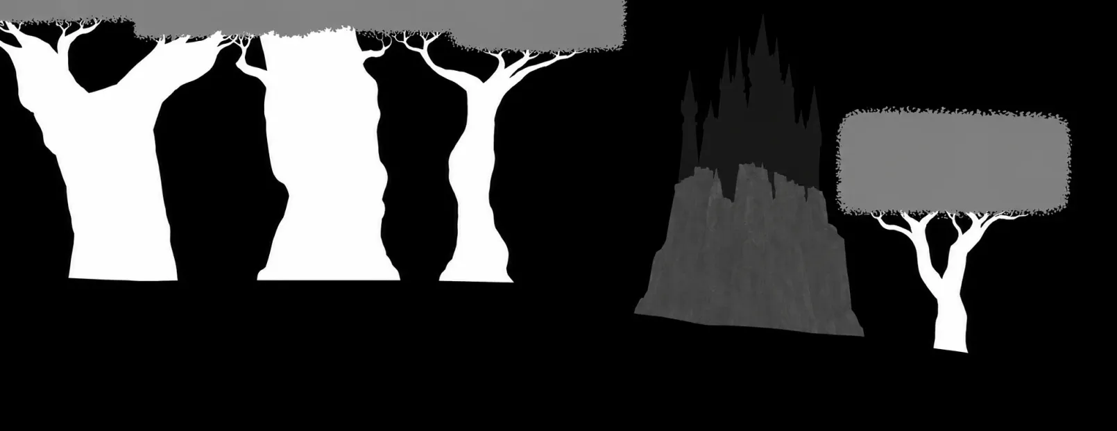
- Eyvind Earle, “Daytime Castle from the Forest” (Briar Rose) Concept Painting for Sleeping Beauty, 1959. Gouache on illustration board, 21.25 × 8.5 in.
- The panorama demonstrates Earle's delicate balancing of flat and textured surfaces, contrasting the smooth, unblemished planes of the distant castle and horizon against the intricate, highly textured bark and boxy foliage patterns of the immediate forest.
- © Rights held by the respective copyright holders.
Composition
Lorem ipsum dolor sit amet, consectetur adipiscing elit, sed do eiusmod tempor incididunt ut labore et dolore magna aliqua. Ut enim ad minim veniam, quis nostrud exercitation ullamco laboris nisi ut aliquip ex ea commodo consequat. Duis aute irure dolor in reprehenderit in voluptate velit esse cillum dolore eu fugiat nulla pariatur. Excepteur sint occaecat cupidatat non proident, sunt in culpa qui officia deserunt mollit anim id est laborum.
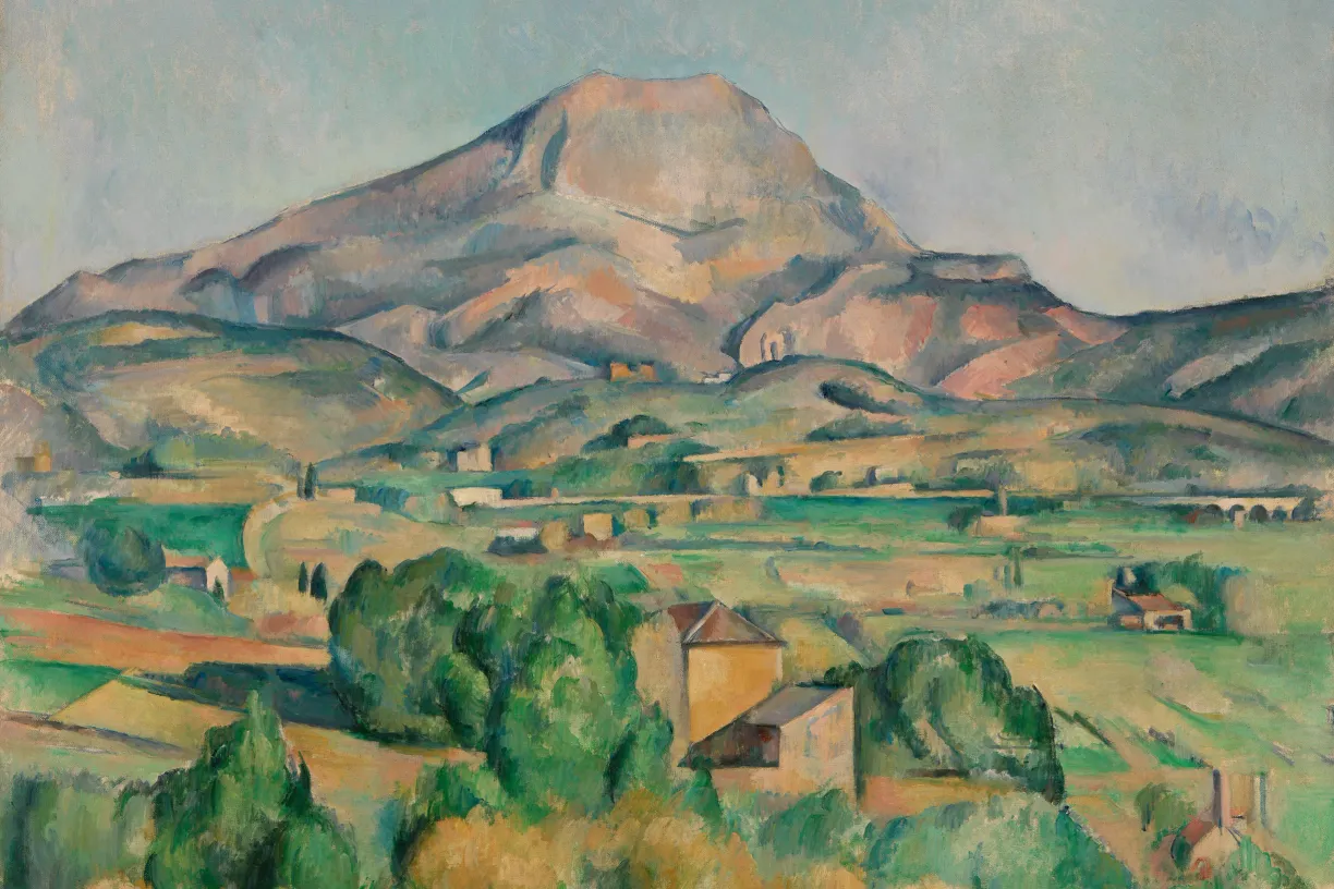
- Paul Cézanne, Mont Sainte-Victoire seen from Bellevue, c. 1885–1895. Oil on canvas, 73 × 92.5 cm. The Barnes Foundation, Philadelphia.
Lorem ipsum dolor sit amet, consectetur adipiscing elit, sed do eiusmod tempor incididunt ut labore et dolore magna aliqua. Ut enim ad minim veniam, quis nostrud exercitation ullamco laboris nisi ut aliquip ex ea commodo consequat. Duis aute irure dolor in reprehenderit in voluptate velit esse cillum dolore eu fugiat nulla pariatur. Excepteur sint occaecat cupidatat non proident, sunt in culpa qui officia deserunt mollit anim id est laborum.
Prospect
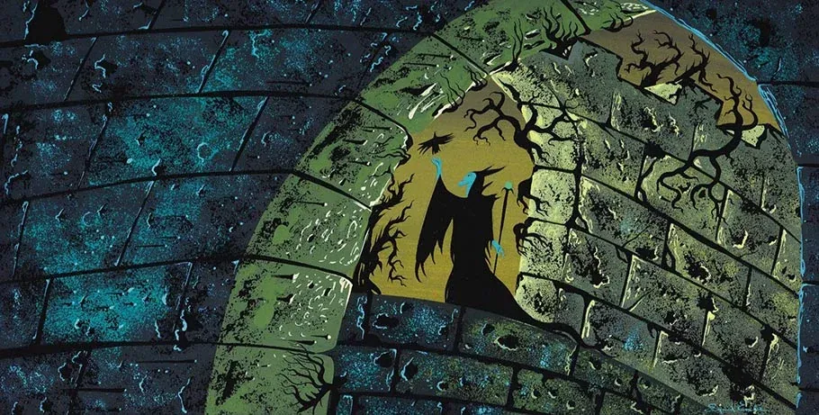
- Eyvind Earle, Maleficent in the Castle Window Concept Painting for Sleeping Beauty, 1959. Gouache on illustration board, 11.5 × 5 in.
- The color key composition highlights an ominous silhouette framed by stone architecture, demonstrating Earle's use of flat geometric windows and high-contrast values to direct visual focus within a restricted space.
- © Rights held by the respective copyright holders.
In this composition, Maleficent stands framed within a series of stone archways, and the space behind her doesn't resolve into a single coherent structure so much as it layers, wall behind wall behind wall, in a way that feels almost paradoxical, closer to an Escher print than an architectural plan. The eye keeps traveling backward through distinct spaces, each one its own environment, nested inside the last.
There's an architectural term for this: prospect, a long, controlled view carried through a succession of spaces, one framing the next. It's a technique used less often in fine art than in actual building design, but the underlying idea, looking through a sequence of spatial thresholds, each distinct from the last, recurs constantly across art history. It shows up throughout International Gothic painting, where artists regularly framed a scene by peering through a massive arch into the space beyond it. It appears across Eastern art. It's a defining structural device of the Renaissance. The device of the framing archway on the boundary of the canvas has largely fallen out of fashion as painting has moved into the modern era, but the core idea, depth built from threshold after threshold rather than a single continuous space, remains a powerful tool wherever it's used. Even beyond modern fashion Earle potentially would have evoked it for the gothic language he was borrowing from for Sleeping Beauty.
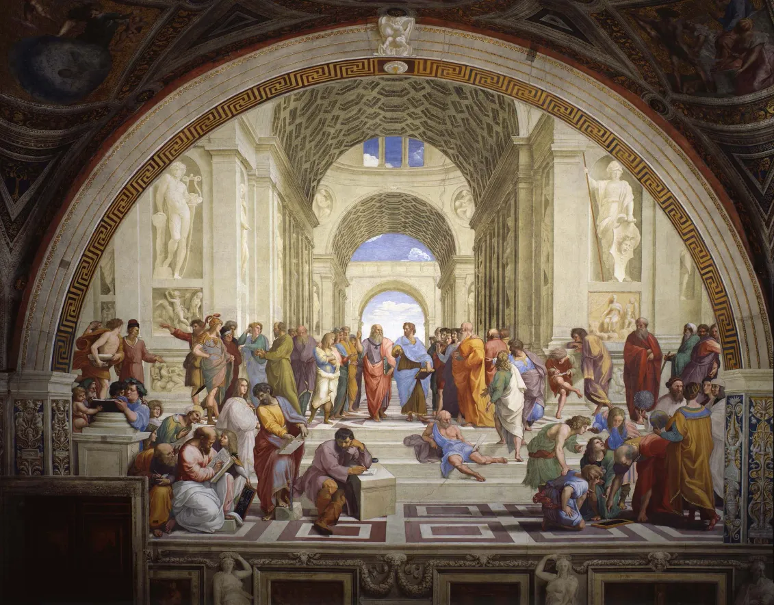
- Raphael, The School of Athens, 1509–1511. Fresco, 500 × 770 cm. Stanza della Segnatura, Palazzi Pontifici, Vatican City.
- The Renaissance masterpiece utilizes a rigorous three-dimensional mathematical linear perspective that stands as a stark stylistic antithesis to the flat, tapestry-like stacked horizons preferred by Eyvind Earle.
- © Rights held by the respective copyright holders.
Raphael's School of Athens is a strong example of exactly this. Its perspective compresses space slightly, giving the whole scene a staged, almost theatrical quality, while still pulling the viewer steadily backward through a sequence of steps, each one revealing an entirely new layer of space beyond it. I've chosen this piece specifically because of how closely it echoes Earle's composition, and because it captures something interesting about what Earle is doing here: a structured, distinctly Renaissance device, filtered through and reshaped by the logic of decorative modernism. Even the pose feels connected. Maleficent's gesture carries something of the same rhetorical quality found in Raphael's philosophers, figures caught mid-argument, mid-thought, their bodies used to communicate meaning as much as their expressions do.
Light tells much of the same story in both pieces, pointed in opposite directions. Raphael's philosophers occupy a bright, evenly lit chamber built from pale stone, open and rational. Maleficent occupies the inverse: a cold, dark, thorn-choked sequence of tightening caverns, with a poisonous twilight standing in for Raphael's open, optimistic sky. Where his architecture invites the eye outward into light and clarity, hers closes in, threshold after threshold, towards a noxious glow.
Spatial Compression
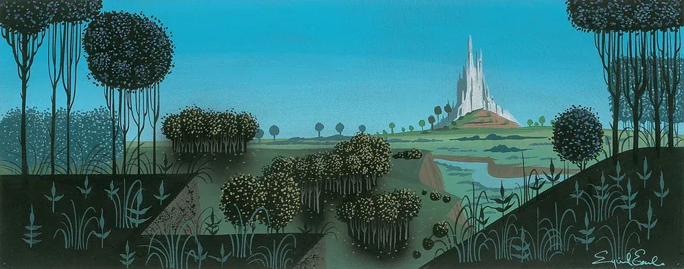
- Eyvind Earle, The Castle Concept Storyboard Painting for Sleeping Beauty, c. 1953–1958. Gouache on board, 14 × 5.5 in.
- The panorama demonstrates Earle's aggressive vertical compression of the perspective, where the receding planes of the hills and the distant fortress are flattened and stacked tightly upward, removing any illusion of real atmospheric recession.
- © Rights held by the respective copyright holders.
This piece shows a mode Earle moves into often, especially around Sleeping Beauty, though never as a hard rule he applies uniformly. There's a flatness here, in the verticality, in how objects are placed relative to one another, as if the scene isn't fully obeying the rules of single-point perspective. This is spatial compression: the collapsing or flattening of depth so that near and far objects sit closer together on the picture plane than optical realism would dictate. It's a long-standing device in fine art, especially prominent in ancient and medieval traditions, where meaning and hierarchy often mattered more than accurately measured space.
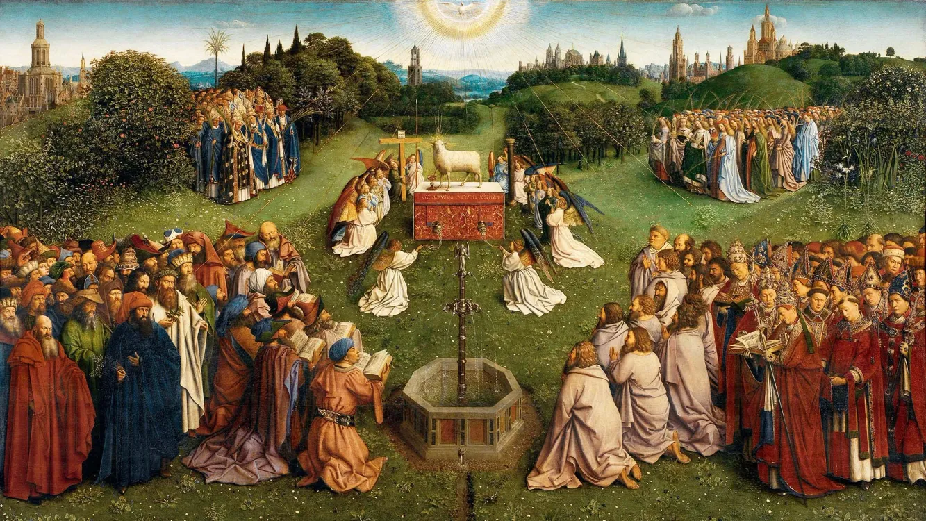
- Hubert and Jan van Eyck, The Adoration of the Mystic Lamb, lower central panel of the Ghent Altarpiece, c. 1425–1432. Oil on panel. St. Bavo's Cathedral, Ghent.
- The lower panel depicts a sprawling, idealized heavenly landscape reminiscent of the visual language Earle chose for his Sleeping Beauty concepts, prioritizing a tapestry-like accumulation of rich environmental details and miniature botanical features on stacked planes.
- © Rights held by the respective copyright holders.
To understand what compression actually does to an image, it helps to look at a clear historical example. In the Ghent Altarpiece, background elements, distant hills, trees, city spires, sit at a scale and clarity that would be impossible if the painting were obeying strict atmospheric and linear perspective. Distant forms don't fade or shrink the way the eye expects. Everything stays legible, everything stays present, because the space has been compressed toward the picture plane rather than receding naturally into it. The effect is to flatten the hierarchy between foreground and background: nothing recedes into unimportance, everything remains part of one continuous, readable surface.
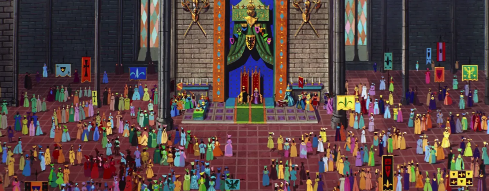
- Sleeping Beauty, 1959. Film still, Walt Disney Animation Studios.
- The grand throne room frame demonstrates a strict vertical compression of perspective, where the massive gathering of courtiers is organized into flattened, stacked horizontal registers that ascend up the canvas to emphasize the royal podium rather than receding into deep space.
- © Rights held by the respective copyright holders.
This same instinct appears, more subtly, in quite a few of Earle's compositions (fig. ??), and this frame from the finished film is a clear example. The vertical compression is gentler here than in the concept painting above, but the unusual, elevated overhead perspective still pushes it into view: figures in the background sit fully above characters in the foreground rather than receding behind them at a natural scale.
This is a rich image to study for more than just its compression. The color work, the perspective choice, the sheer storytelling packed into a crowd scene like this, all reward attention, as does the intricate charm of the assembled court itself, set against strong shapes like the tall orange banners, the gridded floor, the columns, the stained glass. There's an interesting echo here of Earle's forest scenes too: the banners and columns reading almost like trees, the crowd itself like foliage or undergrowth, densely patterned and rhythmic. It's a quiet symmetry worth noticing across the film as a whole, court and forest built from the same underlying visual logic.
- Sleeping Beauty, 1959. Film still, Walt Disney Animation Studios.
- The grand throne room frame demonstrates a strict vertical compression of perspective, where the massive gathering of courtiers is organized into flattened, stacked horizontal registers that ascend up the canvas to emphasize the royal podium rather than receding into deep space.
- © Rights held by the respective copyright holders.
This piece shows a more restrained version of the same language. In Earle's quieter, more grounded compositions, spatial compression often shows up subtly, small shifts between foreground and background rather than a dramatic flattening. As a viewer, I read it as a kind of mid-century modern wit, a playful defiance of strict optical accuracy rather than a technical limitation. Compression, for Earle, isn't a fixed setting. It's a dial he turns up or down depending on what a given piece needs.
Horizontal compression is a harder effect to reason about and point to with confidence, since it's less visually legible than vertical compression, but I believe Earle reaches for it in places as well (fig. ??), objects and forms pulled closer together along the horizontal plane than distance alone would suggest.
Directional Emphasis
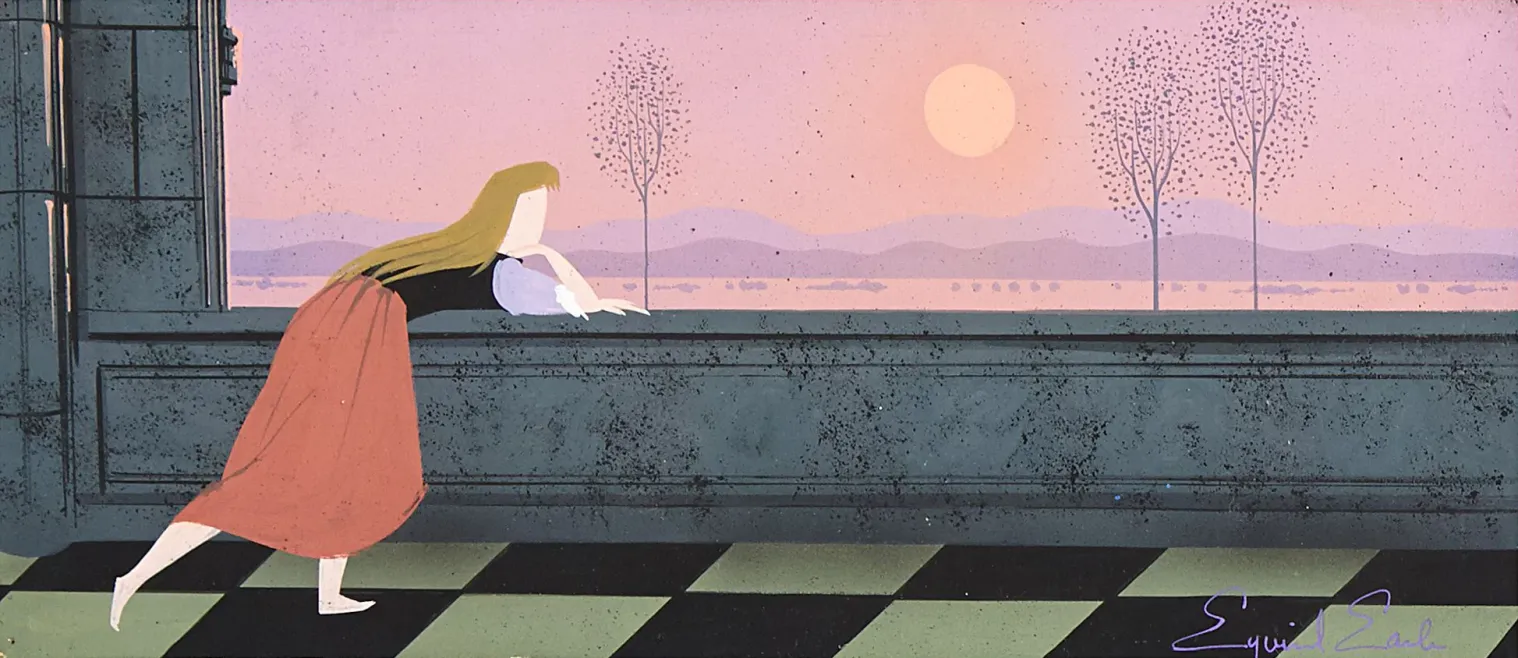
- Eyvind Earle, Briar Rose Looking over the Landscape Concept Painting for Sleeping Beauty, 1959. Gouache on illustration board, 7 x 15 in.
- The panoramic frame demonstrates Earle's approach to figure illustration, fluidly embedding Briar Rose's silhouette to emphasize sweeping motion and organic form against the rigid, geometric grid of the checkered floor and stylized vertical background trees.
- © Rights held by the respective copyright holders.
A number of Earle's canvases organize themselves around a single, dominant directional form, horizontal or vertical, with the rest of the composition built to serve that one axis. In this piece, the long stone balustrade stretches nearly the full width of the frame, and everything else, the figure, the sky, the bare trees, arranges itself in support of that horizontal pull rather than competing with it.
The same instinct shows up vertically elsewhere in his work, often through his stretched, elongated figures, which can turn a single character into a tall, upright form anchoring an entire composition. Even without a literal object present, Earle often creates the feeling of a long passageway or walkway simply through implication. Applied horizontally, as it is here, that directional pull tends to carry a quiet, specific mood, something between loneliness and tranquility, a single figure moving along a long, open line with the rest of the world receding to either side.
Surrealism
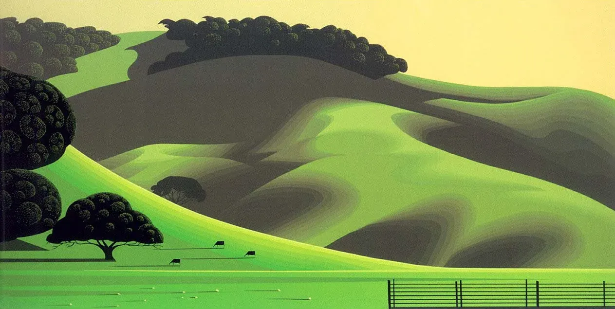
- Eyvind Earle, Soft Green Meadows, 1992. Serigraph on paper, 30 × 15 in.
- The panorama demonstrates the deep, mystical surrealness of Earle's landscapes, turning pastoral grazing hills and cattle into mathematically stylized waves of color that sit beneath an eerie, unnaturally glowing pale yellow sky.
- © Rights held by the respective copyright holders.
Lorem ipsum dolor sit amet, consectetur adipiscing elit, sed do eiusmod tempor incididunt ut labore et dolore magna aliqua. Ut enim ad minim veniam, quis nostrud exercitation ullamco laboris nisi ut aliquip ex ea commodo consequat. Duis aute irure dolor in reprehenderit in voluptate velit esse cillum dolore eu fugiat nulla pariatur. Excepteur sint occaecat cupidatat non proident, sunt in culpa qui officia deserunt mollit anim id est laborum.
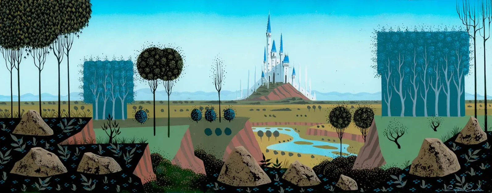
- Eyvind Earle, Castle on a Hill Panoroma Concept Painting for Sleeping Beauty, 1959. Gouache on illustration board, 24 × 9.375 in.
- © Rights held by the respective copyright holders.
Lorem ipsum dolor sit amet, consectetur adipiscing elit, sed do eiusmod tempor incididunt ut labore et dolore magna aliqua. Ut enim ad minim veniam, quis nostrud exercitation ullamco laboris nisi ut aliquip ex ea commodo consequat. Duis aute irure dolor in reprehenderit in voluptate velit esse cillum dolore eu fugiat nulla pariatur. Excepteur sint occaecat cupidatat non proident, sunt in culpa qui officia deserunt mollit anim id est laborum.
Dioramas and Impossible Space
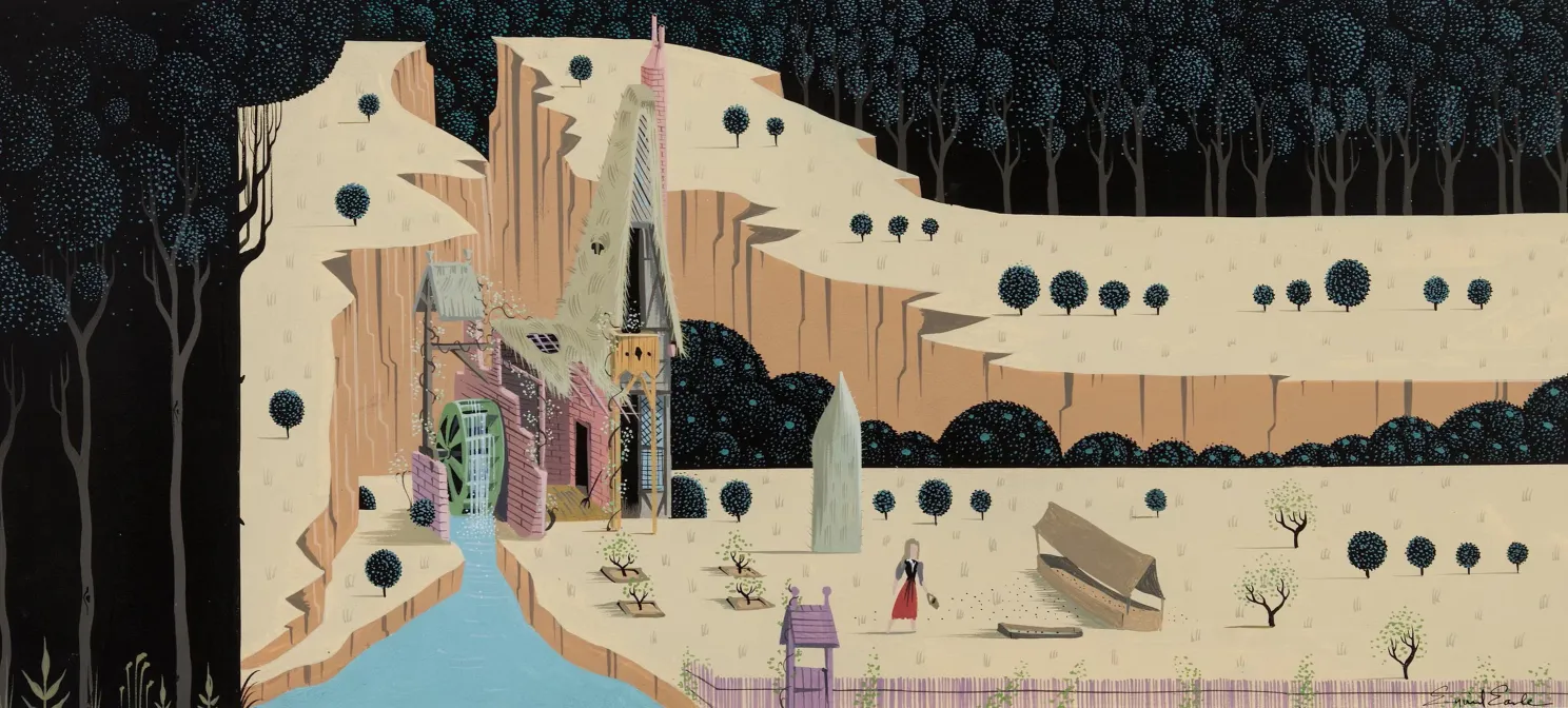
- Eyvind Earle, The Woodcutter's Cottage Concept Painting for Sleeping Beauty, 1959. Gouache and tempera on illustration board, 23 × 9 in.
- The widescreen panorama demonstrates Earle's diorama-like composition style, framing the deeply textured cottage within a flat, meticulously layered foreground and background to establish a self-contained storybook environment.
- © Rights held by the respective copyright holders.
Lorem ipsum dolor sit amet, consectetur adipiscing elit, sed do eiusmod tempor incididunt ut labore et dolore magna aliqua. Ut enim ad minim veniam, quis nostrud exercitation ullamco laboris nisi ut aliquip ex ea commodo consequat. Duis aute irure dolor in reprehenderit in voluptate velit esse cillum dolore eu fugiat nulla pariatur. Excepteur sint occaecat cupidatat non proident, sunt in culpa qui officia deserunt mollit anim id est laborum.
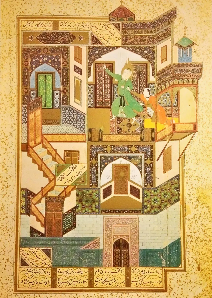
- Kamāl ud-Dīn Behzād, “The Seduction of Yusuf,” folio 52b, from Saʿdi's Būstān, 1488. Opaque watercolor, ink, and gold on paper, 30.5 × 21.6 cm. National Library and Archives of Egypt, Cairo.
- The masterpiece demonstrates multiple viewpoint compositions and vertical compression, fracturing the palace architecture into shifting geometric angles to simultaneously track Yusuf fleeing through seven locked doors while stacking the multi-tiered chambers upward to flatten three-dimensional depth.
- © Rights held by the respective copyright holders.
Impossible spaces, essentially a composite of multiple viewpoints composited into a single image, making a paradoxical escher-like spcae.
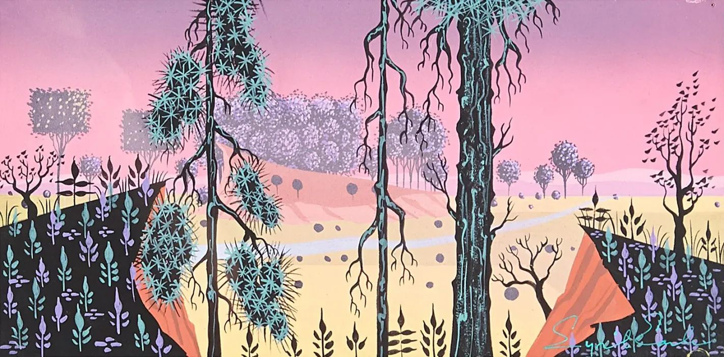
- Eyvind Earle, “Jewel Forest” Concept Painting for Sleeping Beauty, c. 1953–1958. Gouache and cel-vinyl on heavy illustration board, 6 x 12 in.
- The panorama demonstrates Earle's more patterned, structured compositions, where the landscape is organized into rigid, repetitive vertical registers.
- © Rights held by the respective copyright holders.
Directorship & Production Assets
Nearly everything discussed so far in this analysis has come from Earle's concept art and personal paintings, work made quickly, often loosely, in service of establishing an idea rather than finishing one. But Earle didn't stop at concept work on Sleeping Beauty. He personally painted the majority of the film's key backgrounds himself, and in many cases, those finished backgrounds are direct, near one-to-one translations of the concept paintings that preceded them.
That distinction matters here. The concept work this essay has leaned on shows Earle thinking, fast, exploratory, often minimal. The final backgrounds show something different: Earle finishing. They reveal a register of rendering and artistry the concept paintings alone don't fully demonstrate, more built-out detail, more sustained control, a level of finish that took, by some accounts, as long as ten days per painting where a typical Disney background might take one.
What follows is a small selection of those finished backgrounds, to suggest Earle's range of rendering and artistry and to solidify a connection between Earle's visual concept art and the final output of the film itself as a director.
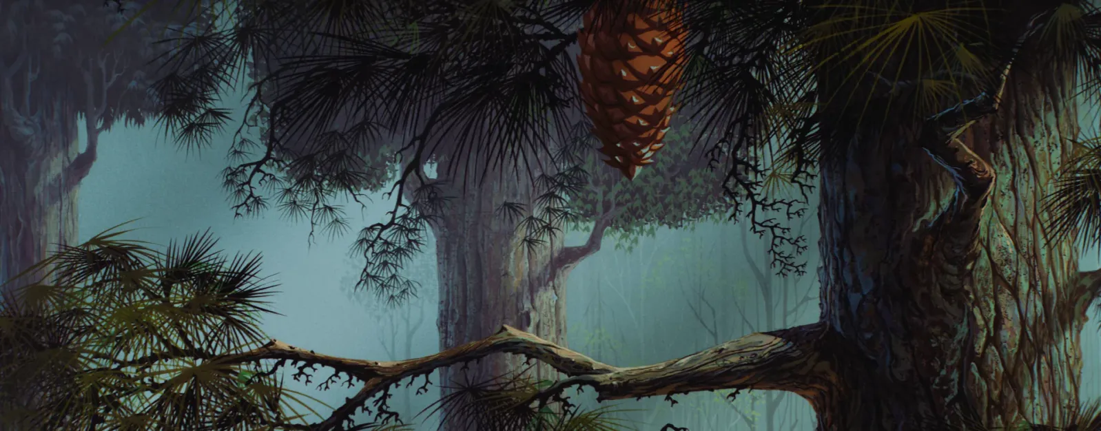
- Walt Disney Studio Artists, Forest Production Background for Sleeping Beauty, 1959. Gouache and cel-vinyl on heavy illustration board.
- The hand-painted master background demonstrates how Earle's language translated into the production phase of the film, as background painters meticulously emulated his distinct, angular aesthetic and sharp graphic trees across a dense forest landscape.
- © Rights held by the respective copyright holders.
This image shows the final rendering quality of what actually appeared on screen, and it's still unmistakably in Earle's compositional language, carrying forward the same features found in his most fully rendered concept pieces. I can't say with certainty what the full production process looked like, but based on available accounts, Earle was likely responsible for the great majority of this hand-painted work himself. The forest sequences were built from many backgrounds like this one, rougher, more textural, still whimsical and imaginative in spirit, but pushed to a stronger level of detail. Notably, the stamped, repeated patterning seen elsewhere in his work is largely set aside here in favor of individually rendered detail, bark, needles, and undergrowth built up piece by piece rather than suggested through repetition.
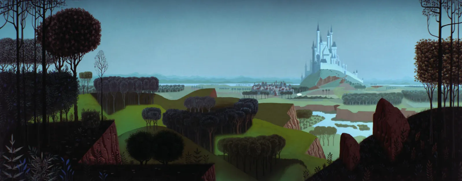
- Walt Disney Studio Artists, King Stefan's Castle Production Background for Sleeping Beauty, 1959. Gouache and cel-vinyl on heavy illustration board.
- The panorama demonstrates how Earle's language translated into the production backgrounds of the film, showcasing how his personal design guides—defined by strict color palettes and interlocking flat planes—were faithfully reproduced by layout painters to construct a grand storybook environment.
- © Rights held by the respective copyright holders.
I've included this piece because it corresponds almost exactly to the concept painting shown earlier in this essay (fig. ??). The composition is close to identical: the same vertical compression, the same geometric hills, the same surreal, decoratively branched trees. It's strong proof that much of Earle's original concept work made it into the film essentially unchanged. Worth remembering here: animation in this era worked largely by panning and zooming a camera across a fixed background, with painted characters on transparent cels layered on top. Backgrounds like this one weren't incidental scenery, they carried enormous screen time and had to do most of the visual work in any given shot.
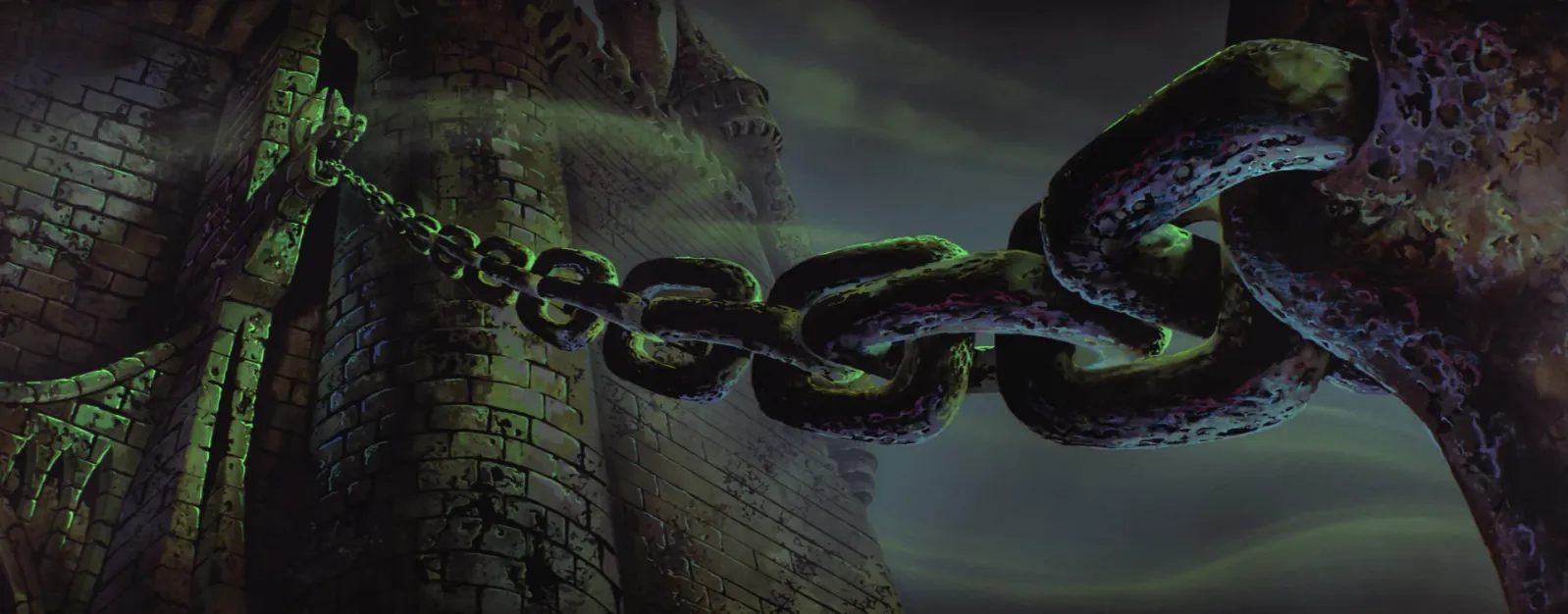
- Walt Disney Studio Artists, Forbidden Mountain Entrance Production Background for Sleeping Beauty, 1959. Gouache and cel-vinyl on heavy illustration board.
- The master background demonstrates how Earle's concept art and style to express the Maleficent theme is conveyed in the final background paintings used in the film, relying on menacing, jagged stone formations, aggressive thorns, and an eerie, sickly green sky palette.
- © Rights held by the respective copyright holders.
This piece shows the same transformation from concept to final render, now applied to Maleficent's domain. The rough stone, the sinister green and yellow glow associated with her presence throughout the film, both carry over directly from Earle's concept work, but here they're rendered with far more polish. The underlying technique stays consistent, roughness suggested through broken shadow and interrupted rim light, but everything is more detailed, more resolved, clearly built with far more time than a concept sketch would receive.
Seeing these finished backgrounds together, what stands out most is how well they'd still hold up in a modern production. They represent a genuinely different register of Earle's artistry, the same visual instincts, given the time and resolution to be fully realized. One caveat is worth stating plainly: we don't have a complete account of exactly how many hands touched these final paintings, and it would be inaccurate to claim Earle worked entirely alone on every one of them.
V. Echoes
What follows is a collection of places I've found Earle's visual style echoing into the future. Some are known inspirations, artists who've named him directly as a reference point. Others are things that remind me of his work, where I can't claim to know if the connection is intentional, only that I see it. This is an exploration of the places I've found echoes of his legacy.
Modern Inspiration

- Elioli Art, Eyvind Earle Style Painting, 2026. Digital painting in Procreate.
- https://www.youtube.com/watch?v=4YlNCvYYbJc
- Included to show a modernized inspiration of Earle's legacy, this video still translates his signature shape language, rigid forest verticality, and high-contrast value structures into the digital tools and stylistic sensibilities of the next century.
- © Rights held by the respective copyright holders.
I came across this piece by Elioli Art (elioliart.net) while researching for this essay, a Procreate tutorial built around a painting made in direct homage to Eyvind Earle. Procreate is a digital painting app popular among illustrators and animators It's a clear example of an accomplished artist working in imitation. From circa 2020, it shows decades on how much of Earle's style can still carry forward: some elements persist almost unchanged, others soften into more contemporary sensibilities and popular tastes. The homage is obvious and thoughtfully explored, and the piece itself is genuinely beautiful, unmistakably communicating Earle even at a glance.
It's worth noting this is digital work, a medium that would likely have suited Earle well. Watching the process, the stamped patterns and tiled textures, both very modern digital techniques, sync naturally with the way Earle handled texture and pattern in his own paintings. As a traditional artist working primarily in gouache, Earle had to build those same effects by hand, layering and repeating by eye rather than by tool. Seeing the same visual instinct achieved through digital means makes for a nice study in both continuity and advancement, the underlying eye is the same, only the technology has changed.
Elioli Art focused on several features that read as distinctly Earle: the verticality of the trees, a recurring trope across his paintings, the texture built into the bark and canopy, the patterning of the grass, and a loneliness to the long horizontal space beneath the trees, all reminiscent of Earle's compositions. The branches on the trees also called to mind his later serigraph work. The overall feeling, that storybook quality, that sense of quiet magic, comes through fully intact.
Hiroo Isono
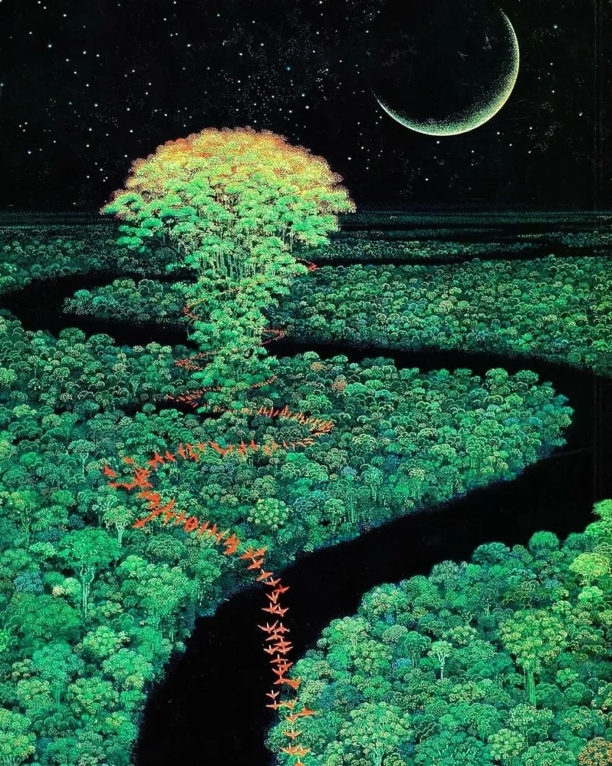
- Hiroo Isono, “Secret of Mana” Key Visual Illustration, 1993. Acrylic on paper.
- Included to demonstrate a comparison to Earle's surreal landscapes, the composition rejects traditional spatial recession by stacking rows of dense jungle trees, mirroring his use of stamped, patterned foliage and repetitive geometric shapes to construct environmental textures.
- © Rights held by the respective copyright holders.
Hiroo Isono is a Japanese artist I've written about before, one I find deeply inspiring in his own right. Active roughly from the early 1990s through the 2000s, he worked as visual director on a major franchise for a production studio, in some ways a close parallel to Earle's role on Sleeping Beauty. His entire body of work centers on one subject: forests.
I see many similarities in approach. Both share a dense, rhythmic patterning, verticality that dominates the frame, a compression of depth, and a surreal charge to their nature, stylized to something closer to myth.
Cyberpunk: Edgerunners

- Hiroyuki Imaishi (Dir.), Adam Smasher Silhouette, Screenshot from Cyberpunk: Edgerunners, episode 10, 2022. Studio Trigger / Netflix.
- The frame synthesizes Earle's environmental design tenets into contemporary digital animation, utilizing dramatic rim lighting to separate sharp, geometric silhouettes from atmospheric, light-pierced backdrops.
- © Rights held by the respective copyright holders.
I found the art direction of Cyberpunk: Edgerunners to be higly reminiscent of this era of Disney where Earle was at the helm. A completely different era and pace of production made it an interesting connection for me to study.
Rim Light of a decisive red, suggesting industrial heat, violence, and technological brutality adorn the villain. Jagged, hard-edged forms are assigned an allegiance through this color, and become emotional, and dangerous. This is identical to the way Earle's concepts around Maleficient work. Her world is a poisonous green and gold surrounded in jagged bramble and thorn, and simplified sharp geometric hard rocks.

- Hiroyuki Imaishi (Dir.), Adam Smasher vs. Rebecca, Screenshot from Cyberpunk: Edgerunners, episode 10, 2022. Studio Trigger / Netflix.
- The frame proposed a similar approach to storyboarding and narrative.
- © Rights held by the respective copyright holders.
The second connection is more specific. In one climactic sequence, a towering armored figure crushes a smaller one beneath it, and the staging carries an unmistakable echo of the confrontation between Phillip and the dragon: the drama, the buildup, the way motion is directed toward a single devastating instant. It's a structural echo more than a visual one.
I find it fascinating how effectively this show a continuity of the visual grammar of this era of Disney, echoing a language built for a medieval fantasy storybook transcribed it into a brutal, violent, futuristic world.
Metroidvania Genre
One of Earle's recurring storyboarding techniques is a strictly horizontal reading of space, as if the viewer is locked to a single pathway a character is confined to move along. He returns to this often in large confrontations: protagonist on one side, antagonist on the other, nothing but a single road between them. It's a composition that wouldn't be formally named and codified for decades, but it's unmistakably the visual grammar of the platformer, and more specifically, of the boss battle.
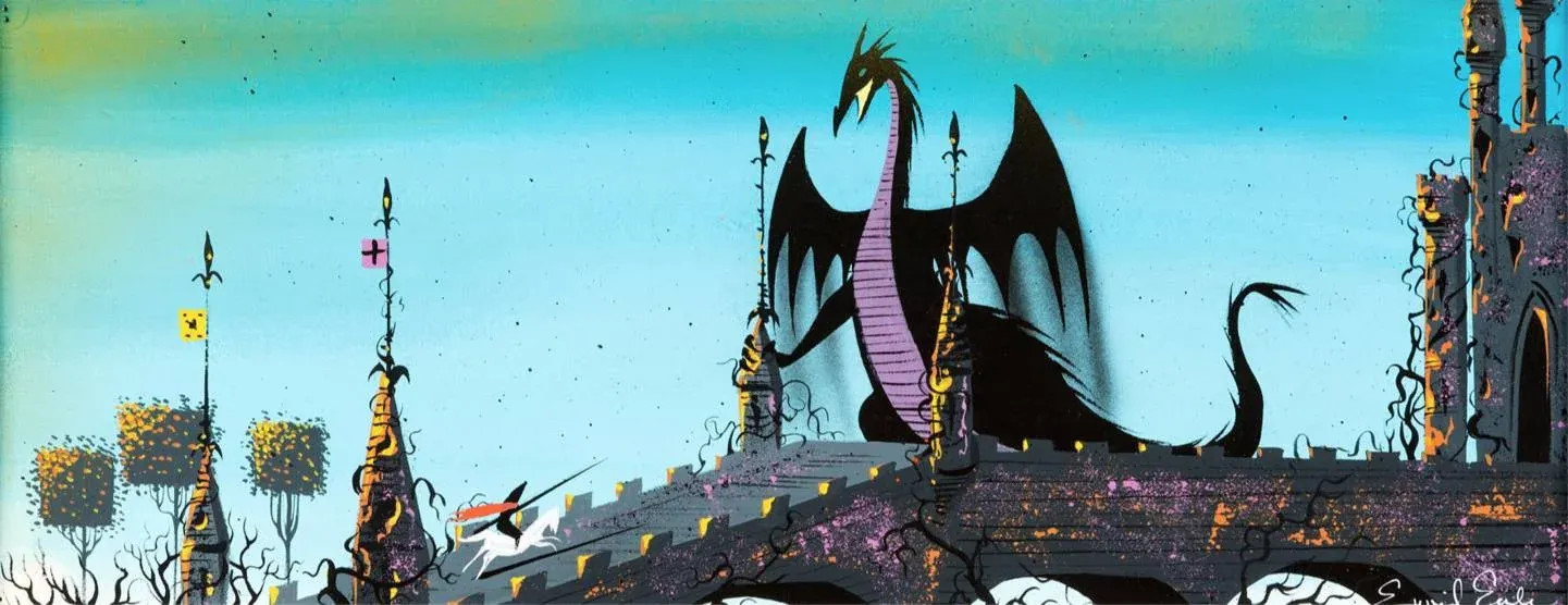
- Eyvind Earle, Maleficent on the Castle Rooftop Concept Painting for Sleeping Beauty, 1959. Gouache on illustration board.
- Depicting similarities to classic Metroidvania big boss storytelling, the panoramic layout utilizes an asymmetric vertical barrier to structure the environment, positioning the colossal antagonist high above the player-surrogate figure to emphasize mechanical scale, spatial confinement, and a dramatic sense of structural progression.
- © Rights held by the respective copyright holders.
Above, the Prince charges on horseback toward Maleficent in her dragon form, positioned along the castle drawbridge. Forty or fifty years later, this exact arrangement became iconic shorthand in video games, and yet here it is, painted years before anyone had imagined a side-scrolling action game, when computers themselves were still room-sized machines found only in research laboratories and government facilities. It isn't only the left-right staging that reads this way. It's the singularity of the path itself, one road, one wall, one confrontation standing between the character and the next chamber.
There's a scale to the piece as well that feels distinctly modern: Maleficent looms large enough that only her upper body and head clear the castle wall, the kind of oversized, partially obscured antagonist scale that real-time games would later need to build out of multiple sprites or model segments just to achieve.
- Capcom, Ghosts 'n Goblins, 1986. Video game screenshot, Room of Great Demon King Astaroth.
- The final boss arena captures the confrontation with Astaroth, demonstrating a classic 2D platforming boss battle environment for structural comparison to Earle's concept art, utilizing a rigid horizontal plane, mirrored vertical columns, and an architectural throne layout that frames the monumental antagonist.
- © Rights held by the respective copyright holders.
This kind of staging is old news by today's standards, but it hadn't been formalized yet in Earle's time. By the mid-1980s, with the Bowser bridge fight in the original Super Mario Bros. and boss rooms like Astaroth's throne here in Ghosts 'n Goblins, the setup was just formulating as a convention: a single horizontal plane, a monumental foe framed by architecture, a knight or hero advancing from one side toward a confrontation staged like a stage play. I've chosen Ghosts 'n Goblins specifically because it sits in roughly the same visual territory as Earle's own gothic, knight-and-castle language, even though the two were made worlds apart.
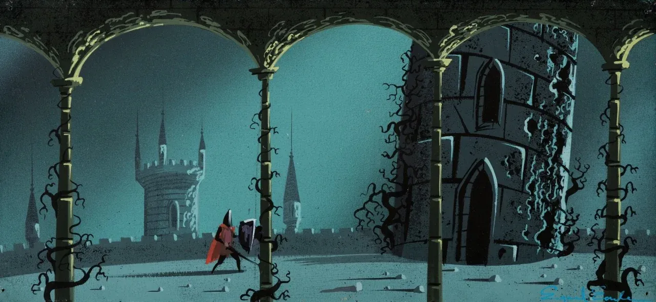
- Eyvind Earle, Prince Phillip Approaching the Tower Concept Painting for Sleeping Beauty, 1959. Gouache on illustration board.
- Demonstrating a modern comparison to the visual language of 2D platforming games, the stark horizontal positioning of the Prince beneath a massive, vine-choked vertical barrier heavily mirrors the environmental communication and aesthetic dread of Blasphemous, highlighted by the striking resemblance of his helmet to the iconic, elongated headgear of The Penitent One.
- © Rights held by the respective copyright holders.
This isn't only the language of the boss encounter itself, though. It's also the underlying structure of the Metroidvania, a genre named for the fusion of two of its earliest defining titles, Metroid and Castlevania. At its core is the platformer: movement confined to a 2D plane, left and right, jumps timed over pitfalls, ladders to climb, a button press to swing a sword. This particular image struck me for how closely it anticipates that genre's visual tropes, both in the shape of its protagonist and in the architecture surrounding him.
I can easily picture this concept art coming to life, in motion, guided through the palace with a controller in hand. In fact, since 2D games are almost entirely sprite-based, Earle's work is genuinely compatible with that medium, it could appear nearly as is, which is an endearing thing to imagine.
- The Game Kitchen, Blasphemous II, 2023. Video game screenshot, Elevated Temples level.
- The gameplay frame demonstrates clear structural similarities between the 2D Metroidvania platforming genre and Eyvind Earle's Sleeping Beauty storyboards, utilizing flat layered horizontal stone bridges, repeating vertical spires, and an asynchronous architecture that echoes his signature medieval style.
- © Rights held by the respective copyright holders.
Blasphemous, a Metroidvania from the 2020s, carries the resemblance even further. The Penitent One's silhouette, the bramble and thorn set against stone columns, the way the background architecture warps and stylizes rather than sitting in strict perspective. The helmet in particular is a striking point of resemblance, an elongated, distinctive silhouette not unlike the Prince's own.
I wouldn't confine this influence to Metroidvania specifically, either. The genre itself broadened into action 3D games where the idea of the singular, monumental boss continued. I would say echoes certainly exist in releases like Dark Souls and Elden Ring as an expansion of this classic confrontation even though these feature a much more grim dark lens.
VI. Thoughts
What follows is personal impressions that Earle's work leaves with me, the feelings that surface when I reflect on his career and his artwork.
V. Insights into Production Arts
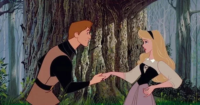
- Sleeping Beauty, 1959. Film still, Walt Disney Animation Studios.
- The frame captures Princess Aurora and Prince Phillip meeting in the deep forest, clearly demonstrating the visual contrast between the flat, cel-shaded animated characters and the intricately detailed, heavily textured background layout rendered by Eyvind Earle.
- © Rights held by the respective copyright holders.
Sleeping Beauty carries a real tension at its core, the pull between the background and the cel-shaded character moving across it. In illustration, this is a clear and available choice. You can let a background stay severe, structural, unwilling to soften, the way Earle did, or you can smooth it down, optimize it, let it recede and give way entirely to the actor standing in front of it. Both are legitimate decisions. They're just very different ones.
3D animation has struggled with this same tension for a long time, though for more technical reasons. It's difficult to build an environment that feels soft and illustrative while still reading as shadowed and grounded, because of how light actually behaves in 3D space. The combination of authored lighting and receiving shadows cast from surrounding objects is a massive challenge. Crude solutions are available but it's near impossible to get the backgrounds to have the charm of soft illustrated work.
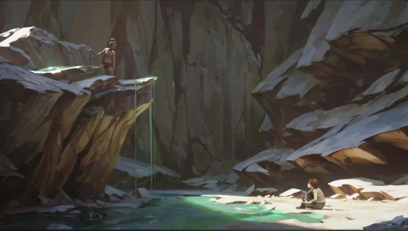
- Arcane, 2021. Animated series frame, Riot Games and Fortiche Production.
- The sequence captures a childhood flashback between Viktor and Sky in the crevices of Zaun, demonstrating Fortiche Production’s revolutionary approach to stylized animation where 3D character models and environments are mapped with expressive, hand-painted digital textures.
- © Rights held by the respective copyright holders.
Arcane is a notable exception, though the cost of that exception was steep in production costs. Achieving painterly, stylized light in a fundamentally 3D pipeline required each set to be lit by hand-painted light, animated dynamically, sometimes frame by frame. It's an extraordinary result, but one most studios simply can't afford to replicate. Even now, 3D animation is largely still bound by this constraint, still struggling to blend cel-shaded characters into environments that feel like they naturally belong to them.
Earle solved a version of this problem differently. He didn't cater to the impulse to soften the background. He let it stay rough, textured, structurally present. It worked, to enormous success. But that success comes with a caveat worth stating plainly: there's an underlying discomfort built into this choice. A broader audience might not immediately warm to it. Leading with that kind of severity probably requires the confidence and mastery of an artist at Earle's level to fully carry off.
I take real inspiration from this, from feeling less pressured to optimize my own production work for broad audience comfort, to resist the pull toward pure optimization. But I don't think that's a license to be careless about it. Doing this well still takes real care and real craft to pull off successfully.
The Romantic Eye
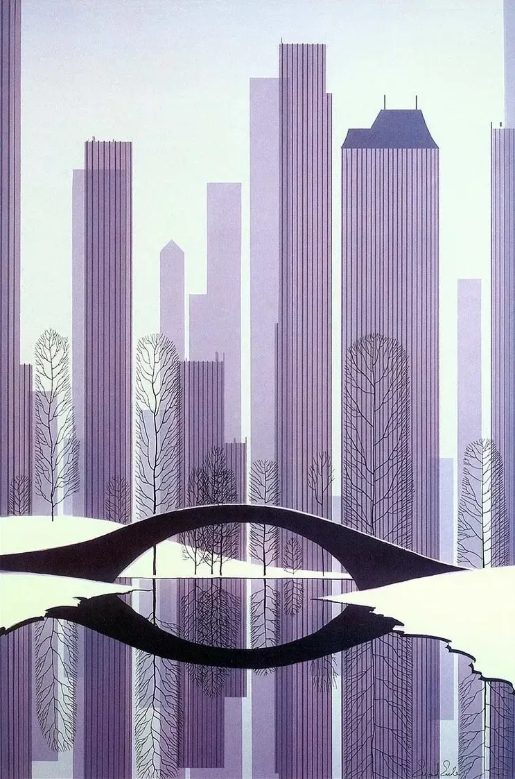
- Eyvind Earle, Central Park, 1983. Serigraph on paper, 30 × 20 in.
- The composition utilizes a monochromatic purple palette, casting dramatic, elongated silhouettes through the intricate winter trees to anchor the cityscape's flattened perspective.
- © Rights held by the respective copyright holders.
Earle's Central Park is stripped down to essentials, towers rendered as flat vertical bands, bare trees traced in fine dark line, a bridge arcing over water that holds its own still reflection. It's a modern skyline, but there's a spareness to it that feels older than the buildings, something closer to a study of shape and rhythm than a portrait of a city.
Earle has shown me, across enough of his work now, that he's willing to play with a scene this way, to let a place become something other than itself, without ever telling me exactly how or why. I don't always know what he intended. What I'm left with instead is the pleasure of guessing, of romanticizing the possibilities his images leave open.
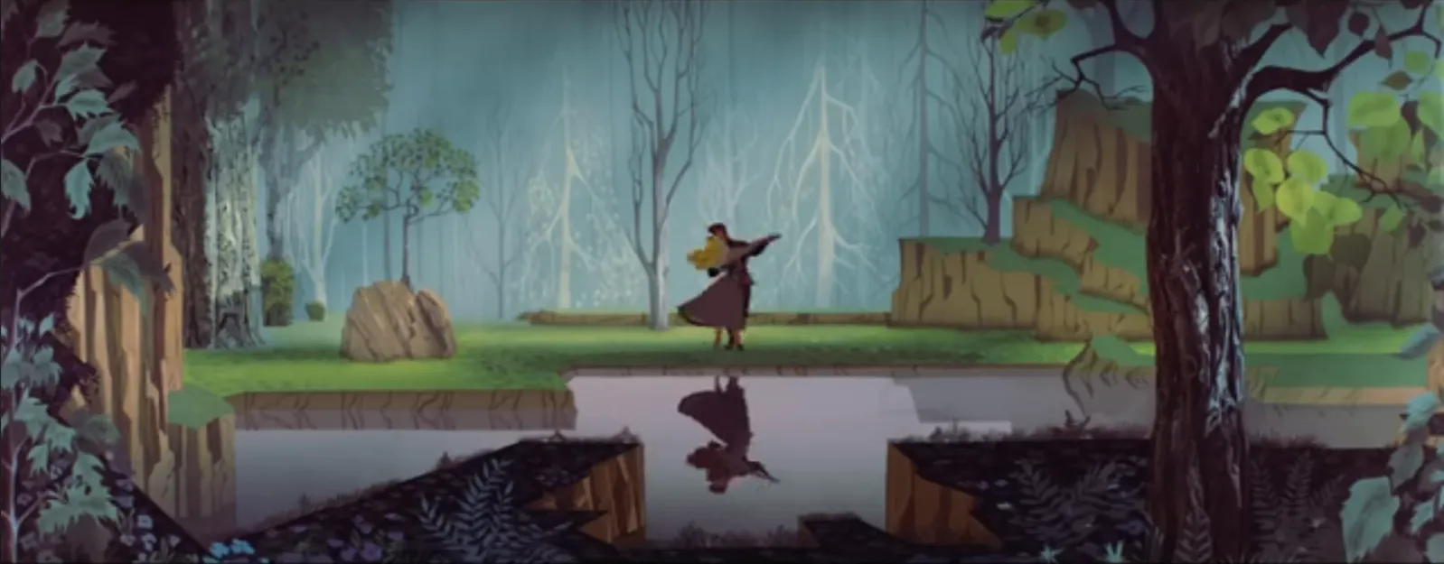
- Sleeping Beauty, 1959. Film still, Walt Disney Animation Studios.
- The wide-screen frame captures Princess Aurora and Prince Phillip dancing during the “Once Upon a Dream” sequence, demonstrating the stark foreground silhouettes, graphic tree geometries, and crisp mirror-water reflections to compare with Earle's Central Park landscape.
- © Rights held by the respective copyright holders.
And then I see this. The same bridge, the same still water and dark reflection, the same bare trees standing witness. A fairy tale forest where two figures once danced, folded quietly into a city park decades later. I don't think Earle is telling me this is the same place. I think he's showing me that it could be, that a bridge in Manhattan and a clearing in an enchanted wood are, in his hands, built from the same visual grammar, the same instinct for how a space should hold a body moving through it.
There's something childlike in that connection, in the best sense: the imagination that can take any ordinary space and turn it into somewhere else entirely, a bridge becoming a stage for a waltz that technically happened in a different world, centuries removed. It's an isekai instinct, the pleasure of believing the world you're standing in might fold into the fantastic if you look at it correctly.
This is where the romanticizing really begins for me, and where it doesn't stop at subject matter. I think this same instinct runs through everything Earle touched, not just literal echoes between scenes, but his whole approach to art itself: the way he moves through styles, pays homage, absorbs a tradition and remakes it as his own. His mastery is real and visible, but the exact mechanics of it, how he arrived at these connections, what he was actually thinking when one image became another, may only ever have been knowable to him. That door stays open. All I can do is stand at it and imagine.
Gratitude
I take real lessons from studying Earle's work, lessons in color, in composition, and in a kind of severity, a willingness to make crucial decisions. It's Earle as a fine artist who inspires me most. His conviction comes through as a powerful message, carried by scholarly diligence, flexibility, and a genuine desire to learn and master anything he turned his attention to, then present it at the highest standard he could reach.
That's a defining trait of a production artist. You have to treat art not only as expression but as language, and you have to be able to move between languages to serve whatever the production needs. Earle's mastery let him move freely through that space, and what I find most endearing is how playfully, how whimsically, he could step into an unfamiliar visual language and make it his own. It's almost like he leaves a roadmap behind, showing exactly how he found his way into each new style.
I can't claim to know his inner beliefs. But I can see the grace in his art, and I can say what viewing the full body of his work speaks to me. I admire the faith I see in Earle. I read it as expressed across his work, not only in the literal religious pieces, but running quietly through images that on the surface have nothing to do with spirituality at all. I see a connection between that faith and infer a vision of love, life, and beauty, as each lifts the other in harmony.
Those traits combined with his convinction and discipline are the message and lessons I take from his body of work, and I'm grateful to have been shown it.
VII. Conclusion
Eyvind Earle's career is, in the end, a study in mastery pursued relentlessly across a lifetime, in fine art, in illustration, in production design, each medium absorbed and remade in his own hand. Few artists move this fluidly across so many forms while still leaving a signature unmistakably their own, and fewer still manage to do it at the level Earle sustained across seven decades of work.
Disney, for a brief window, offered him something rare within that larger career: a system willing to let an individual vision lead rather than simply serve. He didn't invent that ambition, but he became its clearest conduit, and under his hand it shaped an institution, defined an era, and continues to echo through culture decades later.
His work outside Disney clarifies this further. Removed from narrative and production constraint, his independent paintings show the same hand, unsoftened: the geometry, the stillness, the structure, the patience. Seeing that body of work in its own right brought into focus subtleties I'd long responded to in his film work without being able to fully name them within the busier context of animation.
It also stands, in a smaller sense, as evidence for something I believe strongly: that concept and production art can convey real artistic weight, especially when fine-arts is allowed to thrive with in it.
All of this is what makes this moment, and this work, monumental.
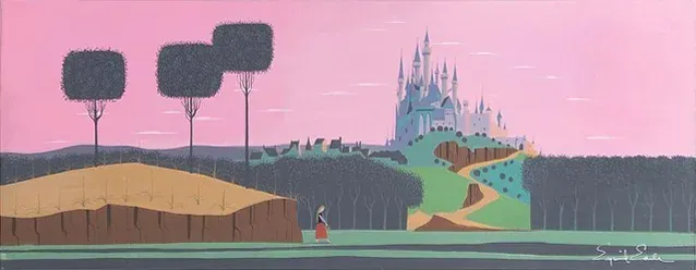
- Eyvind Earle, King Stefan's Castle Concept Painting for Sleeping Beauty, 1959. Gouache on illustration board, 24 × 9.375 in.
- Chosen as a symbolic intro to demonstrate Earle's legacy.
- © Rights held by the respective copyright holders.